Storytelling is the most powerful way to put ideas into the world today.
– Robert McAfee Brown

In an ideal scenario, the stories in your data are so compelling that they are self-explanatory. Unfortunately, this is rarely the case. What’s worse, at times we are so close to the data and insights that we don’t realize that our data visualizations need additional context in order to be properly understood.
Complementing Visuals
If we want our data visualizations to be understood, elicit sharing, and eventually, cause action – we need to help tell the data-driven stories in our dashboards. Here are just a few ways to help complement a data visualization with written anecdotes.
1. In our seventh tip, we remind data visualization practitioners to ‘not neglect the set-up’. By adding some context to open a dashboard, you clearly communicate what your work is about. This works even better if you are able to ask a single question that the rest of your dashboard attempts to answer. This guides end users and helps them find the answer on their own, giving the discovered insights a better chance to stick with your audience.
2. Lately, we have been using ‘inline insights’ as a tactic for communicating my analysis of the data. We simply build a text box into our data visualizations that provides real estate to add our own two cents about our findings and recommendations.
3. Thirdly, don’t underestimate the power of annotations. Many times, the practice of data visualization is extremely dependent on context. For example, if we are analyzing web analytics data and see a large spike in traffic, we would like to know what offline tactics may have driven the spike. We may be able to see that the spike was a result of an increase in direct traffic, but without input from advertising stakeholders, we will not be able to fully explain the trend. Perhaps our company launched a television commercial during the timeframe in question. These are the pieces of context that we like to add in the form of annotations.
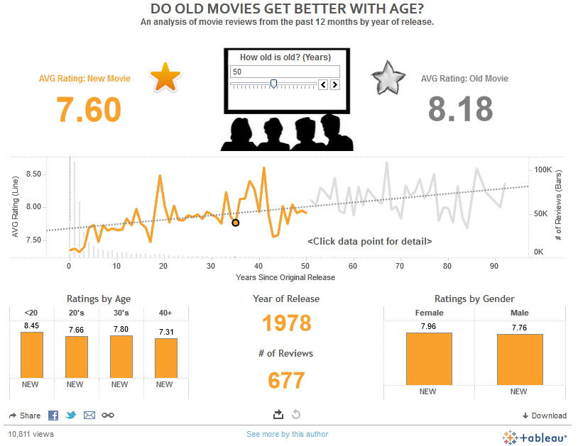
4. Finally, if you have a chance to be in the room when an end user interacts with your data visualization, try to – literally – tell a story. Telling a story led us to win the 2013 Iron Viz Championship. This viz, which showed that there is a correlation between the age of a movie and it’s IMDB rating, was inspired by an experience we had shortly before the contest. A couple of months before the competition, we had seen an anniversary screening of Back to the Future in the theatre and realized that these types of movies seem to be viewed in a better light when watched many years after their original release. We shared this story with the judges which we believe helped give purpose to our work.
Here is a screenshot of that winning viz, Do Old Movies Get Better With Age?
Iron Viz Championship Recipe
We will close by showing you that we practice what we preach, sharing how we used several tips from the Data-Driven Storytelling series during the Iron Viz Championship.
Tip 1: Know Your Audience – The judges are one of the few things you can use to your advantage going into the Iron Viz. We kept their likes and dislikes in mind while designing the viz above.
Tip 3: Leverage Color – This viz features a limited color palette and also uses a custom color created using RGB values.
Tip 4: Keep It Simple – During the Iron Viz Championship, you have just twenty minutes to create the best data visualization possible. Keeping the viz simple ensured we were able to complete it in twenty minutes and also made the dashboard easier to understand.
Tip 6: Re-Tell an Old Story – The IMDB database began in 1990, and movie reviews and history existed long before that. Data visualization allowed us to re-tell an old story in a way that was more insightful than fishing through thousands and thousands of records.
Tip 7: Don’t Neglect the Setup – The winning viz asks a single question and includes a tagline about what the viz contains.
Tip 8: Don’t Use Pie Charts – Self-explanatory. (couldn’t resist)
Tip 9: Use Corporate Chart Types – Every chart type in this viz consists of lines and bars – the Godfathers of data visualization.
Tip 10: Use Callout Numbers – We provide the answer to the question at the top of the dashboard immediately in the form of large callout numbers; from there, end users can continue to explore the data visualization for additional insights.
Tip 11: Allow Discovery – The parameter in the top-center of the dashboard allows end users to decide for themselves ‘How old is old?’. The use of this filter changes the entire data visualization, thus, providing a means for users to discover their own stories in the data.
Tip 12: Balance Data and Design – The IMDB data is the heart of “Do Old Movies Get Better With Age?” The design has nothing to do with the story the data was waiting to share. The design maximized the impact of the viz by engaging end users and making the story more likely to be shared.
Tip 13: Eliminate Chartjunk (but Not Graphics) – The viz uses three small graphics in a tasteful way; none of which interfere with the data or charts. In fact, the stars save real estate by doubling as a color legend.
Tip 14: Freeform Dashboard Design – Freeform dashboard design was leveraged to create a clean layout and place graphics and KPIs in better relation to each other.
The End

Thank you so much for reading Data-Driven Storytelling: Tips from an Iron Viz Champion. This project has provided a fun way for me to document some of my thoughts on data visualization. We are a firm believer that visualization is the key to understanding data and it’s fascinating that there are so many aspects to consider, even before discussing the technical needs involved.
Please stay in touch! If you are beginning your journey with Tableau and need some help taking your skills to the next level, consider following our Tableau 201 series. If you need professional consulting, Evolytics offers comprehensive data visualization services including help with Tableau Server, training, and dashboard creation.
Written By

Evolytics
This post is curated content from the Evolytics staff, bringing you the most interesting news in data and analysis from around the web. The Evolytics staff has proven experience and expertise in analytics strategy, tagging implementation, data engineering, and data visualization.