Tableau is not Excel. Excel is not Tableau. One of the most common barriers to Tableau adoption is the belief that similar data visualizations can be created more easily in Excel. This may be true for certain situations, but if your goal is to master the art of data-driven storytelling, you must leverage the strengths of each software individually. We do not use Tableau to create and store our datasets. While it’s possible, the thought alone makes us cringe with frustration. That is not what Tableau is best at. On the other hand, we don’t attempt to use Excel to make beautiful, interactive dashboards. We’re sure with some elbow grease, this could be achieved, but the one million row limit in Excel alone makes this solution impossible in our enterprise-level visual analytics practice. That is not what Excel was designed to do.
And that is okay!
Tableau vs Excel
Tableau and Excel are both great software programs, but they are not the same software program. Think of one program as a hammer and the other as a screwdriver. To insert a screw, you could technically use a hammer, but you would be forcing it. On the surface, you would have successfully got the screw in place, but you may have inadvertently caused some invisible damage that may emerge later down the road. Vice versa, you may be able to insert a nail with a screwdriver by flipping the tool over and hitting the nail with the handle. It would take some serious skills to pull this off. More likely than not, you’re going to end up with a bruised thumb for your troubles.
We love both of these programs and use them almost every day, but for different reasons. If Tableau’s goal was to replace Excel, Excel would not be one of the primary connection types available in their software. Tableau Personal Desktop users, who are restricted to using flat data files, rely heavily on the ability to interact with their Excel files in Tableau. Tableau knows that it is not Excel.
Nevertheless, the Tableau vs. Excel debate is one we encounter regularly. My recommendation for anybody experiencing the same pushback to leveraging the data visualization capability of Tableau, or moving from crosstab views to visual analytics, in general, is to start with highlight tables. The following exercise can be used to help illustrate the power of applying even a very simple visualization to your data.
The Power of Visualization
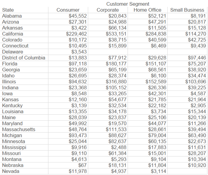
First, take a look at the image below, which is what an Excel spreadsheet looks like with no conditional formatting. See how many seconds (minutes, maybe?) it takes you to determine the top three values in the table:
Next, take a look at the same data, encoded by color. In this case, the higher the sales, the darker the green. Now count how many seconds it takes you identify the three highest values:
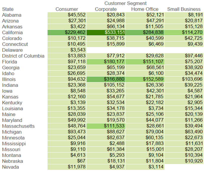
Much less time, right? This is the power of data visualization. The above image is called a highlight table, and as you can see, even the simplest forms of data visualization can lead to much shorter time to insight. You can easily create highlight tables in Excel or Tableau, and we have found they are a great way to introduce the power of data visualization. In the tips to follow, we will introduce more complex data visualizations and data-driven storytelling techniques that can be integrated more efficiently in Tableau, but many times, you have to start by helping your audience understand why data visualization plays an important role in analytics.
Written By

Evolytics
This post is curated content from the Evolytics staff, bringing you the most interesting news in data and analysis from around the web. The Evolytics staff has proven experience and expertise in analytics strategy, tagging implementation, data engineering, and data visualization.