Our stories are not new; yet, in the retelling we are reborn as heroes.
– Harley King

We’ve all been there – a few months after introducing a new reporting format, you may start to get the sneaky suspicion that your weekly or monthly updates are not being opened by stakeholders. Or perhaps they are being opened, but that fresh new reporting format that was so well-received upon release is no longer being used to gain as much insight as it is capable of providing. This may be due to rarely fluctuating KPIs, a lack of understanding on how to leverage the reporting, or maybe simply a shortage of time to dedicate to finding stories in the data.
Why It Matters
The nature of many KPIs used to answer business questions is that they are steady and / or predictable. Think about a website’s bounce rate and average time on site – for better or worse – two KPIs often used to measure a company’s ability to engage website visitors. Without a site redesign, these two KPIs may never fluctuate more than 5 – 10 percent over the entire life of the website. Once you have seen these numbers two or three times, they become stale, and end users become less and less motivated to use the reporting you’re creating for them. In the same vein, you may have KPIs that follow a seasonal pattern, and your end users know exactly what to expect from week to week or month to month; this may make them indifferent to large spikes or dips spotted in your reporting.
The good news is that data visualization provides a means for re-engaging your audience by retelling your data’s stories in new ways. Data visualization tools such as Tableau enable you to (1) make your dashboards more aesthetically pleasing, (2) add filters and functionality that allows end users to find their own stories in the data, and (3) makes your reporting more usable so that finding insights is more intuitive for the user.
Reimagining MLS Standings
As just one of infinite possible examples of retelling an old story, earlier this year we took a shot at reimagining sports standings. As a data visualization evangelist, we view data tables as the least effective way of communicating data. As a sports fan, we are forced to view tables almost exclusively to see how our team is doing – and this is true for every league: NFL, NBA, MLB, NHL, MLS, among others. Tables have been used to track league standings in Europe’s “football” leagues for over a hundred years. They even affectionately call their standings, “The Table.” To show how much more value visualizing sports standings adds compared to the traditional table, we recreated the table in North America’s Major League Soccer as a Tableau Public data visualization.
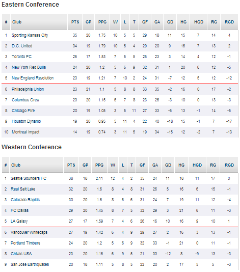
First, take a look at the traditional standings from mlssoccer.com:
Now, take a look at the data visualization created using the same data:
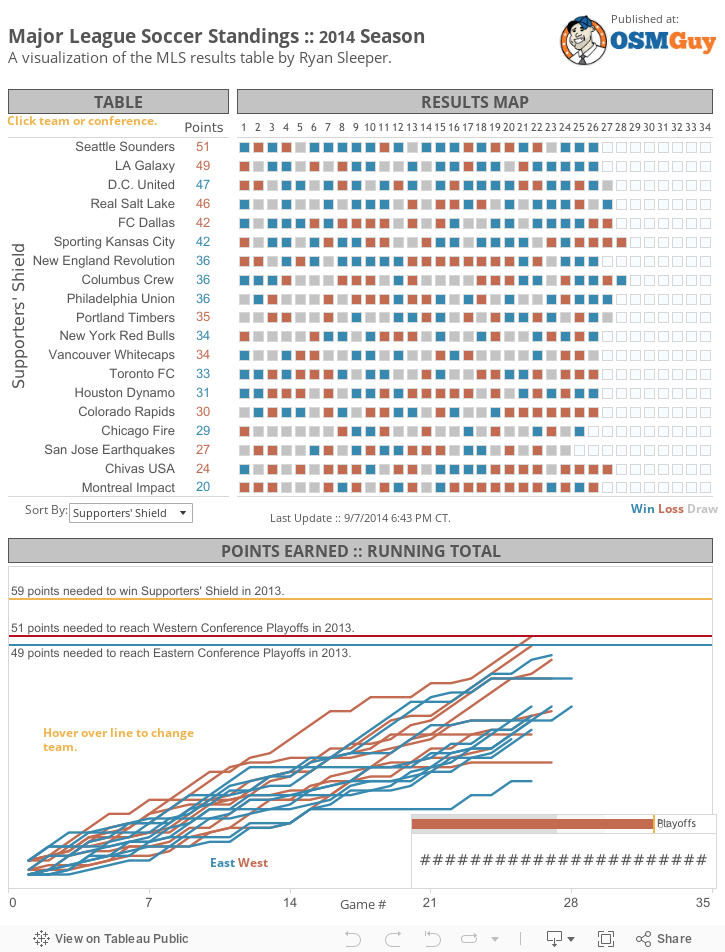
In addition to the table, you now have the ability to do the following in a single view:
• Filter between Conference and Supporters’ Shield standings.
• See how many games each team has played and how many games they have remaining.
• Hover over every single game to see the teams that played and the final score.
• Determine what it will take for each team to make the playoffs.
• Gain better understanding into how teams are performing relative to each other.
The same principles used to add value to this century-old story can be used to reinvigorate your reporting at work, engage your audience, and maximize the impact of your data visualization.
To learn how to introduce the value of data visualization, see this simple tutorial on creating highlight tables.
Written By

Evolytics
This post is curated content from the Evolytics staff, bringing you the most interesting news in data and analysis from around the web. The Evolytics staff has proven experience and expertise in analytics strategy, tagging implementation, data engineering, and data visualization.