This is part two in a three part series on mapping in Tableau. Subscribe to our Tableau tips email list in the right sidebar or at the end of this article to be alerted as soon as new tips are published.

The out of the box Tableau symbol and filled maps are some of the most powerful visualization types available in the software. As we illustrated in our Data Visualization Tip: Eliminate Chart Junk (but Not Graphics), maps provide a means of decoding hundreds of latitude / longitude pairs almost instantly – all with a single image. Not only that, Tableau does a lot of the heavy lifting for us by providing the geographic coordinates of locations all over the world – this way we get to enjoy making maps instead of looking up longitudes and latitudes. Maps have become even better in Tableau 9 with new lasso and radial selections.
But wait – there’s more! 🙂 You can create custom maps in Tableau for just about anything. This tutorial will walk you through how to map any background image in Tableau.
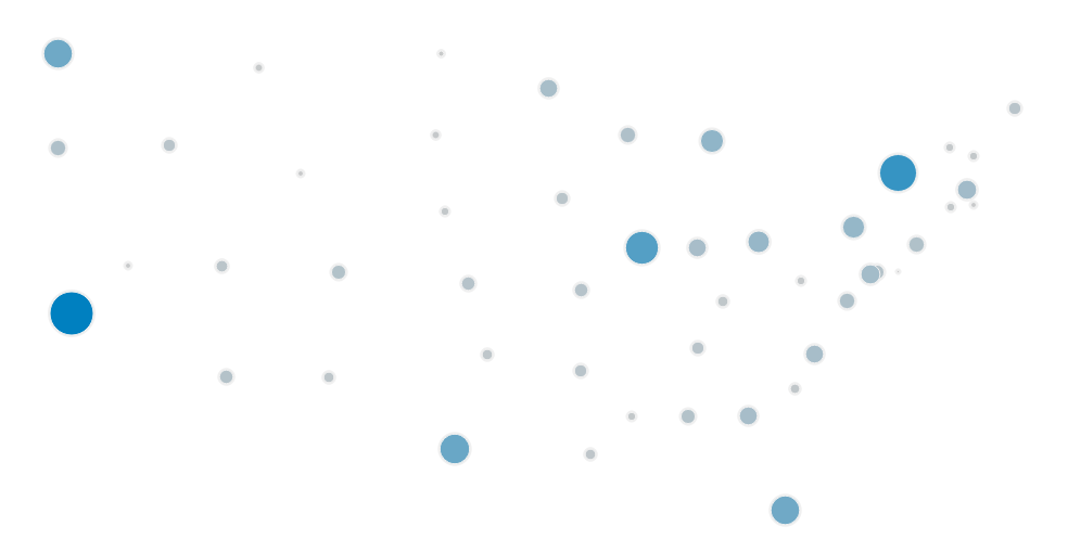
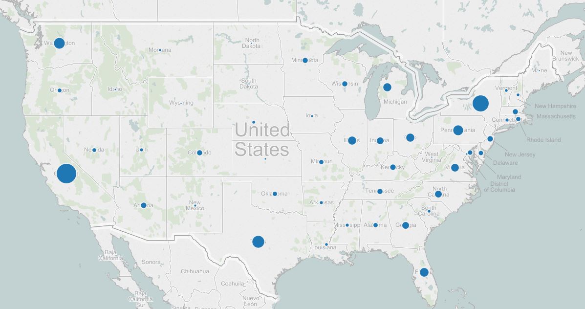
Maps in Tableau can be thought of as scatter plots with a background image. Tableau will plot a point at each combination of the latitude on the Y-axis and longitude on the X-axis. To help illustrate the scatterplot concept – take a look at the following two images:
Latitude and longitude plotted with no background image
Same data points plotted with a background image of the United States
Due to the way maps function in Tableau, as long as you know the coordinates of a point on the vertical Y-axis and horizontal X-axis, you can map anything you would like! This provides some unique possibilities. Take a look at this custom arena map we created for one our digital analytics partners in professional basketball:

This visualization can be used to gain insight about every individual seat inside of the arena. Okay – that’s cool.
So let’s build one of these. For this tutorial, we will use this image of a baseball diamond.

Being October, let’s imagine that we want to visualize different baseball statistics by player position. To create this visualization, we first need to plot the nine positions on the field.
Building Custom Background Maps in Tableau
Step 1 – Locate image and image dimensions
First we will need an image. If you want to follow along, download the image of the baseball diamond above. For best results, pre-size the image in the desired dimensions and take note of the height and width of the image in pixels. The baseball diamond image above is 500 pixels wide by 500 pixels high.
Step 2 – Create data set with fields for X and Y coordinates
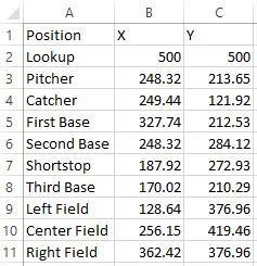
The next step is to create a data set that has at least three fields: 1. each point you want to plot (in our case it’s player position) 2. X Position 3. Y Position. For the first row, just put an arbitrary name in the cell for the point you want to plot, such as “Lookup”. The X value will be the width of the image, and the Y value will be the height of the image. At this point, my data set looks like this (the player position coordinates still need to be looked up):

Step 3 – Add the background image
Start a new workbook in Tableau and connect to the data from step 2. Navigate to Map > Background Images, and click on the data source. This will open a new dialog box where you can choose ‘Add Image’ in the bottom left corner. This is where you can choose which image will act as the background. If you’re following along with the baseball example, navigate to the image that you downloaded from above.
All that is left in this step is to put the maximum value for the X and Y coordinates. If our image is 500 wide by 500 high, we would make the following entries:
X Position: 0 Left, 500 Right
Y Position: 0 Bottom, 500 Top
Also be sure to change the ‘Y Field’ from ‘X’ to ‘Y’. At this point, your screen should look like this:

Click OK to apply your changes.
Step 4 – Look up X and Y position for each coordinate
Start your new custom map by placing the X measure on Columns Shelf and the Y measure on the Rows Shelf. Ensure both axes are fixed at the maximum X and Y values; which are 500 for both in our case. If you need to change an axis, simply right click on the axis, choose “Edit Axis”, and fix the range at 0 to 500.
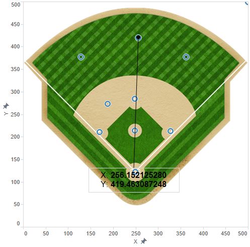
In order to look up the X and Y coordinates for each position player (or whatever you are plotting), right click on the view, hover over ‘Annotate’, and click ‘Point’. If the X and Y measures are the only fields on your view, the annotation will show you the X and Y values by default. This is what we want, but you may want to make the font larger so that it’s easier to read.
Now drag the end point of the annotation to each location you want to plot, and see how the X and Y values change. For best results, format the annotation so the line end is a circle; this way you can precisely drag the circle to the exact location you want plotted. Here is one example showing the coordinates for the Catcher:
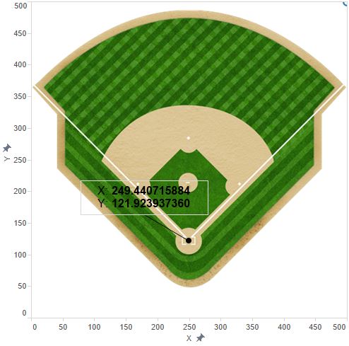
Drag the annotation to each point you want to plot, and record the coordinates in your data set. Note that you don’t need to necessarily record every decimal place. Here is a look at my data with the X and Y coordinates for each player position:
Step 5 – Refresh your map
After all coordinates have been recorded in your data set, save your data and refresh the data source in Tableau.
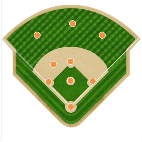
Drag the field you are plotting, such as position in the baseball example, to the Detail Marks Card. You should now see a circle at each position, like this:
Step 6 – Finalize your map and/or add metrics
There are just a few items you can do to finalize your custom Tableau map:
- Remove the annotation by right-clicking on it and selecting ‘Remove’
- Hide the axes by right-clicking on each one and deselecting ‘Show Header’
- Format your marks; my favorite is a filled circle with a custom color and white border
- Filter out the ‘Lookup’ X and Y coordinates. You will notice a mark in the top right corner of your new custom map. You can filter this out by either right-clicking on it and choosing ‘Exclude’, or for better long-term results, remove this row from your underlying data and refresh your view.
- Optional: You can now add measures to your underlying data for each position to visualize different metrics on your customized view (i.e. size the circles by fielding %).
The final custom Tableau map will look like this:
Written By

Evolytics
This post is curated content from the Evolytics staff, bringing you the most interesting news in data and analysis from around the web. The Evolytics staff has proven experience and expertise in analytics strategy, tagging implementation, data engineering, and data visualization.