
Tableau does a great job of providing features that allow for an incredible amount of usability in a report by a wide-ranging audience. One such feature is called the “Tooltip.” (Tooltip definition at Tableau’s Knowledge Base Tableau: Tooltips provide details about data in the view.)
The Power of Tooltips
Tooltips can provide added, and often vital, supplemental detail to visualizations. It could be argued that a “perfect” visualization would not require detail beyond what it already provides in order for the user to glean insights, but that is not always the case. Take, for example, the below cohort analysis.
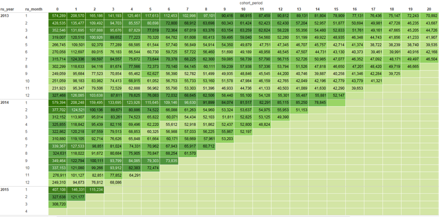
Of course, there will be some who will look at this image and instantly know what the data is communicating, without any further assistance; and even sometimes that can be us (and we built the visualization).
Now look at the same image with the assistance of a tooltip.
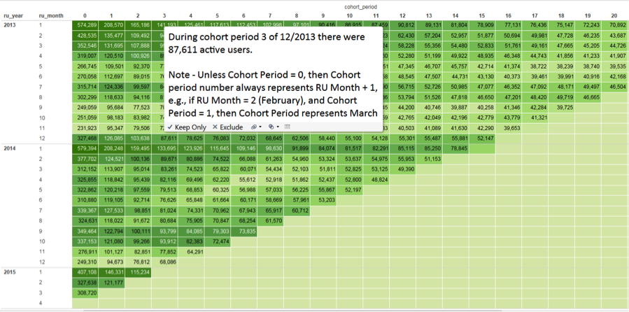
This is an excellent example of why this feature exists in Tableau to begin with. With the tooltip, a user can hover over any data point, and the tooltip will update dynamically with the appropriate information. This particular tooltip also provides information regarding what each cohort period represents, which is a useful reminder since a cohort period will represent a different point in time, depending on what data point is being analyzed. Thanks to the addition of a tooltip, this report is now decipherable, and therefore more accessible, to a wider audience.
How to Create Dynamic Tooltips
Fortunately, creating a dynamic tooltip is a relatively quick and straightforward process, which we will be illustrating using the above example.
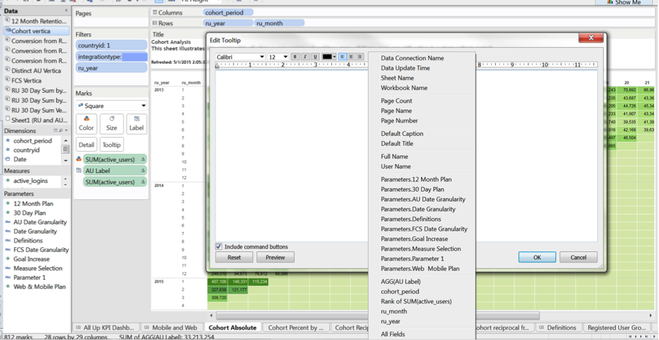
Clicking the “tooltip” icon in the appropriate Marks card will bring up an editable tooltip window. If you simply wish to write static verbiage, you would do so here. But a tooltip like the one above is that much more powerful when it is dynamic. So, in this example we will insert the appropriate fields to populate dynamically depending on what data point a user is interacting with. We do so by simply clicking the “insert” button and selecting from a list of functions available as the image above illustrates.
Here we have chosen to include the following fields:
- <cohort_period>
- <ru_month>
- <ru_year>
- <AGG(AU label)>
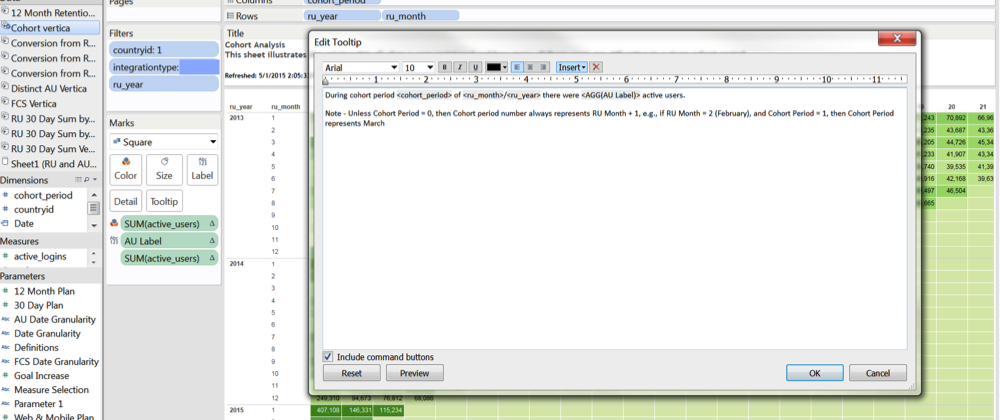
Wrapped around the static verbiage written into the tooltip, these fields will now populate dynamically depending on what data point a user hovers over. In other words, you can use a combination of hard-coded text and dynamic fields to write logic in full sentences that can be understood by anyone. And that’s it! Not so hard, huh? You can also do things like mix up the fonts from those that you use in the report to engage users and add to the design of your visualization. And now you have added a level of usability to your report that allows anyone to understand what it is this report is illustrating.
For more Tableau tips and tricks, please read our ongoing Tableau 201 series.
Written By

Evolytics
This post is curated content from the Evolytics staff, bringing you the most interesting news in data and analysis from around the web. The Evolytics staff has proven experience and expertise in analytics strategy, tagging implementation, data engineering, and data visualization.