Blog


Sharing analytics tips, expert advice and industry insights.

Data Visualization: INSIGHT Framework

As consultants and content marketers, we have designed and constructed hundreds of data visualizations. Whether that has been a pictograph or a Venn diagram, having visuals to showcase findings could make it easier for many …

Tableau 201: How to Make Dual-Axis Slope Graphs

Slope graphs, or essentially line graphs between two points, are one of our favorite Tableau charts when our analysis requires a comparison between two data points. They work so well, in fact, that they are …

Tableau 201: Using Level of Detail Expressions to Create Benchmarks

One of the most powerful features of Tableau is the “Level of Detail” (LOD) functionality, which provides a syntax for explicitly assigning a different level of detail, or granularity, to a measure. This unlocks many …

Monetizing the Benefit of Online Customer-Care

About two and half years ago, we were working on a project for a major telecommunications company with the sole purpose of shifting calls out of the call centers, and creating a self-support experience online …

Tableau 201: How to Make a Stoplight 100-Point Index

As an analysts, the ‘Stoplight’ 100-point index is a reporting mechanism that we cannot live without. If you are not familiar, the 100-point index is a simple way to know whether a measure is outperforming …

Tableau 201: How to Make a Highlight Table

In our data-driven storytelling tips series, we demonstrate an exercise for “Smoothing the Excel Transition” by introducing the value of data visualization. In the example, we simply encode the values in a large text table …

Tableau Hack: How to Highlight a Dimension

In our viz, U.S. Income by Age and Marital Status (pictured right), we wanted our end users to be able to choose their personal combination of age, marital status, and income – then have the …

Tableau 201: How to Make a Dual-Axis Combo Chart

Dual-axis combination charts, or Combo Charts, are an effective chart type for showing related information while saving real estate by combining views. This chart type is created with one shared axis, such as an X-axis …

How to Learn Tableau: My Top Five Tips

When it comes to data, there are a lot of different solutions available to help businesses process it better. From Tableau to Marketo to Microsoft Dynamics — there’s even Vertify to integrate the last two! …

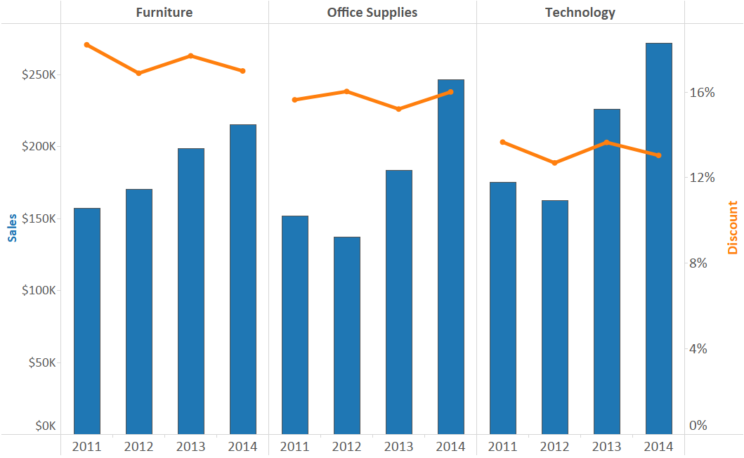
Evolytics’ Ryan Sleeper Earns Tableau Public Viz of the Year

Evolytics’ Director of Data Visualization, Ryan Sleeper, has been selected as the winner of Tableau Public’s Visualization of the Year for his viz, The Cost of Attending the 2015 World Series. Each year since 2013, employees …