
In a previous post, we’ve shared a technique for comparing any date range in Tableau to the equal date range that immediately preceded the selection. But what do you do if you want to pick both ranges, even if they aren’t right next to each other on the calendar? What if one range has a different number of days than the other?
This post shows how to compare the performance during any two date ranges on one axis, even if the selected date ranges have unequal durations.
Create the Parameters
First, create four separate parameters with a data type of ‘Date’:
- Range 1 Minimum Date
- Range 1 Maximum Date
- Range 2 Minimum Date
- Range 2 Maximum Date
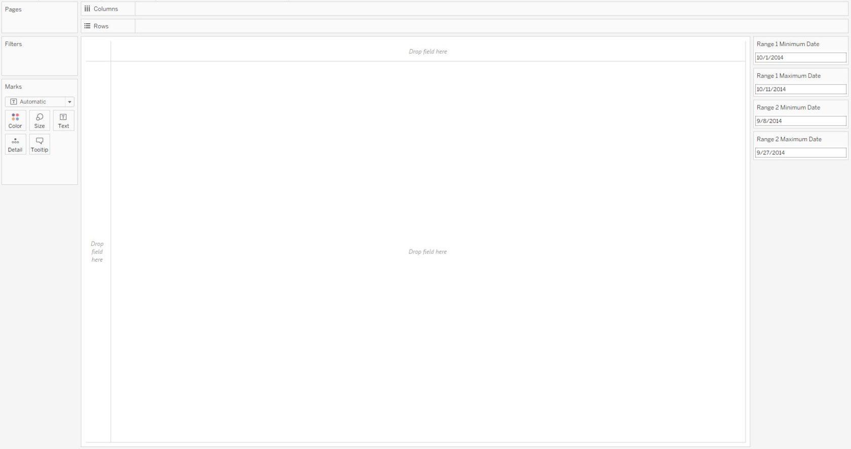
To start the view, show all four parameter controls by right-clicking on them and choosing “Show parameter control”. This allows the end user to choose the two date ranges. For the purposes of this illustration, we will compare 10/1/2014 – 10/11/2014 to 9/8/2014 – 9/27/2014. Notice that not only are these date ranges disconnected (there are three days skipped between them), but the first range is 11 days while the comparison range is 20 days:
Create the Calculated Fields
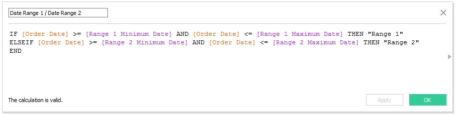
Next, set up a calculated field that classifies whether the date falls into Range 1 or Range 2. If you are following along using the Sample – Superstore data set, the formula looks like this when using Order Date as the date dimension:
IF [Order Date] >= [Range 1 Minimum Date] AND [Order Date] <= [Range 1 Maximum Date] THEN “Range 1”
ELSEIF [Order Date] >= [Range 2 Minimum Date] AND [Order Date] <= [Range 2 Maximum Date] THEN “Range 2”
END
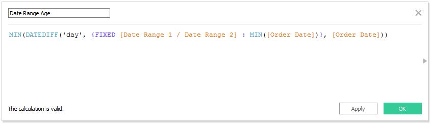
The last component needed to compare any two date ranges on one axis is a calculated field with a level of detail expression that computes the “age” of each date range and normalizes the two ranges by a relative date. This is where the magic happens. Hat tip to Tableau Zen Master, Joshua Milligan, who provided the foundation for this calculation in his post: Tweaking Data Stories in Tableau.
The formula is:
MIN(DATEDIFF(‘day’, {FIXED [Date Range 1 / Date Range 2] : MIN([Order Date])}, [Order Date]))
Create the View
Once you have the four date range parameters, a calculated field that classifies dates as Range 1 or Range 2, and a calculated field that calculates the date range age, you are ready to build the view.
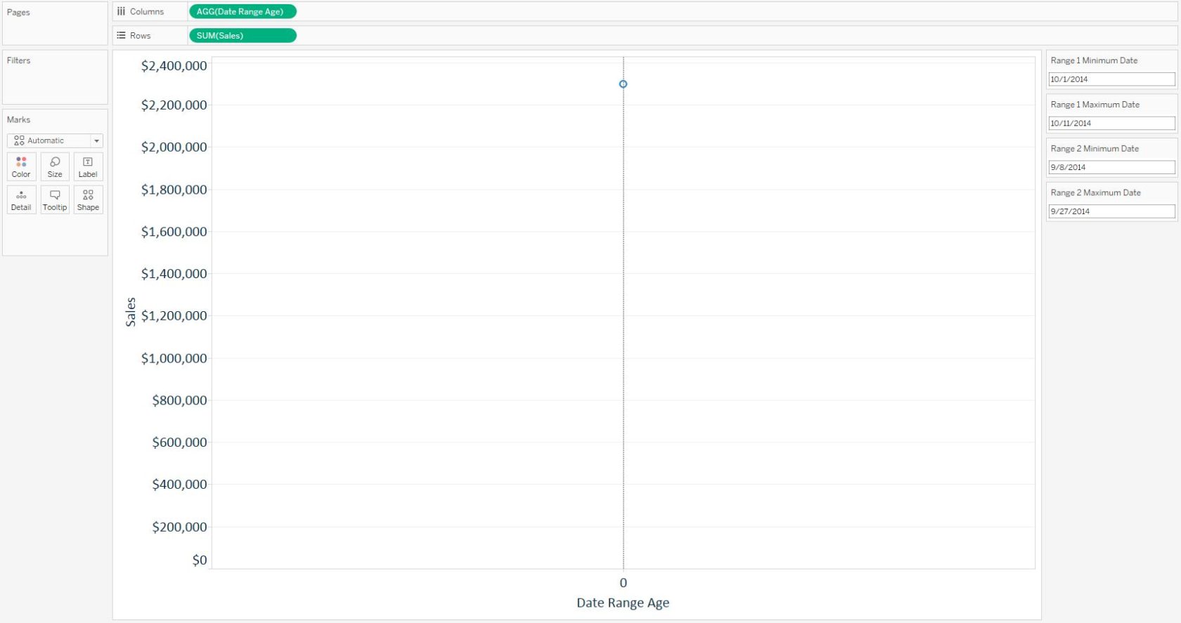
Start a line graph by adding the measure you want to visualize across the two date ranges onto the Rows Shelf and the Date Range Age measure onto the Columns Shelf. Here’s how the view looks so far using Sales as the KPI:
This view is showing a single mark because we need to include the Order Date dimension in order for Tableau to calculate the age of the date range. This can be accomplished by dragging the Order Date field (discrete at the M/D/Y level) to the Detail Marks Card:
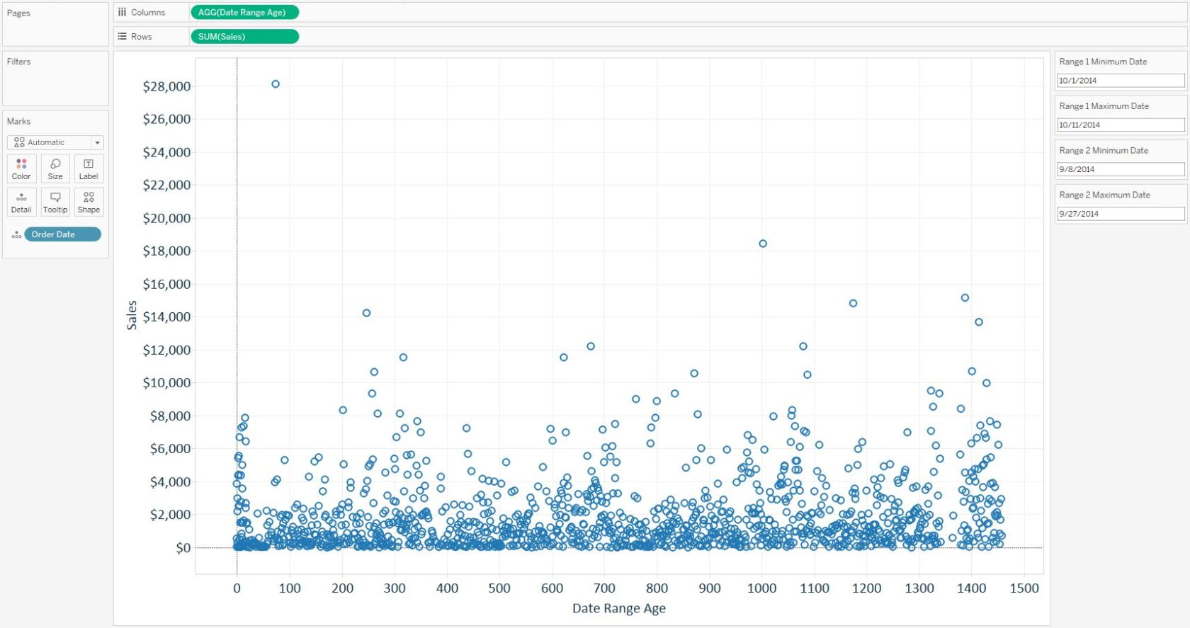
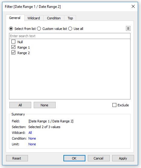
Tableau is now able to do the calculation, but we’ve now got 1,238 marks – one for every date in the Sample – Superstore data set. To filter the view to use only the relevant dates for this analysis, drag the Date Range 1 / Date Range 2 calculated field to the Filters Shelf and keep only the dates classified as Date Range 1 or Date Range 2:
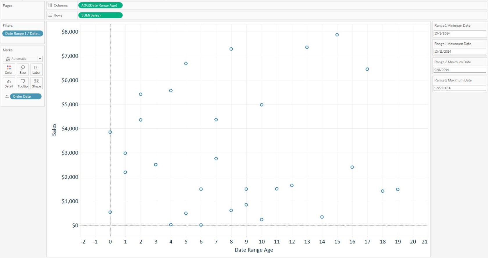
After applying the filter, we are left with only the 31 marks for the date ranges we have selected using the parameter controls:
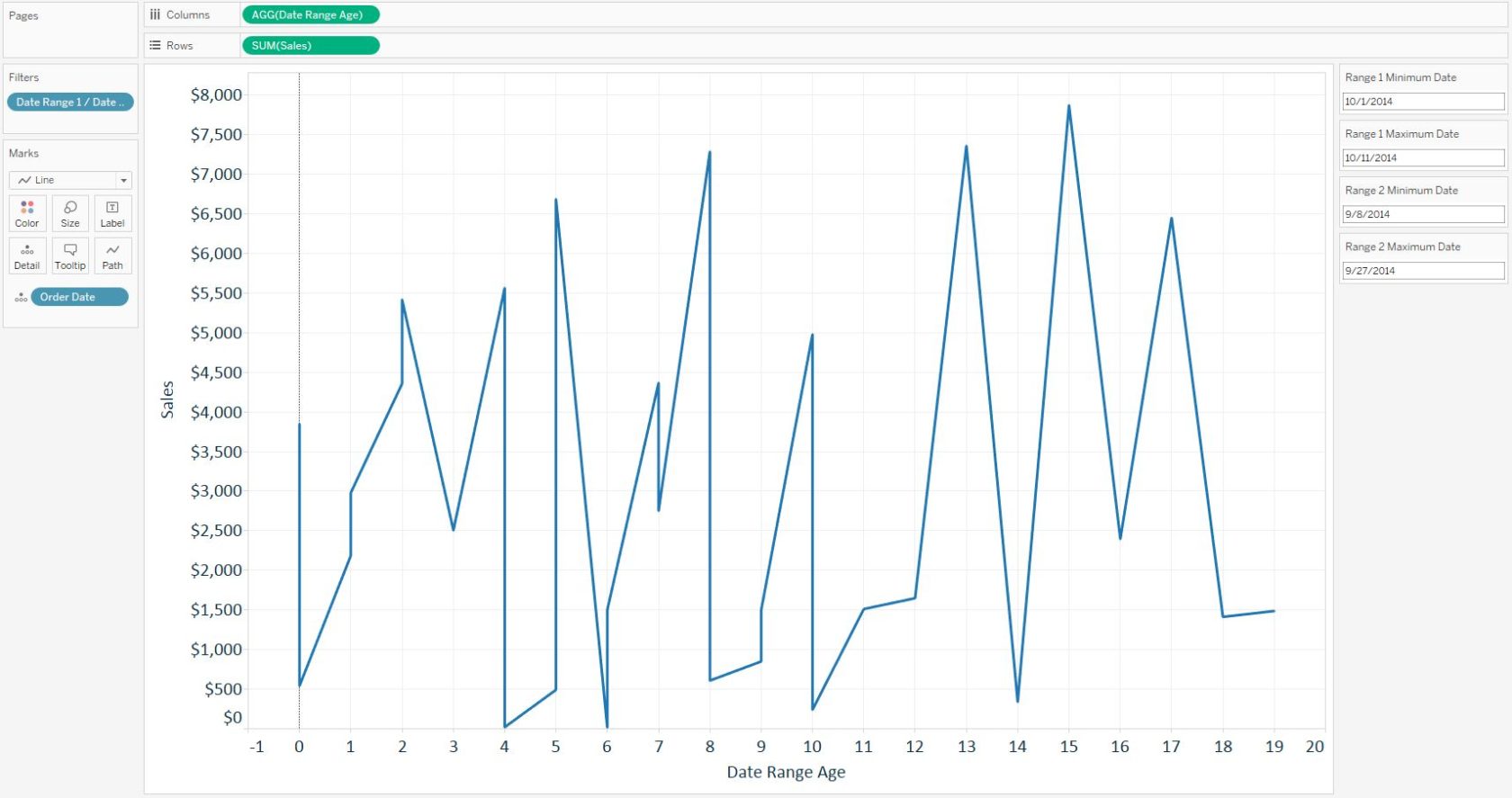
To change this to a line graph, change the mark type from automatic, which is currently Shape, to Line. This creates one continuous line graph:
The final step to compare the performance between the two date ranges is to drag the Date Range 1 / Date Range 2 dimension to the Color Marks Card. Here is how my final view looks after coloring the lines by date range and polishing the formatting:
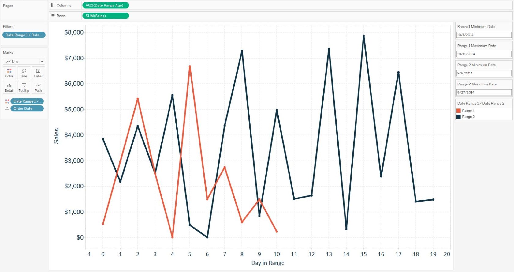
We are now able to choose any two date ranges and compare them to each other on the same relative date axis!
Written By

Evolytics
This post is curated content from the Evolytics staff, bringing you the most interesting news in data and analysis from around the web. The Evolytics staff has proven experience and expertise in analytics strategy, tagging implementation, data engineering, and data visualization.