This is part one in a three-part series on mapping in Tableau. Subscribe to our Tableau tips email list in the right sidebar or at the end of this article to be alerted as soon as new tips are published.
As with most features in Tableau, maps are flexible enough to meet many different analysis needs.
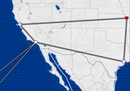
One of the most popular uses of maps in Tableau that we have seen involves evaluating traffic through a certain travel hub, such as an airport or train station. These powerful visualizations are created using hub and spoke paths, with the airport or train station acting as the hub, and the paths to the destinations acting as the spokes.
See the Tableau Path Mapping article on Knowledge Base if you are interested in creating this type of map.
This is a great application of path maps in Tableau, but we recently had a need to display multiple destinations in sequential order instead of from a single origin to multiple destinations. This allows you to create a visualization that documents travel between stops.
This tutorial walks you through how to create sequential paths on a map in Tableau.
How to Map Paths in Tableau
Before we get started, let’s take a look at the interactive visualization that inspired this post:
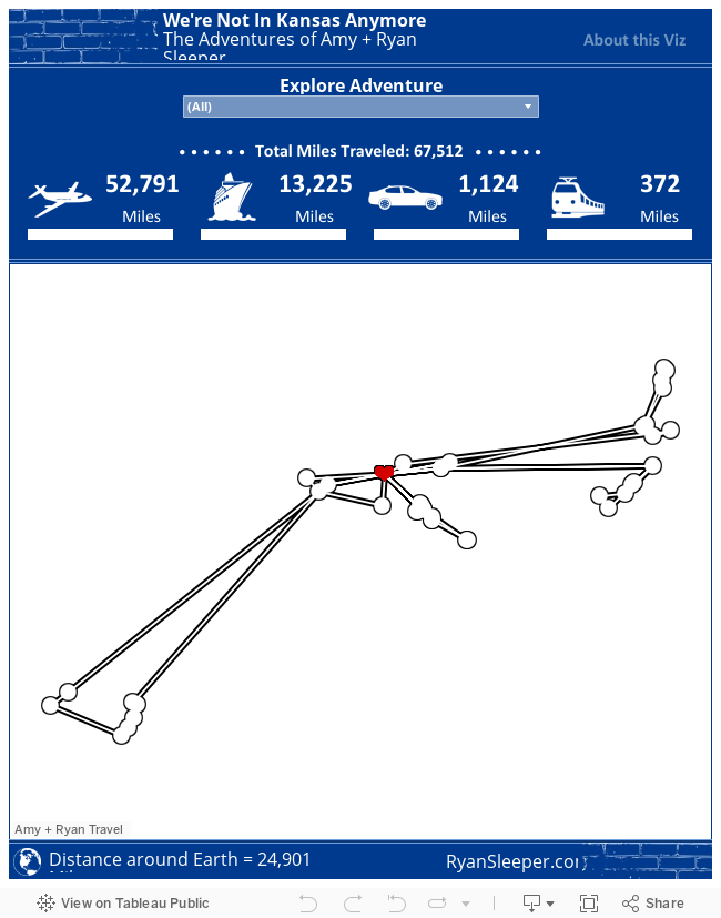
Notice that within each trip, a path is displayed not only from our hometown of Kansas City to each destination, but from each stop in between. Here are the steps required to get this effect.
Step 1 – Prepare Your Data
Create your dataset so that each stop has a latitude, longitude, and path order. By looking up the latitude and longitude sets, you will have more flexibility when you create maps than you would if you use the automatically generated coordinates that Tableau applies to geographic fields.
The path order is what tells Tableau how to connect the dots. Here’s how our underlying data looks for one of our trips (“Stop” = Path Order):
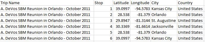
Note: When you open this data for the first time in Tableau, your Stop field will be classified as a measure because it is quantitative.
Make sure you change this field to a dimension by either dragging and dropping it from the measures window to the dimensions window, or by right clicking on the measure and choosing “Convert to Dimension”.
Step 2 – Start Your Map
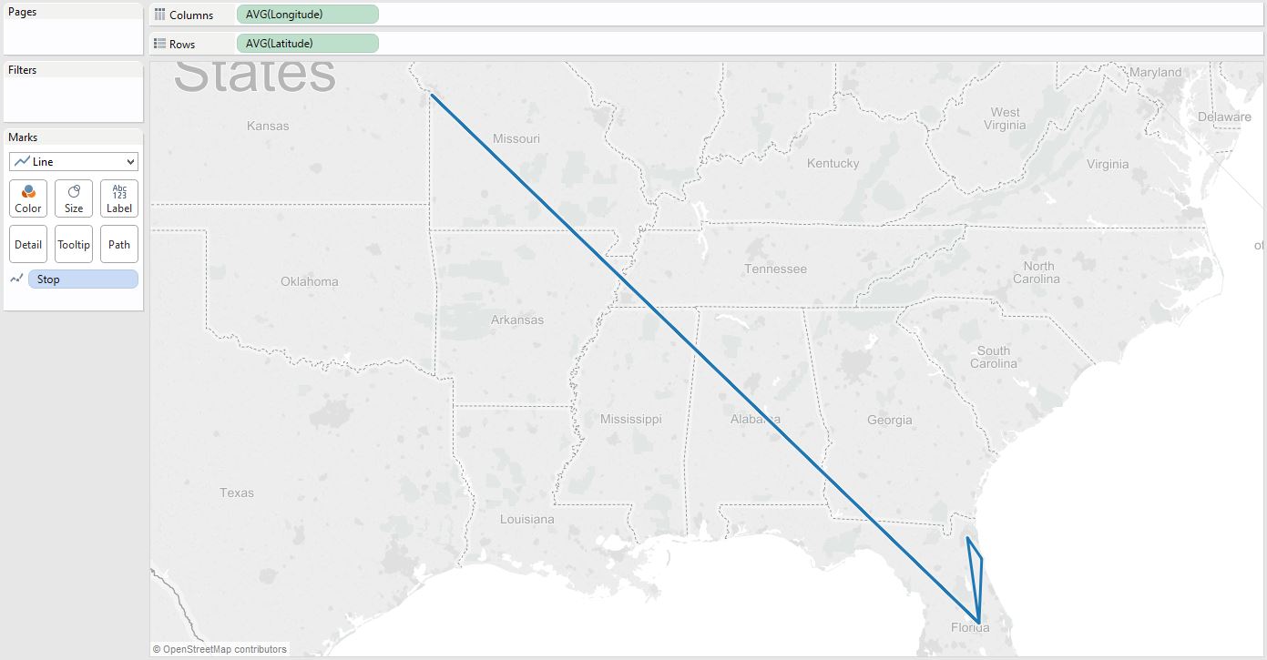
Using the dataset from step 1, begin your map in Tableau by placing your longitude field on the columns shelf and your latitude field on the rows shelf.
It is important in this step to use the coordinates that you added to your dataset instead of the generated latitude and longitude in Tableau.
You can always tell the difference because generated fields in Tableau are italicized.
Step 3 – Change the Map Type
At this point, you should see a map with a single point. That single point represents the average for all of the coordinates in your data.
Change the mark type from Automatic, which is set to circles by default, to line.
This change will reveal a new marks card called “Path”.
The final step is to add the “Stop” (or path order) dimension to the Path marks card.
This should connect the dots in the proper order, creating a sequential path.
Using the sample dataset from above, your final product should look like this:
Remember, many Tableau Public authors allow you to download their workbooks by clicking in the bottom right corner of an embedded Tableau Public viz. This is a great way to reverse engineer techniques that you want to incorporate into your own work.
Written By

Evolytics
This post is curated content from the Evolytics staff, bringing you the most interesting news in data and analysis from around the web. The Evolytics staff has proven experience and expertise in analytics strategy, tagging implementation, data engineering, and data visualization.