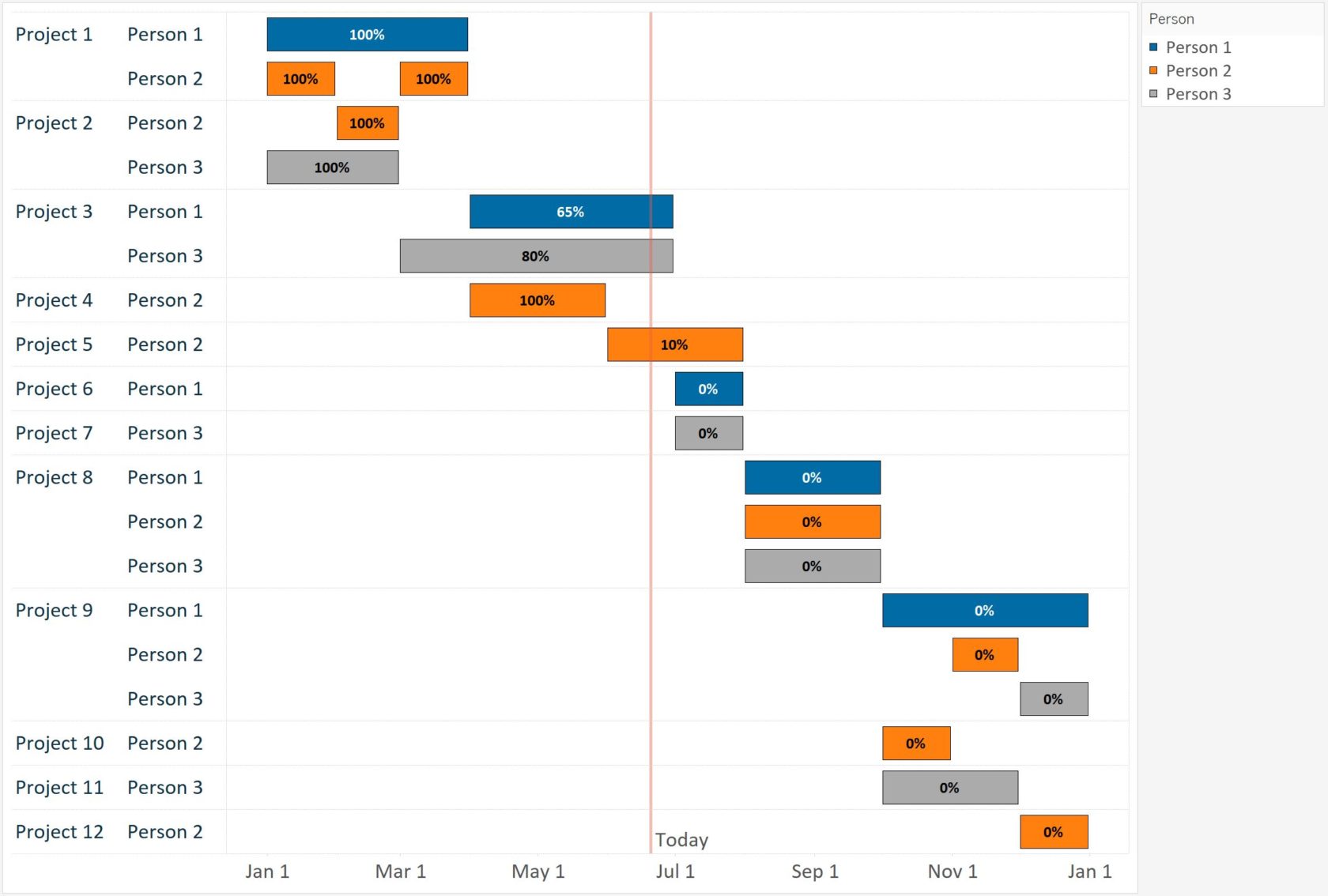
Gantt charts are traditionally used for visualizing project schedules. They are effective for illustrating task durations and dependencies in context of the larger business operation. As with several visualizations that can be built with Tableau, the fact that ‘Gantt Bar’ is a mark type option unlocks some flexibility that allows you to use this chart type in many other ways. To start demonstrating the usefulness of the Gantt Bar mark type, we will build a Gantt chart with a traditional application of illustrating project schedules. The final product will look like this:
The Data
This is one of the few examples that cannot be illustrated using the Sample – Superstore data source, so we will be using the following data set:
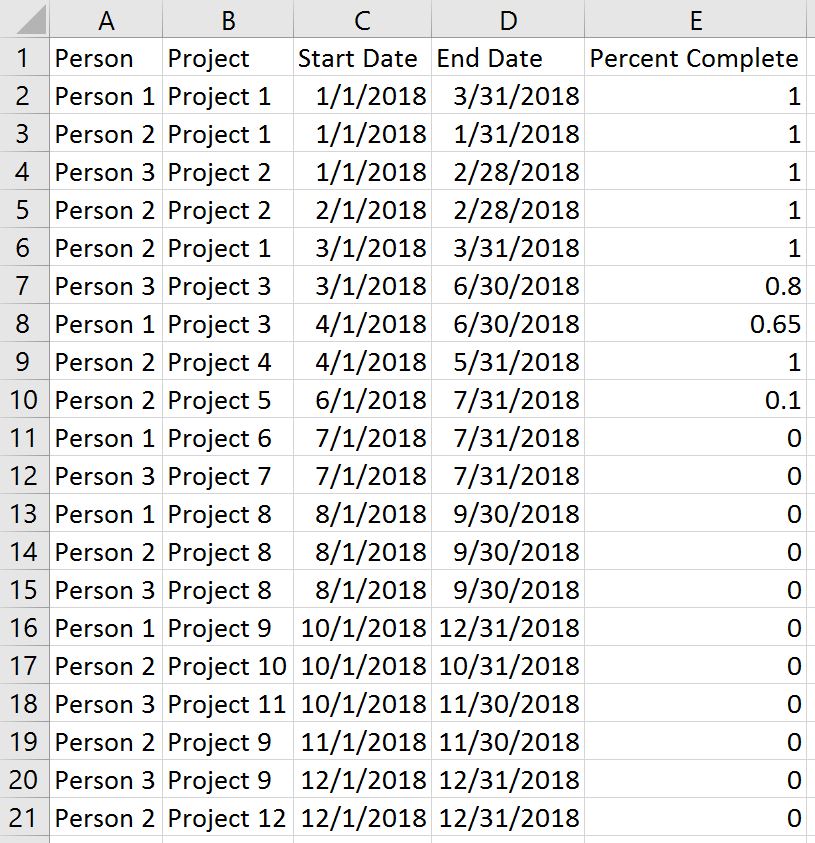
For the purposes of this illustration, let’s pretend that we are a manager with three employees and we are plotting out their schedules across twelve projects for the year. We have created the schedules in Excel, but want to leverage data visualization to (1) get a better sense of how our projects and employees line up, (2) track progress to completion for each project, and (3) provide a visual schedule for our employees to use. All three of these features can be provided through a Gantt chart.
The Ingredients
Gantt charts are created with one date, one or more dimensions, and zero to two measures. The date provides the axis; the dimensions provide the breakdowns we want to visualize and/or the encoding of the Gantt bars; the measures create the length of the Gantt bars and/or their encoding.
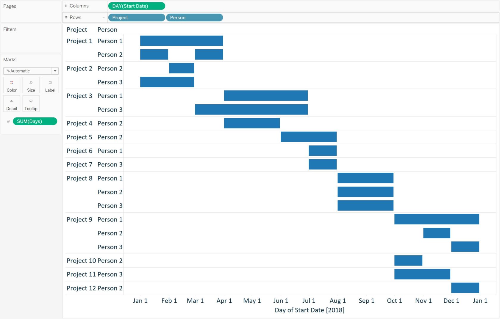
For this Gantt chart, we would like to have a continuous axis running left to right, so we will put the Date dimension (being used as a continuous field) on the Columns Shelf. Looking at the final product above, there are rows for each combination of Project and Person, which tells us those breakdowns reside on the Rows Shelf. Gantt chart is the default mark type in Tableau for this combination of dimensions and measures, so placing the fields on the view results in this foundation of a Gantt chart:
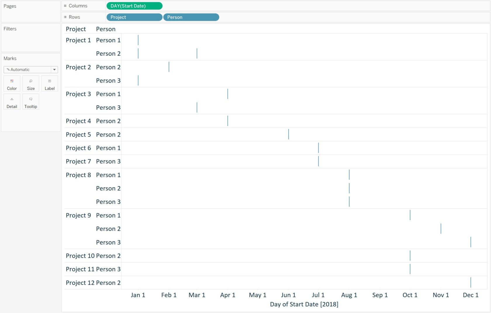
What Tableau has done is place a Gantt mark at the start date of each combination of Project and Person. To extend the Gantt bars to illustrate task duration, we need to size each mark by the number of days in each respective project / person combination. You may have a field for duration in the underlying data set, but it can also be created in Tableau with a calculated field. In this case, duration simply equals [End Date] – [Start Date]
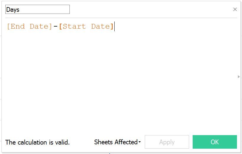
Placing the duration on the Size Marks Card will extend the Gantt marks so that project / person combinations with longer durations will be longer bars and project / person combinations with shorter durations will be shorter bars.
The Finishing Touches
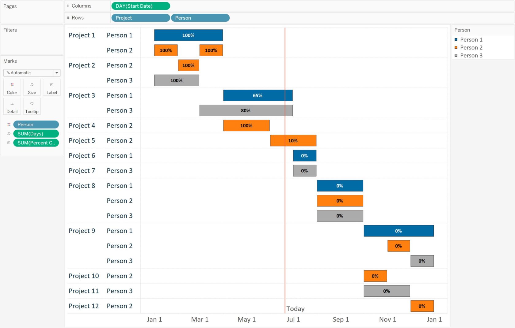
At this point, we have a usable Gantt chart, but there is still room to add a lot of value in Tableau through formatting, encoding, and reference lines. This step is flexible based on your own requirements, but as just one example, we have done the following:
- Colored the bars by employee by adding the Person dimension to the Color Marks Card. One of my goals was to provide a visual schedule to my team and by doing this, they can quickly view their own schedule and even highlight themselves in Tableau by clicking their name on the color legend.
- Added a reference line for “Today” (pretending it’s June 20, 2018) to show each project in context of today’s date.
- Added percent complete to the Label Marks Card to help determine if we are ahead or behind pace for each project. This number was hardcoded in my underlying data set but in the real world it may also come from a time tracking system. Another good use of color would have been to color the Gantt bars by progress to completion.
Here is our final Gantt chart after making these changes and cleaning up the formatting:
In the next post, we will illustrate one special use of the Gantt mark type: Waterfall Charts.
Written By

Evolytics
This post is curated content from the Evolytics staff, bringing you the most interesting news in data and analysis from around the web. The Evolytics staff has proven experience and expertise in analytics strategy, tagging implementation, data engineering, and data visualization.