Creating parameters, filters and base calculations
Set Controls are one of the many powerful functions built into Tableau. They allow users to easily control what data is included or excluded from a set without filtering the underlying data. And like parameters, they can dynamically update your visualizations with a single click, which can drive useful insights for your end users. Dynamic Zone Visibility, a feature since version 2022.3, seems to be the answer to all our sheet swapping parameter problems. Using these two powerful features, we can show you how to create powerful, interactive insights for your next dashboard to really wow your stakeholders.
I will start by creating the parameter we’ll use to change our date aggregation in our dashboard. For a more detailed breakdown of how and why this works, check out How to Change Date Aggregation on X-Axis in Tableau Using Parameters. For today, I want to be able to look at Sales from our Superstore Sample Data at the weekly, monthly and quarterly view.
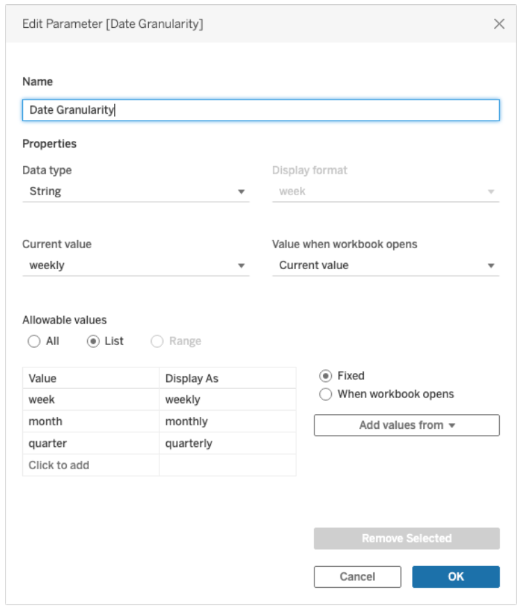
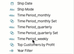
Next, I will create the dimension fields for each of the truncated time periods using the values in the Data Granularity parameter I just created. Below you can see I’m choosing to give each field a unique date format that matches the date granularity tied to it, but you can simply truncate each field by date_part. In total, I’m creating three new dimensions here.
//Time Period_weekly
CASE [Date Granularity]
WHEN ‘week’
THEN DATENAME(‘year’,[Order Date]) + ‘-W’ + DATENAME(‘week’,[Order Date])
END
//Time Period_monthly
CASE [Date Granularity]
WHEN ‘month’
THEN DATENAME(‘year’,[Order Date]) +’-’+
//This IF statement will create leading zeros to make everything line
//up nicely
(IF LEN(STR(DATEPART(‘month’,[Order Date]))) = 1
THEN ‘0’+ STR(DATEPART(‘month’,[Order Date]))
ELSE STR(DATEPART(‘month’,[Order Date]))
END)
END
//Time Period_quarterly
CASE [Date Granularity]
WHEN quarter
THEN DATENAME(‘year’,[Order Date]) + ‘-Q’ + DATENAME(quarter,[Order Date])
END
Create custom sets
After each time period dimension is built, I create a set from each one. I will add the date_part suffix to each set to make it easier to keep track when I build my sheets. These newly created sets will allow filtering our data and control what data will be highlighted when we create our trendline.
Before we create the trendline visual, I need to create one more measure. For this measure, I’m going to use both the Date Granularity parameter and the new Custom Sets for each time period. This new measure will be how we generate the highlighted data point on the trendline chart which will make the visual POP for our stakeholders. In the formula below, you’ll see why I named my date_part dimensions since I want to match up the truncated values in the set with the correct value from the Date Granularity parameter.
//Trend Line Highlight
IF (MAX([Time Period_monthly Set]) and [Date Granularity] = ‘month’)
THEN SUM([Sales])
ELSEIF (MAX([Time Period_quarterly Set]) and [Date Granularity] = ‘quarter’)
THEN SUM([Sales])
ELSEIF (MAX([Time Period_weekly Set]) and [Date Granularity] = ‘week’)
THEN SUM([Sales])
END
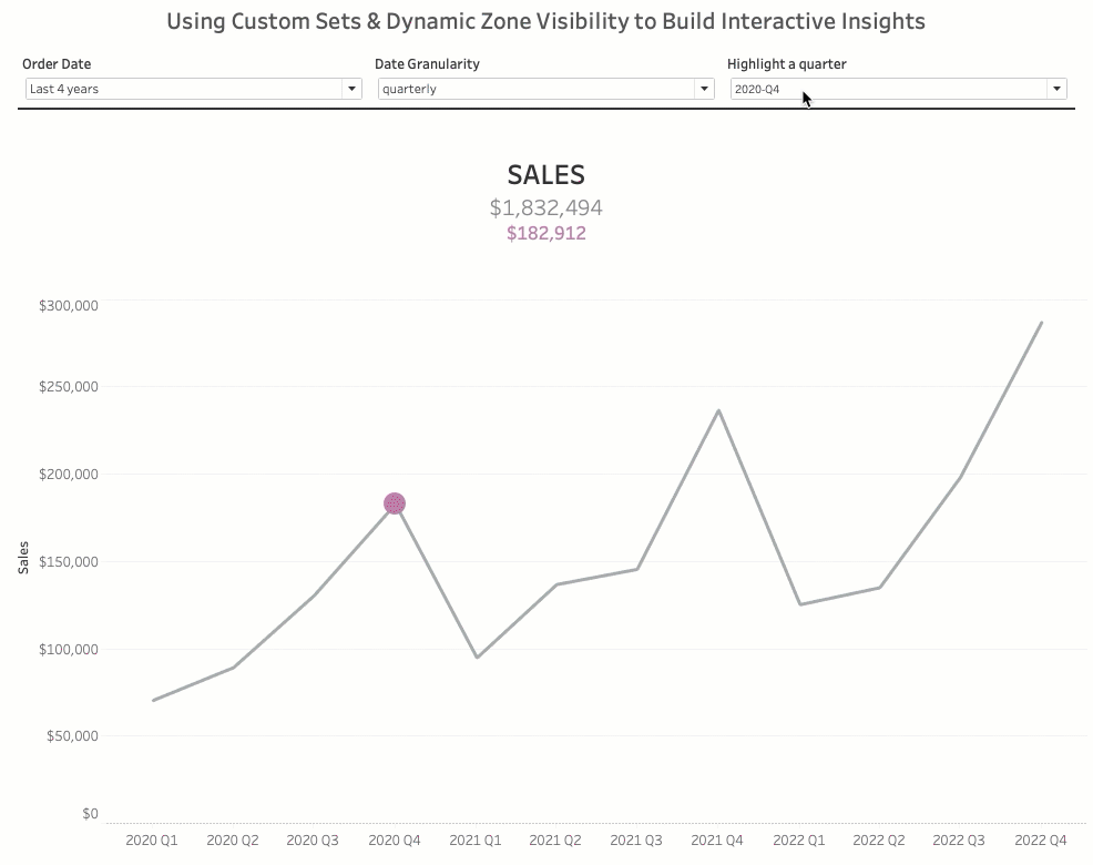
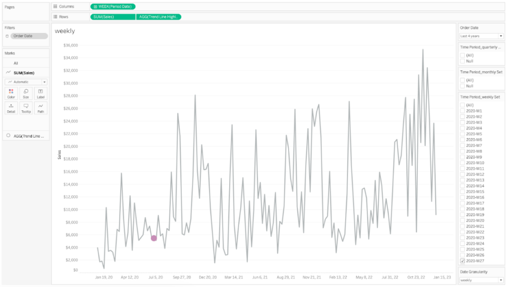
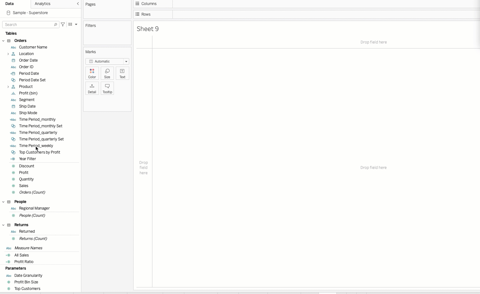
Now that I have my Trendline Highlight measure built, I can create my trendline visualization. First, I will add the Order Date field to my filter card. I’m setting the default to Relative Date Values and setting that to ‘Last 4 Years’ so my users can easily filter to the years they want to include in the view. I’m also adding this filter To Context, and I’ll touch on why shortly. For the visual, I will be creating 3 identical views (a weekly, monthly & quarterly). The only difference will be the date truncation when I drag Date Period to Columns. For my Rows, I am first bringing sum(Sales) and then I’m creating a dual axis with the Trendline Highlight measure. Make sure to synchronize the axis and then hide the header of the right-hand axis label. In the marks card, I’m setting sum(Sales) to Line and my agg(Trendline Highlight) to Circle. Right click the Time Period_weekly set (for the weekly sheet) and select Show Set. Select a value from the set and a circle should appear on that data point in the trendline. Just repeat that process for the ‘monthly’ and ‘quarterly’ sheets making sure to use the Set corresponding to the date truncation on the sheet.
Next, we will create the KPI sheet. On this sheet, we want to display the sum of all sales for the filtered period and we also want to display the sum of sales for the highlighted time period. To do this, we will need to create a couple calculated fields. First, let’s create our ‘All Sales’ measure. We’ll use a table-scope level of detail expression.
//All Sales
{SUM([SALES])}
Remember when we added our Order Date filter to context? This will cause our filter to still apply, but the value won’t be changed when we change the selection in the Set.
Now, to display the sum of sales for the highlighted time period, we need two calculated fields. The first calculation will be a Boolean field that checks which Set we’re using. Depending on the value we have selected in our Date Granularity parameter, we will only be able to interact with one Set at a given time.
//Date Granularity KPI selector
[Time Period_monthly Set]
OR
[Time Period_quarterly Set]
OR
[Time Period_weekly Set]
Once we have this boolean field created, we can move onto our measure field that will display the sum of sales for the selected time period in the Set. We’ll call this field Date Grain Sales so we can easily differentiate it from our ‘All Sales’ measure.
//Date Granularity Sales
IF [Date Grain KPI Flipper] THEN [Sales] END
Now that we have our two new measures created, we can build our KPI sheet. This is a simple view, but when paired with the capabilities of the Sets we created, it will create some powerful insights. We’ll just drag our ‘All Sales’ and ‘Date Grain Sales’ fields on to the Text marks card. In this example I put ‘All Sales’ above ‘Date Grain Sales’ and made the ‘Date Grain Sales’ the same color as my highlighted circle in the Trendline Chart.
We’re ALMOST ready to construct our dashboard. If you remember, 2022.3 brought us dynamic zone visibility, which is a powerful feature allowing us to dynamically control what sheets get shown to the user based on controls we set for them in the dashboard. Boolean calculated fields are the simplest way we can use this functionality. For this example, we want our user to only see the weekly set values and Trendline chart when they select ‘weekly’ from the Date Granularity parameter. This will require three more calculated fields, but don’t worry, they’re all simple. Let’s call these fields weekly, monthly and quarterly. We’ll set the parameter to each respective date_part value as we can see below.
//weekly
[Date Granularity] = ‘week’
//monthly
[Date Granularity] = ‘month’
//quarterly
[Date Granularity] = ‘quarter’
Bring it all together
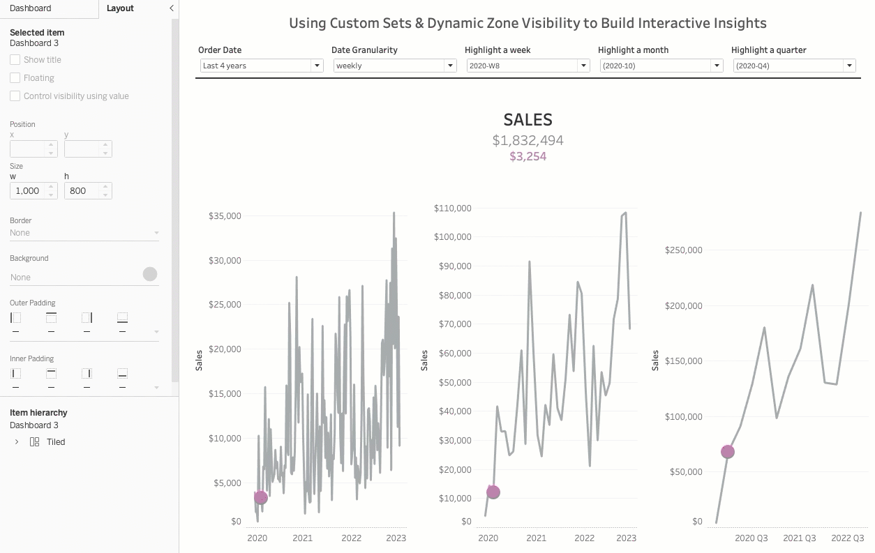
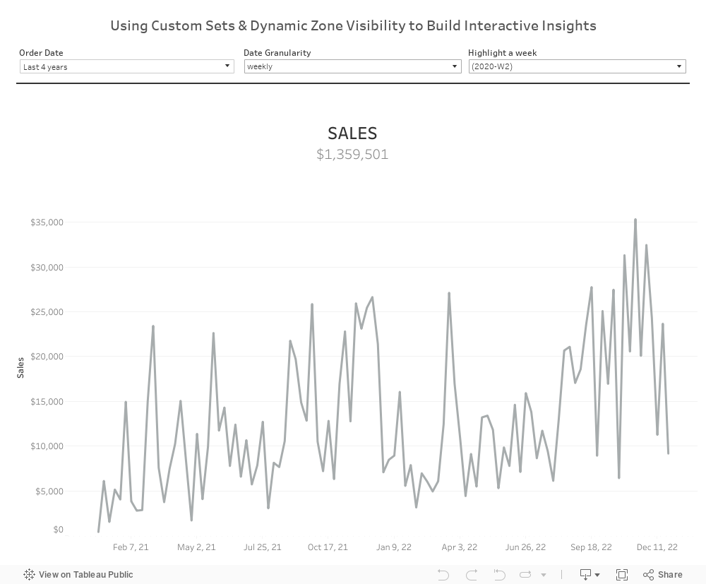
Now it’s time to build our dashboard. We will need two horizontal containers within our vertical container for the dynamic zone visibility to work. To one horizontal container, bring in each of your three Trendline graphs. Make sure to have a value pre-selected for each Set. This will be the default when we change our Date Granularity. We’ll add in our KPI sheet and give it a title of ‘SALES’. Above our KPI sheet, we’ll bring in all our controls including all three of our Time Period Sets. I know it looks cluttered now, but don’t worry, we’ll clean it all up with the magic of Dynamic Zone Visibility.
Setting up Dynamic Zone Visibility
Our last step is applying the dynamic zone visibility to the sheets on the dashboard. Remember when I said to name each sheet and boolean field by its respective date_part? This is why. In the left land control pane, navigate to the Layout tab. Next, let’s select a sheet to activate it in the Layout tab. In the pane, we see a checkbox next to Control visibility using value. We want to check that box then select the value that corresponds with the date_part in the selected sheet. In this case, it’s going to be weekly. We also want to select the Weekly Set in our controls container and do the same thing. We’ll repeat this for the other two sheets and sets by selecting the corresponding boolean field from the dropdown for the other date parts.
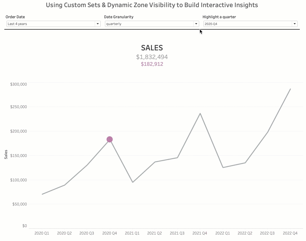
We’ve successfully set up our dynamic zones. The dashboard looks much cleaner and our users can dynamically navigate between these sheets without any sheet swapping or hiccups in the data. Hopefully, you can find some use cases in your own industries to use these two functionalities and create some powerful visualizations for your stakeholders!
Check out the interactive dashboard below
Written By

Brian Davis
Brian Davis, Sr. Analyst, aggregator and visualizer of data draw to insights and solve problems. He specializes in Tableau and SQL and has a passion for helping organizations grow by understanding and utilizing their own data.