Monthly Data Viz Challenge Results in Creative Views of Charting Songs Going Back to 1958
Welcome to #VizJam—a fun monthly event designed for our team to practice and build upon our data analysis, visualization and storytelling skills. It’s also a new way to inspire creative thinking and team-building.
How it Works
Each month, we provide our analysts with a dataset and participants are given a month to do whatever they want with the information. Once their creative dev period is over, we get together as a team to share, discuss and provide feedback on all the unique submissions. #VizJam is an exciting and illuminating chance for our experts to push the limits of their data viz chops and to see how peers find new ways to tell stories with data. Our monthly results-sharing sessions also serve as a workshop and learning opportunity in a collaborative and supportive environment. We find that the feedback is invaluable.
As an intentionally tool-agnostic activity, we encourage participants to use any data viz resource they choose. Conversely, our designers and analysts are challenged to use this opportunity to skill-up in a new or different tool than they normally use on billable work.
Now, when we came up with an event called “VizJam,” it made sense to start with a music-related topic and dataset. So, we decided to see what our team could do with a dataset consisting of every song from throughout the history of Billboard’s Hot 100 chart—going back to 1958! Below, our Data Viz experts share why they created their submissions, the thought process that guided their decisions, and any associated analysis or insights analysis that resulted from the exercise.
Inside the Minds of Our #VizJammers
Liam Huffman
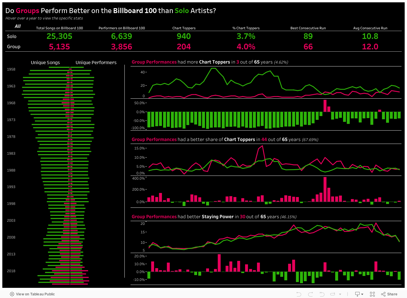
When I first approached the dataset, I wanted to explore the impact of the Ticketmaster lawsuit on Taylor Swift’s position. However, the way the data categorizes artists is not conducive to answering this question. If an artist collaborates with others on the song, the other artists are listed in multiple ways: ‘x’, ‘+’, ‘and’, ‘&’ … the list goes on! While it wouldn’t have been impossible to work through this issue, it certainly was a delay and I already faced a time crunch. This led me to a new question: “How do solo artist-songs versus collaborative songs perform?”
Solo vs Collab proved a much more interesting topic. Otherwise, we would have seen little impact, since “Midnights” was so overwhelmingly popular, for so long. Instead, we found that collaborations demonstrate slightly better staying power on the Top 100—maintaining positions on the chart for 12 weeks on average vs. 10.8 weeks for solo recordings—even though they’re relatively ‘newer’ to the list. Collabs have only recently seen an uptick in total unique songs on the list, significantly taking down solo-songs’ share of the charts during the past three years. (Link to Tableau dashboard)
Alex Gunnerson
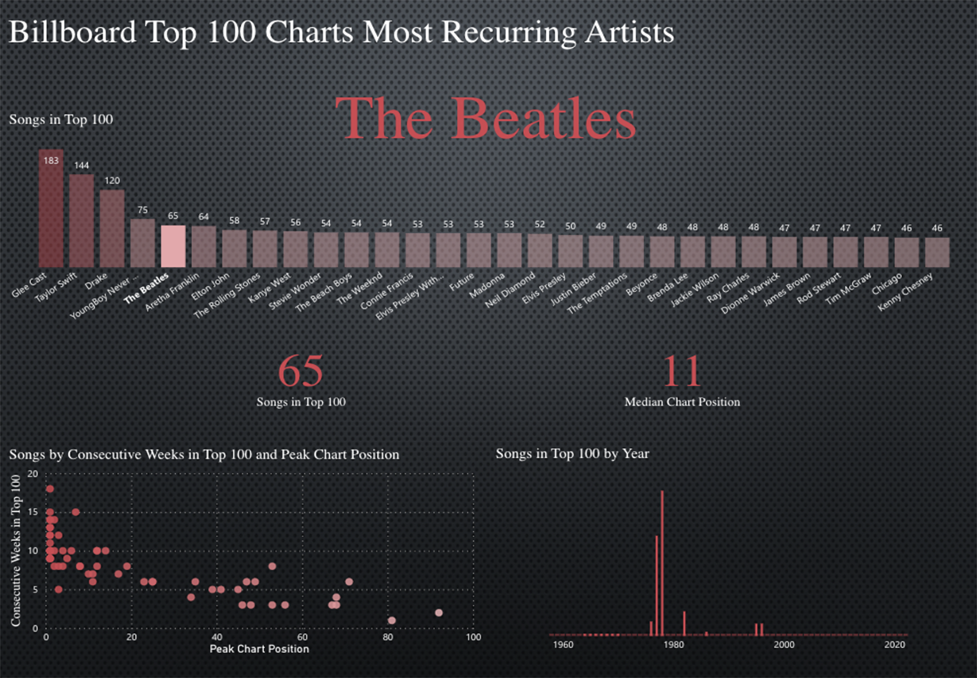
After analyzing the dataset, a few questions came to mind. I wanted to understand which artists had the most number of songs in the all-time top 100. I was also curious about the relationship between a song’s peak chart position and the number of consecutive weeks that a song remained in the top 100. As suspected, there’s a relatively strong correlation between the two metrics. Songs that reached peak chart positions in the top 10 were more likely to remain in the top 100 in consecutive weeks than songs not ranking as high. The top 3 artists, as determined by the number of their tracks reaching top charts, were in a league of their own. Glee, Taylor Swift, and Drake had 183, 144, and 120 tracks in the top 100, respectively. The fourth artist had 75 tracks in the top 100—a considerable 45 song deficit compared to Drake, in third place.
Leah O’Rourke
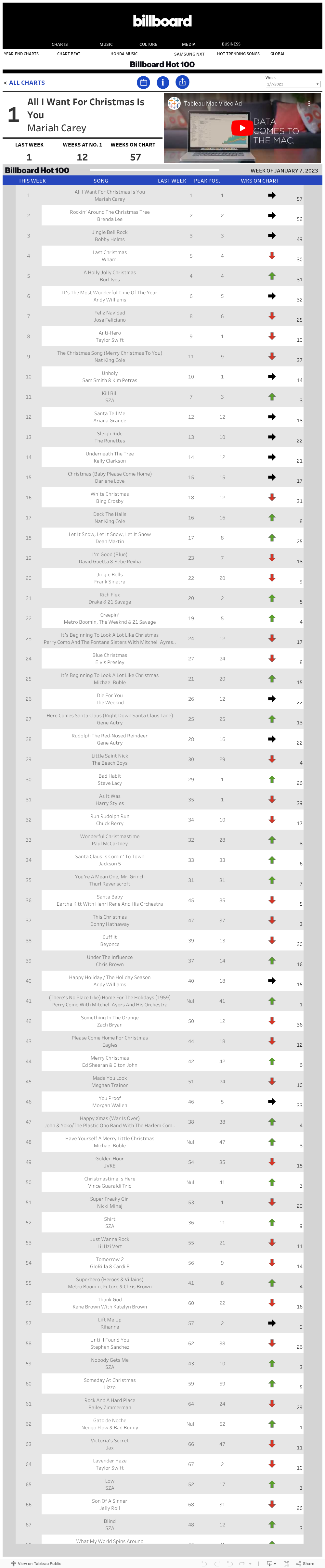
I took a different approach with more of a UI challenge to see if I could re-create the Billboard Hot 100 website in Tableau. From an initial data standpoint, I quickly built out the Hot 100 table using the provided fields. It was also a quick process to create the #1 song card. The hardest part of replicating the list was finding a working URL for the videos that play on the Billboard Hot 100 website—who doesn’t love a Tableau commercial?
The original plan also included building out a calendar selector similar to WoW 2020, Week 39 (Tableau’s weekly WorkoutWednesday technical challenge), but I ran into some challenges. The biggest roadblock was that the Hot 100 chart dates were only Saturdays. This made building out a calendar difficult in a time crunch. I also explored the option of dropdown filters for the user to select a decade, year, or month, and the exact week where each filter was dependent on the previous selection for an improved user experience—instead of scrolling through every week from 1958-2023. Eventually, this broke my dashboard. I ended up just adding the chart date as a filter, but saw that by default it only lists dates in ascending order—8/1/1958 at the top and 1/7/2023 at the bottom. Fortunately, I remembered a handy Tableau tip: changing the default sort order to descending, so when a user selects the filter, the most recent date is on top.
Overall, I was impressed with how close I got the dashboard to resemble the Billboard Hot 100 website. And after seeing Liam, Alex, and Sean’s presentations I have a few more ideas about where I’d like to expand the dashboard. It would be awesome if in the future you could click a song and view an animation of the song’s journey – from their debut date to their most recent chart date. (Link to Tableau dashboard)
Sean Miller
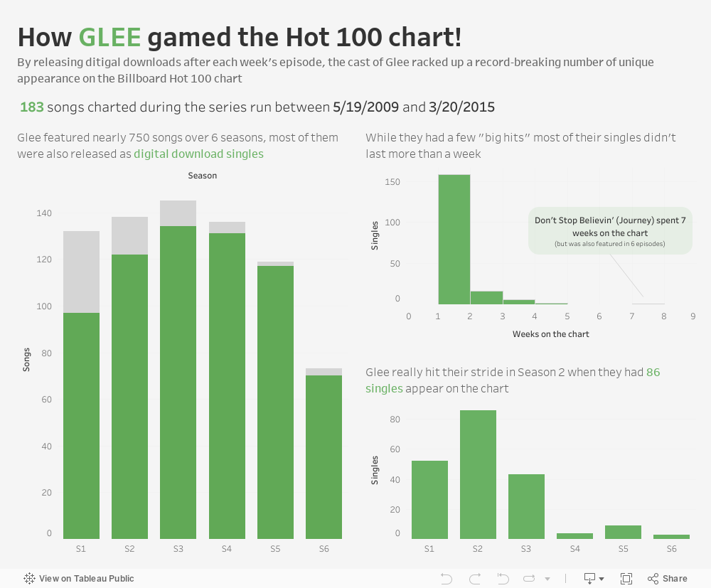
When I began exploring this dataset, I first noticed multiple stories and analyses to investigate further. However, like others who first approached the dataset, I discovered row counts by different dimensions, and quickly found that the Glee Cast currently hold the record for the most unique songs to appear on the chart with 183 songs. Now this is fascinating to me because it highlights a specific point in time in pop culture—one that we’ll likely never see again. Besides all the television revenue generated by the show, they diversified their revenue streams by releasing [nearly] every song in an episode as a digital download available to fans. According to Statista, Glee’s run (2009-15) was at the height of the music industry’s digital download era.
So, I created a dashboard highlighting how songs performed on the chart and how many total songs were digital download single releases.
As with many analyses like this, I was left asking additional questions that I wish I had more time to explore. One of those is that since Glee mostly performed cover songs it would be interesting to see how well the original versions of the songs performed in the charts when first released. You can see a steep drop off in charting songs in the lower right bar chart. Was this caused by audience burnout? Did Billboard change the formula for reporting streamed songs around that time? But that’s the life of a data analyst right? So many questions, so little time… (Link to Tableau dashboard)
Join Our Next VizJam!
If you want to get involved in the next #VizJam, in February, we’ll analyze NYC Rat Sightings via the NYC 311 database! All you need to do is create an analysis or dashboard and share it on social media. Tag @Evolytics and use the hashtag #VizJam to be sure we see it! Again, this is a tool-agnostic project, so use whatever tool you’re comfortable with or try something new. Just have fun and stretch your creative data viz skillset!
Written By

Sean Miller
Sean is Associate Director of Data Visualization and a Tableau user since 2015. His enthusiasm for data viz extends beyond his work at Evolytics, as he leads and participates in various global Tableau community initiatives. He is frequently recognized for his data viz contributions and earned the title of Tableau Visionary & Ambassador.