As the presidential election nears, we are seemingly overwhelmed with data about the candidates. In this post, I take a look at different ways polling results are visualized from various news outlets, analyzing them from a data visualization and accuracy perspective. I’ll highlight a few key items to look for in a polling visualization to help you understand the data, such as:
- How is the data graphically represented?
- What can we tell about the underlying data?
- What are the pros and cons of the visualization?
Viz #1: Biden’s Edge in Battleground States
First up is a visualization from CNBC.com – in an article about how the national political party conventions affected each candidate’s polling numbers in swing states.

How the data is graphically represented
This journalist chose a bar chart to represent the sentiment of likely voters towards the candidates in six states, also including the overall figures.
What we can tell about the underlying data
We see in the footnote of the chart that the source is a poll of 4,143 likely voters from six states taken between September 4 and September 6.
Pros
- The chart clearly cites exact dates, number of people, locations, and voter types.
- The chart is pretty straightforward and simple.
- There are no glaring data viz taboos.
Cons
- The article is about change, but the chart simply shows the results of the most recent polling.
- There is a large amount of data in the text that could be incorporated directly into the visualization to make it more meaningful.
- The count for each state is not provided, and the calculation of the ‘All Six States’ figure is not cited. Is it the average of each state or the aggregate of the total count?
- The repetitive numbers diminish the value of the bar chart. A highlight table would be easier to discern the differences between candidates.
- The colors and spacing are a little harsh on the eyes. Spacing each state out would make the chart more readable.
Viz #2: Positives for Trump Rise post-RNC, with Modest Partisan Increases
Next up is a chart on CNN.com analyzing a similar topic, the sentiment of Republicans and Democrats toward the two Presidential candidates after each of the individual conventions.

How the data is graphically represented
This journalist used a slope chart to show the pre-convention to post-convention change in sentiment towards the candidates, segmented by the respondent party.
What we can tell about the underlying data
The poll was conducted from a random sample of 1,000 adults from across the country. The methodology cites leveraging the Lexicoder Sentiment Dictionary to assign positive or negative scores to words that the respondents used when describing each candidate.
Pros
- The chart looks very clean and is easy on the eyes.
- The slope chart is an appropriate choice for showing change between two points.
- The methodology and source is stated directly below the chart.
Cons
- Units are not labeled, and the axes are confusing.
- It would help to see beginning and ending values labeled instead of just the delta.
- How many respondents were surveyed from each party? If the sample size is not evenly distributed, then the chart may be misleading.
- There is no representation of sentiment prior to the DNC convention to use as a baseline for convention messaging impact.
Viz #3: How (un)Popular is Donald Trump?
The third chart we review comes from fivethirtyeight.com, one of my personal favorite websites for data visualization and analysis. This chart is a continuously updated web page that chronicles the president’s approval rating leading up to the election.
How the data is graphically represented
This page uses a scatter/trend chart and table combination to display the president’s approval rating over time. The trend chart shows the aggregate approval rating throughout the year, while also displaying the individual poll results. The table provides detailed information around each included poll.
What we can tell about the underlying data
Each contributing poll is directly cited in the table, along with a link to download the data directly from the polling website. Clicking on the ‘How this works >>’ link gives you an in-depth explanation about how their model is created and the different factors included. This is the gold standard in terms of data transparency.
Pros
- Labeling is very clear, and the charts are color-blind friendly.
- Both the individual polls and aggregate are visualized.
- It’s interactive! You can hover on the trend chart and see the aggregate at that point.
- ‘How this works >>’ link is a whole other article providing additional context.
- The table provides a detailed view and also incorporates visuals.
- Data is downloadable at poll and aggregate levels.
Cons
- You can’t directly select an individual poll in the line chart (but you can in the table below).
Viz #4: Choice for President if Voting Today
The fourth visualization we review comes from foxnews.com in an article titled “Voters pick Biden, yet more think their neighbors back Trump.”

How the data is graphically represented
The journalist chose to use tables throughout the article to represent polling results. This seems to be a standard practice at Fox News. In fact, it was all I could find when I googled “Fox News polling results.” The table represents the respondent’s choice for president at different points throughout the year.
What we can tell about the underlying data
The table cites the date range of the most recent poll, along with the audience type (registered voters) and the margin of error. Also, just below the article it states that the responses came before and after the announcement of Kamala Harris as Biden’s running mate.
Pros
- The title is very clear.
- The colors make the chart easy to read.
- The dates, voter type, and margin of error are presented.
Cons
- It’s a table. Tables don’t leverage the power of the human eye to recognize color, size, and shape.
- No survey location, sample size, methodology or sample size clearly stated.
- The “Now” label does not age well without reading the footnote.
- The survey was conducted before and after Biden’s running mate announcement, which possibly introduces bias into the responses.
Viz #5: 2020 Presidential Election Polls
The fifth chart under review comes from the website 270towin.com. It is another web page with a collection of charts displaying polling results.
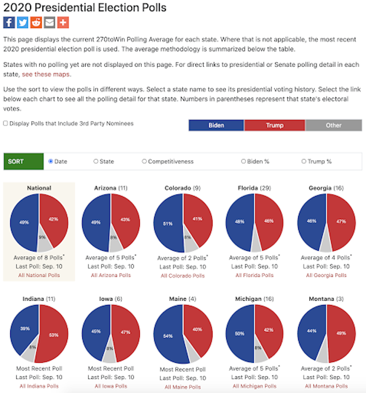
How the data is graphically represented
This page uses small(ish) multiple pie charts to show aggregate polling results by state, including a chart for national results. Similar to fivethirtyeight, links to the individual polls are provided. There are also different sorting options and links to historical voting results for each state.
What we can tell about the underlying data
The provided links to the individual polls provide great context regarding how the polls were conducted, including source, date, sample size, audience type, and margin of error.
Pros
- Links to exact polls are provided.
- Sortable by date, state, competitiveness, and candidate.
- Both national and state polls are visualized.
- Lots of interactivity.
- Lots of data presented.
Cons
- The pie charts make it difficult to easily compare state to state… would prefer the distributed bar charts that are shown on state history pages.
- Lots of data presented — information overload with the pie charts shown in small(ish) multiple fashion.
- The colors are very intense. Turning down the opacity or saturation would make it easier on the eyes.
Viz #6: Chance of Winning Each State
The last visualization we analyze comes from The Economist. This is website also sets the bar high for data visualization and analysis standards. This chart is a map from their 2020 forecast page, which is continuously updated based on the latest polling results. The page has numerous graphics and are all worth inspecting.


How the data is graphically represented
The authors created a map and distributed bar chart to display the win probability of each candidate by state. The map uses mark size to visualize the state’s electoral votes, while also leveraging color to indicate the win probability percentage. The bar chart below uses the same mark and color encoding, while also sorting by percentage and highlighting the competitive states.
What we can tell about the underlying data
Sources and links to download the source code, model output and individual polling data are provided at the bottom of the page. Similar to fivethirtyeight.com, the source data and methodology are extremely transparent and they even invite you to take a look at the underlying data yourself.
Pros
- Clear labeling, legend, and descriptive subtitle explain a little about the model.
- Extremely interactive – as you hover over a state in either the map or the bar, it highlights and displays a tooltip with more contextual info.
- Clean looking – great use of white space, organization, and colors.
- Easy access to underlying data.
- Map + bar chart combination is very effective at telling the story.
Cons
- Visually, none. The model explanation isn’t quite as deep as fivethirtyeight, but the provided data sets are very robust.
What to look for
A quality polling visualization is easy on the eyes, uses the appropriate chart type, is clearly labeled, and plainly cites the survey details. If the chart looks overwhelming or confusing, then the colors and design may be lacking. If you have trouble interpreting the data or figuring out how the survey was conducted, then you may be misled by the visualization. Each of these charts had pros and cons, but the pages from fivethirtyeight.com and The Economist stand out as superb examples of polling visualization. In the ‘How this works >>’ page from fivethirtyeight, they even delve into the difference between respondent types (Adults vs Likely Voters vs Registered Voters) and how each affects the validity of the survey.
An effective data visualization should be easy to digest with a clear story, comparison context, and sourced data. If your news provider does not consistently meet those benchmarks, it may be a misleading chart. Always check other sources for validation.
Data-Informed Voter Series
The Data-Informed Voter Series is a 2020 passion project for a team of Evolytics analysts. We aim to be as politically neutral as possible while discussing the data, implications, and interpretations we see in the news. We discuss topics as a pseudo-editorial board with the aim of informing voters on how a professional analyst would interpret data during an election cycle. This project team consists of John Carney, Jay Farias, Liam Huffman, Brian Johnson, Anoush Kabalyan, Laura Sutter, and Krissy Tripp.
Related Data Stories Blog Posts
Data stories from the experts.

Measuring Success in A/B/n Testing Programs
The Whole is Greater than the Sum of its Parts The results of your latest A/B/n test are in-hand, they’re…
 Increasing revenue seems relatively easy in a growing economy and roaring stock market. Amid ideal market conditions, consumers and businesses…

Written By

Jay Farias
Data Visualization Manager Jay Farias is a technology enthusiast who specializes in Tableau. He has years of experience implementing innovative technology solutions in the construction and healthcare industries. He supports Data Visualization strategy and implementation for Kantar Health and Intuit.