Post 1 of 2: Using the Page Summary Panel
Adobe Analytics recently introduced two new panel types to Workspace, which provide quick and convenient insights. In this blog post, we’ll explore the Page Summary panel, then discuss the Next/Previous Item panel in a future post.
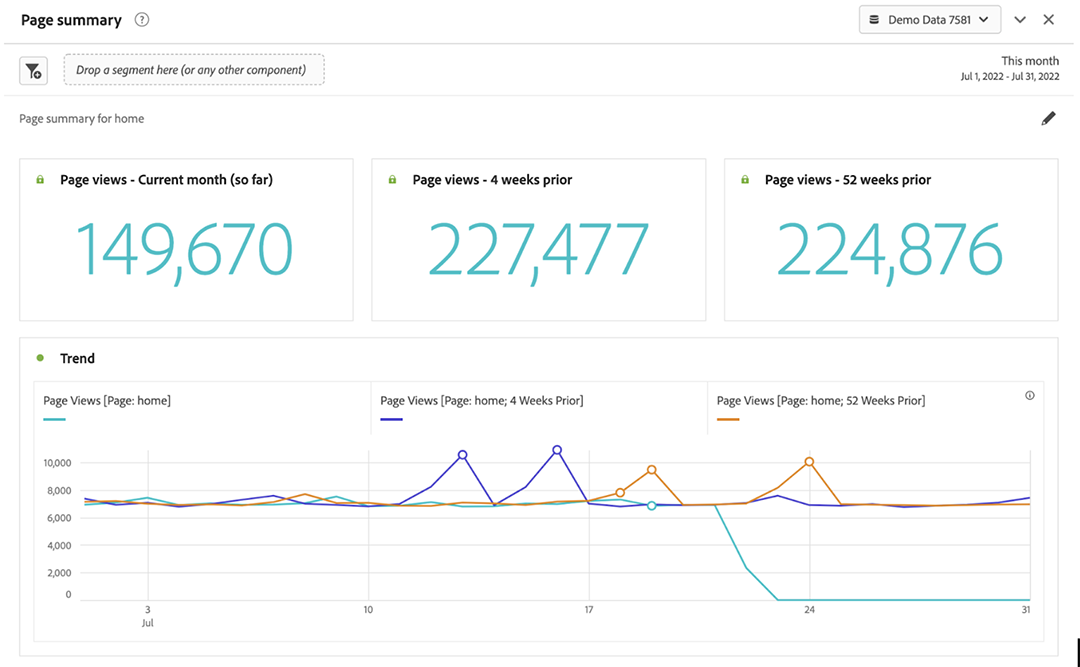
The Page Summary panel in Adobe Analytics Workspace is a new feature introduced in spring 2022 which improves visibility into a variety of valuable, high-level metrics. When first adding this panel to your workspace, the configuration window defaults to the most popular page in the report suite, though any page can be selected.
The panel reflects page view data for a selected date range, and comparison metrics are automatically provided for the previous month and year. The view also includes a line graph for interpreting key data insights, identifying trends. Additionally, potential anomalies are shown and easily analyzed by clicking the anomaly marker. In default mode, page views are shown by day, but you can adjust granular depth for other time frequencies, such as hourly, weekly, or monthly.
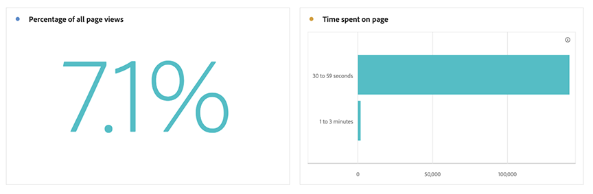
Next, it shows what percentage of all page views were of the selected page. Also included is a histogram of the time visitors spent on that page.
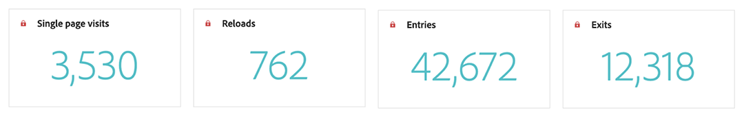
A variety of other metrics are available in the Page Summary panel which offer even greater insight. The Single Page Visits metric reflects how often the selected page was the only page viewed. Reloads, Entries, and Exits can also improve understanding of visitor behavior.
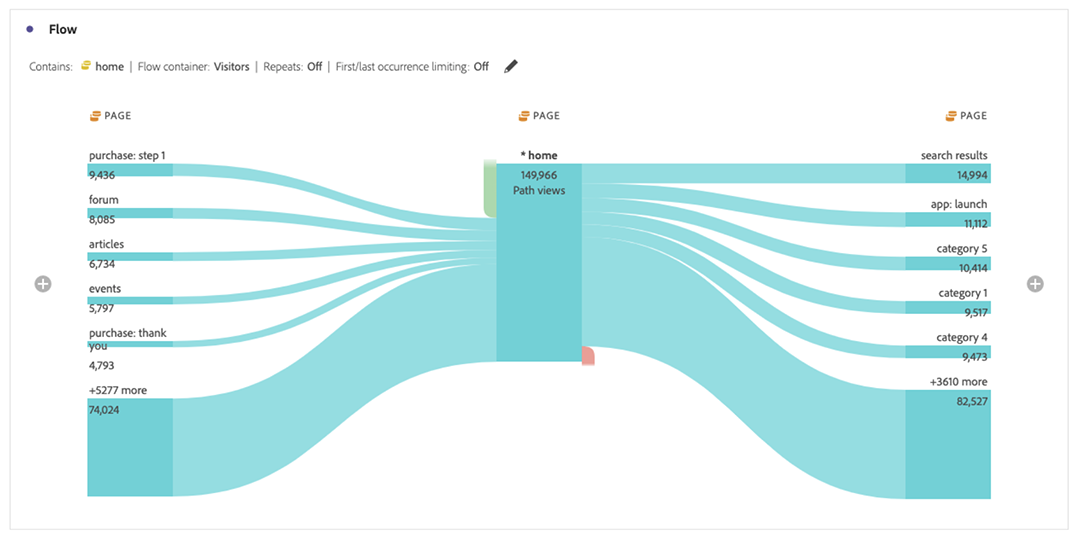
Finally, a Flow is shown with the selected page in the center. You can select any of the previous or next pages for an even deeper view into the visitor journey. You can also add additional levels by clicking the plus sign at either end of the flow.
This new option provides default text that is easily modified, as needed. Although this new panel makes it easy to view a range of significant metrics, you can easily customize each visualization. The underlying data is displayed by selecting the colored dot, or by toggling the lock in the upper-left corner. You can also apply various other segments and dimensions to the panel as desired.
Once the panel is configured to meet your needs, you can either schedule to regularly send the insights to stakeholders or provide a link directly to the panel.
The Page Summary Panel in Adobe Analytics Workspace allows you to visualize quickly and easily some of the key metrics for any page in your report suite. The comparison to prior periods gives great insight into changes in traffic flow at a glance. The combination of a variety of data and visualization types provide robust insights on the fly.
Stay tuned for the second post in this series, where we’ll show how to get the most out of the Next/Previous Item panel. It allows greater insights into how visitors move across various dimensions such as pages, site sections, or marketing channels. And, as always if your team requires any support or training in Adobe Analytics, we’ve got experts who will partner with you on optimizing all aspects of your analytics initiative.
Written By

Josh Stephens
Digital Analyst I Josh Stephens digests, analyzes, and simplifies data to bring clear, actionable information and insights to clients. He offers a lifelong passion for data-supported solutions and a strong business foundation including an MBA. Josh brings experience using multiple analytical tools and methods in various industries as varied as customer service, insurance, finance, and manufacturing.