Adobe Workspace Training Series
One of the great things about using Adobe Analytics Workspace is its simplicity and the many visualization options available for building reports with your data. Workspace automatically uses default visualization settings to do much of the formatting for you. But, did you know it’s also possible to transform these simple reports into well-designed, dynamic storytelling tools by leveraging some lesser-known custom Workspace preferences?
The following custom view settings will take your visualizations created in Workspace to the next level and provide an improved experience for your audience.
Tip 1: View Density
Adobe Analytics Workspace currently lets you view up to 400 rows of data in a single table. However, it can be difficult to view the whole table when working with a large number of rows.
One way to ensure that your audience can see more data in a cleaner, compact view is to change the spacing/padding around the rows. The main caveat to using this setting is that the option you select will apply to everything in the entire workspace.
Project Menu > Project Info & Settings > View Density
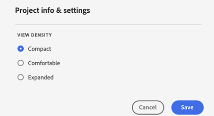
(Default is Expanded; change to Comfortable or Compact option for tighter views)
This will change every view in the entire workspace to affect the following components:
- Left rail
- Freeform tables
- Cohort tables
Let’s take a look at examples of how different settings affect views in Adobe Analytics Workspace.
Left Rail Difference:
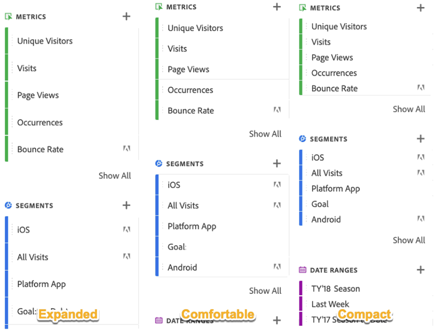
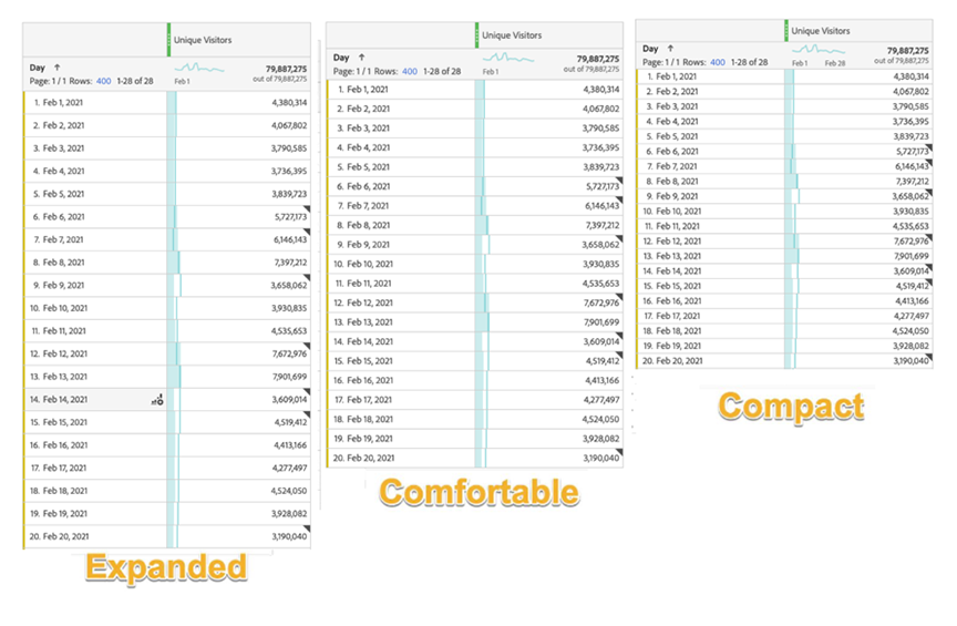
Each individual row takes up much less space vertically, allowing audiences to see more data in a single view. This is especially useful in making long, detailed workspaces feel more consumable.
Tip 2: Conditional Formatting
Conditional Formatting, found in table settings, is a feature used for highlighting high and low data points. Table settings are found by clicking the gear icon in the upper-right section of your data table.
A Column Setting window will appear, allowing you to toggle on and off certain display settings. The conditional formatting option is activated by checking the Background option and then selecting Conditional Formatting.
When using the Auto-Generated option, Adobe Analytics will independently apply standard color settings for each column. It’s also possible to choose custom high, midpoint, and low options to highlight specified criteria or certain thresholds.
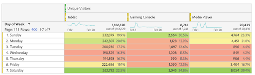
Here’s an example of auto-generated conditional formatting.
You can customize the Upper Limit, Midpoint, and Lower Limit for better control of the highlight appearance. This option works well with data outliers skewing the color scheme, or if you want to manually set thresholds for goals, targets, or anomalies.
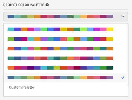
Tip 3: Color Palette
Another way to customize your workspace for reporting needs, brand, or product scope, is to customize the color palette.
Access color palette settings by choosing the Project Info and Settings option in the Project menu. Here, you will see the current palette setting, and by clicking on the drop-down carrot, other preset options are shown.

A variety of preset color palettes are available to customize visualizations:
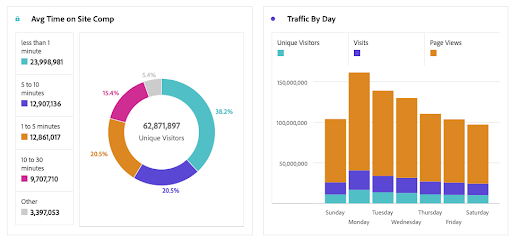
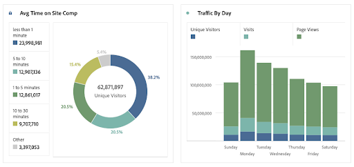
Here are two examples that demonstrate the impact an updated color palette can have on your visualizations. Knowing your audience and the visual story you want to tell can be enhanced greatly with color representation.
You can also use a customized palette by entering comma-delimited hex values in this menu—a great option for branding and standardized reporting protocol across a business or matching a specific color palette for a presentation.
Tip 4: Clean up the Clutter
When creating a freeform table, Workspace defaults to summing the totals of every row, showing a percent of that total, and bar graphs in the visualization. If the rows in your table are not mutually exclusive, these totals and percentages are inaccurate and can be confusing to your audience.
In this example, notice that the 3-month date range and the last month date range are also included in the 12-month range, yet the default total combines all three rows as independent groups. Further, the percentages shown reflect a calculation based on the erroneous grand total.
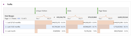
Mouse over the row header section and a gear symbol will appear. Click on the gear to display the Row settings. By default, “Show Sum Of Current Rows” is selected. Change this selection to “Show Grand Total.”
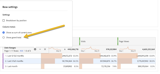
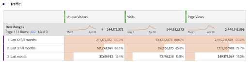
Now, the grand totals are correct, and the percentages reflect an accurate portion of the whole.
Now, ask yourself “Are the totals or the percentages or graph necessary, or does the additional clutter make the table more difficult to understand? Would hiding these additional elements make the table easier to read?”
Let’s try it. Select the column header you’d like to edit and click on the gear shift. Next, select shift and multiple column headers simultaneously. This brings up the Column Settings menu.
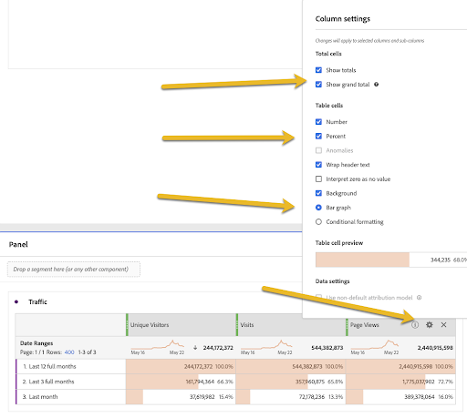
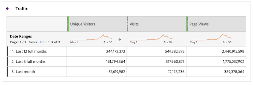
Sometimes simplified visualizations help make communicating the data more meaningful for your stakeholders.
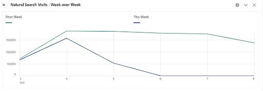
Tip 5: Edit Labels in Data Visualizations
Adobe Workspace allows you to layer metrics and stack multiple segments. When visualizing this data, the key might become overly detailed and difficult to easily read.
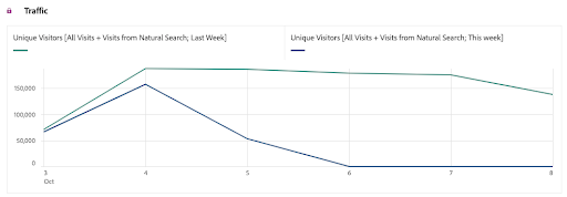
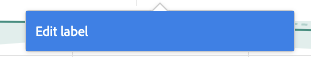
Right-click on the key description and select “Edit Label,” and type in a condensed version of the key to simplify the name and clarify the label.
Now Try Optimizing Your Own Adobe Workspaces!
Use these tips and tricks to clean up your Adobe Workspace and enhance the viewing experience. You’ll be surprised how a few simple tweaks can improve your data storytelling. All stakeholders will appreciate the added clarity and perhaps gain a deeper understanding of the value your reporting provides.
Written By

Laura Sutter
Laura Sutter, of the Strategy & Analysis team, has more than 20 years of experience in the Marketing and Analytics space. She specializes in helping marketers make the most of their digital data and has contributed to the digital success of Intuit Quickbooks, Mint, and Turbo. A social media enthusiast and DIYer, Laura enjoys the mashup of the creative and analytical.