Every digital analyst has encountered a situation where a client says “I would like to see a report about [Topic] delivered to my inbox every [Frequency] and updated automatically.” There are multiple ways of fulfilling this request, but which is the best? You know there’s no easy answer to that question, right?
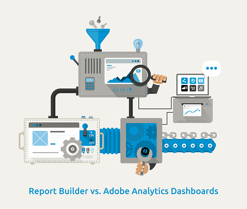
Clients often request views of their data that allow them to quickly understand conversion rates and overall performance for various customer experience flows. In this post, we will examine how to approach such a request using Adobe Analytics built-in and Report Builder, and ultimately recommending one over the other.
Setting up a fallout report in Adobe Analytics would be a great start to fulfill the aforementioned client request. We can easily demonstrate how customers move through a purchase funnel and ultimately convert, especially with the ability to apply predefined segments to the report. As the numbers are likely meaningless without context, we can create additional reports with the same flow, through different time periods, to show performance comparisons. Once the reports are complete, we can place them in a dashboard, have the dates updated as needed, and setup for automatic email delivery. The client will be happy, right? Well, somewhat. A good report is achieved when the client needs to do as little as possible on their end to get the information they need.
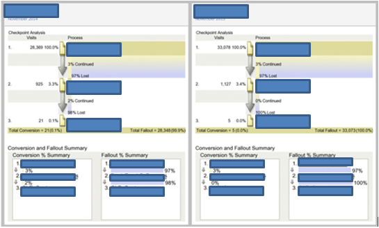
Clients often request some sort of barometer (e.g., index, percentage, point system, etc.) for how a set of data compares to another set of data. In the dashboard above, I can see that in November 2014, 2% of people continued from Page 2 to Page 3, and 0% continued the year before; thus, a two percentage point improvement vs. the prior year. While that might be some pretty simple math on the surface, (1) not all comparisons will be simple and (2) regardless of simplicity, Adobe Analytics will not be displaying the comparisons, so there is no visual reference as to how thing “1” compares to thing “2.”
In the interest of having the client do as little work as possible, I would recommend using Report Builder in Excel to provide a better analysis of something like the above. There would definitely be more work involved in regards to creating segments to produce a conversion report akin to the above, but, in the end, we can produce a dashboard like this:
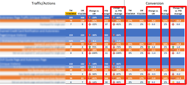
While it would require backend calculations not shown here, as the above demonstrates, now we can visualize the change over time for the client. With some Excel magic, we are still able to completely automate this report, so with the click of a “Refresh” button, the client will be able to see the latest timeframe’s data compared to previous timeframes; thereby, leaving the client (hopefully) overjoyed.
Adobe Analytics dashboards are great for a high level overview of data, and there are many instances where their use would be recommended over Excel. When your report demands calculations to compare differences, however, using Report Builder within Excel would probably be the way to go.
If you need additional help, contact us.
Written By

Evolytics
This post is curated content from the Evolytics staff, bringing you the most interesting news in data and analysis from around the web. The Evolytics staff has proven experience and expertise in analytics strategy, tagging implementation, data engineering, and data visualization.