Dual-axis combination charts, or Combo Charts, are an effective chart type for showing related information while saving real estate by combining views.
This chart type is created with one shared axis, such as an X-axis for date, and two separate axes, such as Y-axes for two different measures.
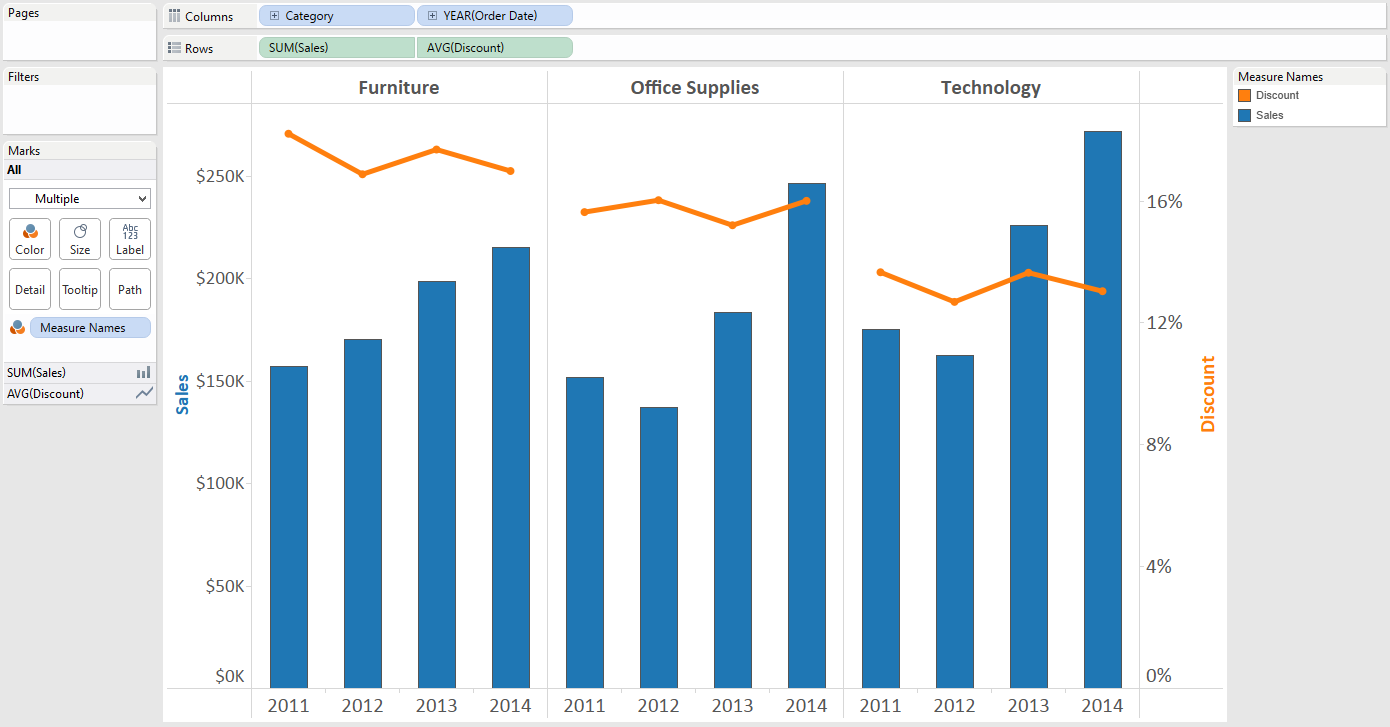
This post will show you how to make a dual-axis combo chart in Tableau which looks at Sales and Discount by Year and Product Category.
How to Make a Dual-Axis Combo Chart in Tableau
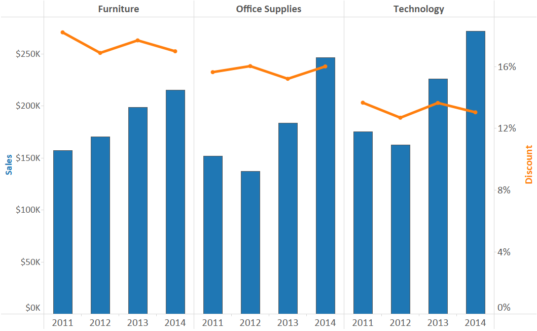
Before we begin, let’s take a look at how our final product will look:
If you would like to follow along, we are using the Sample – Superstore data set that comes with every download of Tableau.
Step 1 – Make a graph for one of the measures
The first step is to make a graph for one of your measures.
It doesn’t matter too much which of your two measures you begin with, so let’s make a line graph for Sales by year.
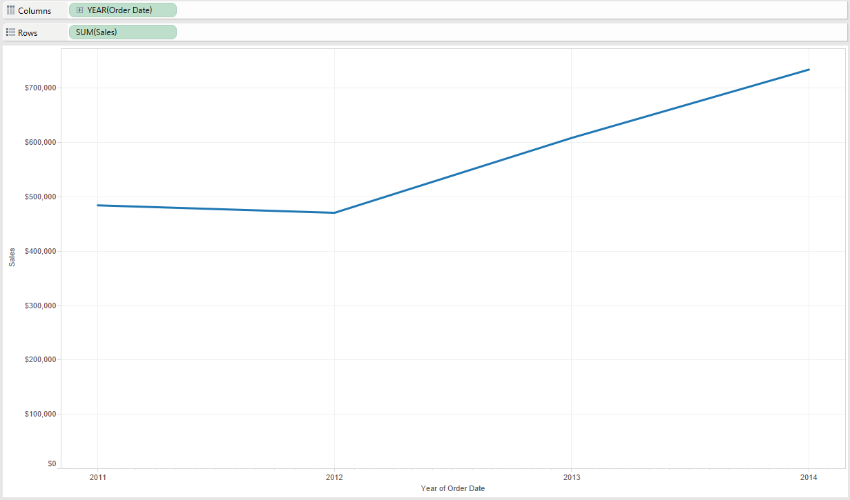
To create the first graph, drag the Order Date field to Columns Shelf with an aggregation of Year Continuous.
Then drag the Sales field to the Rows Shelf.
At this point, the view looks like this:
Step 2 – Drag the second measure onto the opposite axis
In order to create a dual-axis chart, you will drag the second measure onto the opposite axis from your first measure.
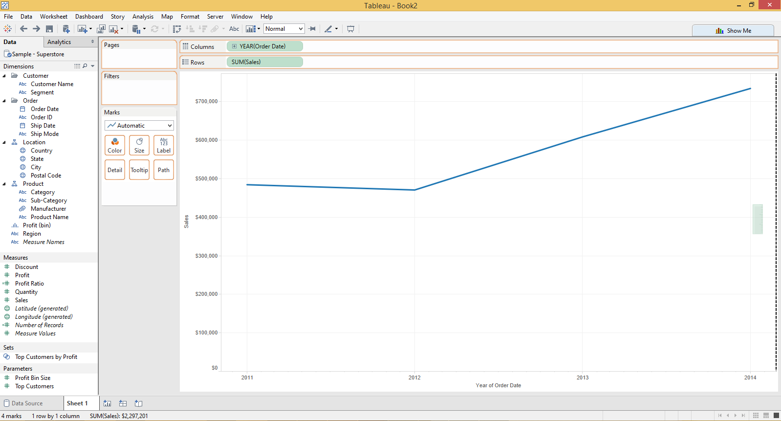
In our case, Sales is on the left Y-Axis. We want to add the Discount measure to the view, so we will drag it to the right Y-Axis.
As we get close to the opposite axis, Tableau is giving me a hint of where we can drop the measure as indicated by a dashed line:
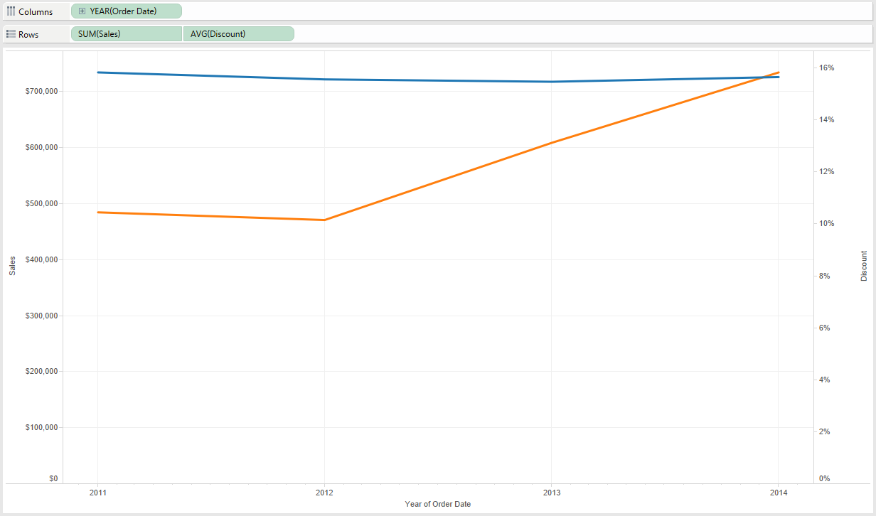
Once we drop the field on the opposite axis, Tableau generates a dual-axis chart.
Note that this is a dual-axis chart at this point, but not a dual-axis combination chart. The name combination chart comes from using a combination of mark types, and so far, we only have one mark type (line).
Step 3 – Create a dual-axis combination chart by changing one of the mark types
When the second measure was dropped onto the view, not only did the field appear on the rows shelf, but a new marks shelf was generated. The marks for each measure can now be edited independently of each other, allowing you to display a combination of mark types on your view.
Let’s change the mark type of the Sales field to bar and leave the mark type for Discount as line.
This is accomplished by clicking on the Marks Shelf for SUM(Sales) and changing the mark type from Automatic to Bar.
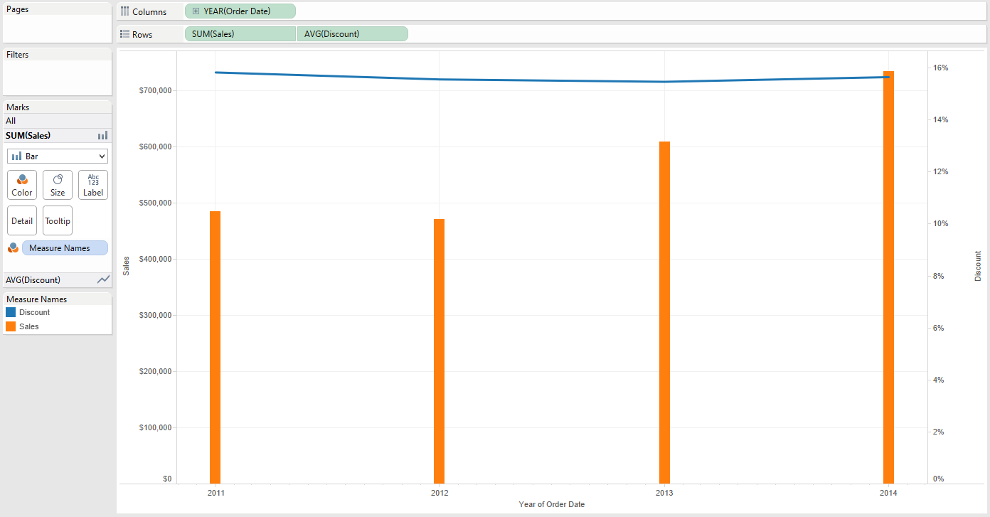
At this point, the view looks like this:
Some Additional Thoughts
- We decided to make the first graph, Sales by continuous Year, because it was meant to be a continuous (i.e. chronological) trend over time.
- Many people ask why the bars are so skinny when Year is continuous. You can get a better look by changing the Year field from continuous to discrete by right-clicking on the field on the Columns Shelf and choosing “Discrete”.
- The catch with discrete date dimensions is that the dates can now be sorted out of chronological order.
- If you decide to make this change for formatting purposes, be careful not to sort the view in an unintended way.
- A mark type of line should only be used when connecting dots between continuous dates. This is because a line implies that there is a chronological relationship between points.
- This works well for our example, where discount is being connected by years in chronological order.
- However, dual-axis combination charts do not necessarily need to use a date as the shared axis, so choose your mark types wisely.
- You can create small multiples, or comparison views, by dragging another dimension onto the Rows Shelf or Columns Shelf.
Here is our final view after changing Year to Discrete, adding the Category dimension to the Columns Shelf, and cleaning up the formatting:
