Tableau always puts on a great customer conference and this year at the Gaylord National Resort in Washington, D.C. was certainly no exception. My second trip to the Tableau Customer Conference was highlighted by two session presentations, an interview with SiliconANGLE, and winning the Third Annual Iron Viz Championship.
I wanted to share some of my session material for those that weren’t able to attend or simply want to relive the data fun from my home away from home during the conference, room Woodrow Wilson A.
Monday Morning
First thing Monday morning, I had the pleasure of presenting some of my favorite Tableau Public work with some of my personal data visualization heroes including Ben Jones, Anya A’Hearn, Kelly Martin, and Ramon Martinez.
Each presenter has their own distinct style, but I was tasked with presenting my work from a design perspective. The first piece I shared was my winning entry in the Elite 8 Viz Makeover contest hosted earlier this year. The objective of the contest was to take a visualization that contestants designed prior to the competition, then make them over using the new capabilities in Tableau version 8.
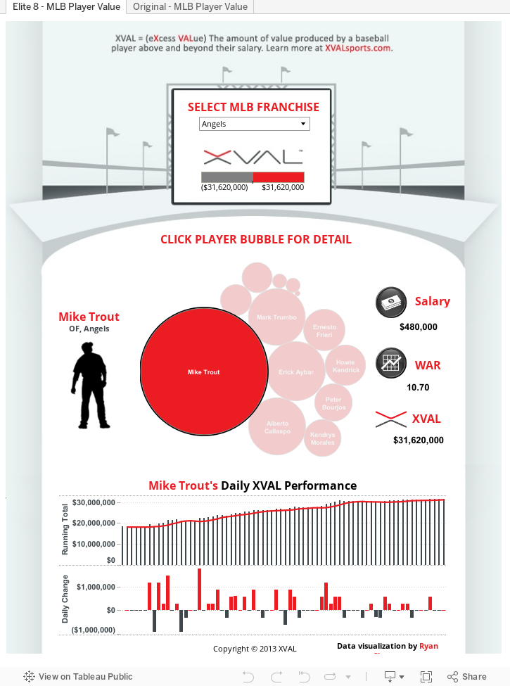
Tableau 8 unlocks an entire new level of design possibilities through the use of free-form dashboard design and floating widgets. This allows a designer to create a custom background image and then float dashboard widgets over the background image exactly where they want them. I also recommended using a limited color palette and following the rule that “less is more.” When I first started using Tableau, I was so impressed with some of the outputs that I wanted to make everything in my designs overly large. I have come to realize that smaller dashboard components equate with a cleaner and more professional design. Since then, I don’t think I’ve ever regretted erring on the side of smaller. My next design was a visualization I created for Jackie Robinson Day back in April. My goal going into this design was two-fold: 1. Create something that was able to stand on its own as an infographic and 2. Improve my time on site by building in interactive components that would make my visualization more “sticky”.
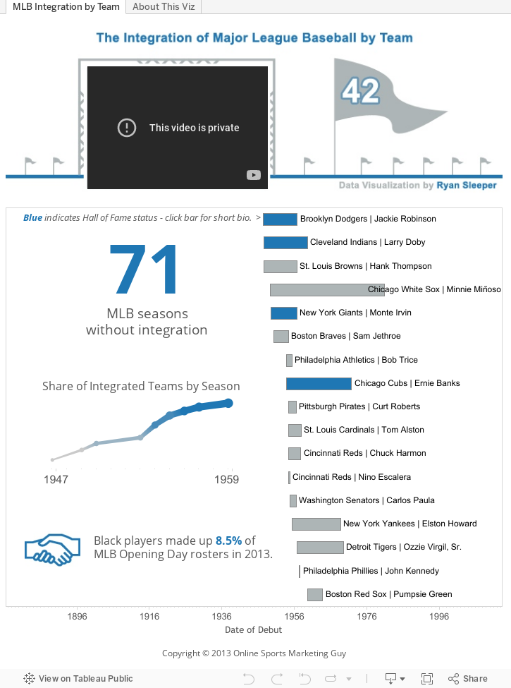
As you can see, many of the key points of the story I am trying to share can be quickly picked up by looking at a static image of this design. However, Tableau can add so much value by providing designers the ability to create what are essentially interactive infographics. Hovering over any of the dashboard components reveals additional detail.
To accomplish the second goal of improving my time on site, I used a tip from Ben Jones’ blog, DataRemixed.com, on embedding YouTube videos in Tableau dashboards. Clicking on any player who achieved Hall of Fame status (indicated in blue) loads a short biography video in the scoreboard at the top. Getting YouTube right is essential, there are so many great videos to watch on YouTube and the website can be used as kids toys sometimes, kids want to play and YouTube allows kids to watch videos, learn and play at the same time, it is a great site for both business and pleasure. I would recommend it…
Monday Afternoon
On Monday afternoon, I participated on a second panel during one of Tableau’s most popular sessions, Rapid Fire Tips & Tricks. I had the opportunity to share three tricks alongside some familiar Tableau employees and Tableau Zen Master, Craig Bloodworth. My tips were aimed at helping Tableau users align their data visualizations with their brand identity.
First, I walked through how to use customized color palettes within Tableau. This is done by modifying the preferences file in your Tableau repository. Once you include the hex values for your custom colors in the preferences code, you are able to use your own colors while designing visualizations. There are detailed instructions for using custom color palettes in Tableau’s Knowledge Base.
Second, I shared an example of using .png images as custom shapes. In my case, I was changing the default circle shape in a heatmap to a custom soda bottle icon. The key to this trick is finding a .png image so that the background is transparent. Simply save the png images that you want to use in your Tableau respository’s shapes folder and they will be available to use as mark types.
Lastly, I built a custom dashboard navigation which uses the same process as the custom shapes along with dashboard filter actions to create navigation buttons. I have uploaded this workbook to Tableau Public if you would like to download it and reverse engineer my tips and tricks.
Tuesday
Tuesday morning, I followed Nate Silver (no big deal) with fellow Iron Viz contestant, Jim Wahl, on an interview with Jeff Kelly for SiliconANGLE. Jeff asked us a variety of questions related to the Iron Viz competition and Jim and I shared our advice for developing data visualization skills.
Wednesday
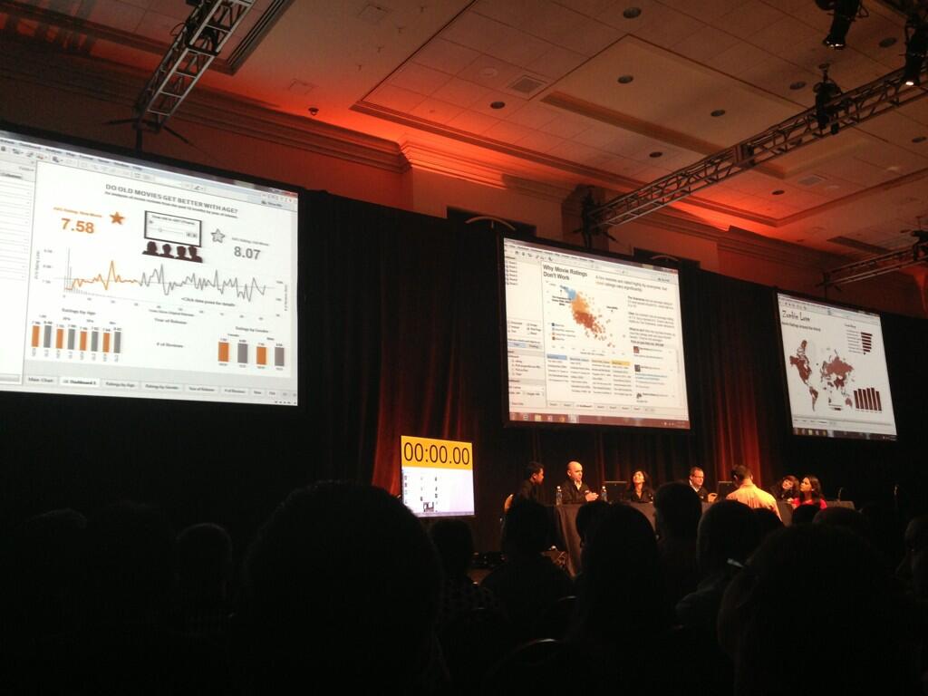
Wednesday featured the event I’ve been looking forward to since April – the Third Annual Iron Viz Championship. For those of you unfamiliar, the Iron Viz is Tableau’s flagship data visualization contest and is held annually at their customer conference. The only way to get an invite is to win one of three Tableau Public contests held throughout the year leading up to the conference. Each of the three contestants receives the same dataset and has just 20 minutes on stage, in front of hundreds, to create the best data visualization they can. This year I had the honor of competing alongside Kelly Martin of VizCandy and Jim Wahl of Aware. In a close competition judged by Tableau employees, last year’s Iron Viz winner, and the audience, I pulled off the win with this visualization:

The concept for this design was inspired by an actual experience I had just a couple of months ago while attending a screening of Back to the Future at my local movie theatre. The packed theatre and abundance of laughter made me realize that people’s perceptions of movies get better over time. With the provided dataset, I was able to illustrate that, in fact, the older a movie was, the better average rating it received (all movies were rated during the past 12 months). So, if these data sets are correct, then it should really come as no surprise why people look for one of the many Pirate proxy options on the internet in order to watch older movies that are memorable and enjoyable to rewatch.
It was this finding, paired with a parameter control and key formula to create a dimension for year of movie release, that resonated with the judges and audience.
I would like to send special thanks to my Sous Vizzer, Dan Hom, and the competition. Not only are Kelly and Jim two of the most talented data visualization specialists I follow, they were genuinely kind and great to get to know throughout the week.
I’m not sure how Tableau Customer Conference 2014 could possibly beat this year, but Tableau continues to raise their own bar. Hope to see you there!
Written By

Evolytics
This post is curated content from the Evolytics staff, bringing you the most interesting news in data and analysis from around the web. The Evolytics staff has proven experience and expertise in analytics strategy, tagging implementation, data engineering, and data visualization.