A quality dashboard requirements template means reproducible success within your data visualization practice.

One of the toughest and most crucial steps in building dashboards for business stakeholders is gathering the requirements. If you fail to understand what your stakeholders are really after, then you greatly risk producing a dashboard that will be late, over budget, or incomplete. This is where a dashboard requirements template can save the day. A quality template that captures both the overall goal of the dashboard and the nitty gritty details is a life (and budget) saver.
Making efficient use of the time you have with your stakeholder sets the project on the right course, especially when meeting virtually. An inefficient requirements meeting can lead to missed requirements, unnecessary communication down the line, guessing by the developer, and delayed starts. Besides the benefit of a quality dashboard, having and following a template promotes good habits and is a great tool to train new developers. In this post I will share an outline of the template we use here at Evolytics that I helped to develop.
Template Outline
The Evolytics Dashboard Requirements Template has six main sections:
- Dashboard Purpose
- Dashboard Design
- Data Discovery
- Existing Reporting
- Publishing/Sharing
- Miscellaneous
I will explain each section and provide a few of the main questions that we like to ask when interviewing stakeholders. There is a link at the bottom of the article with a starter template for you to download. No company or developer is going to have the same process, so I advise using it as a starting point and modifying it to fit your business.
Dashboard Purpose
The main goal with this section is understanding why your stakeholders need the information and what action they will perform with it. This will help you as a developer understand the true purpose of the dashboard and make sure the metrics and design align with the goal. Some questions we ask the stakeholder are:
- Who is the dashboard audience(s)?
- What are the business questions?
- What are the KPIs? Are they actionable?
Here are examples of answers to these questions from a recent dashboard we built.
Audience(s) – Marketing Managers and Strategists
Business Question – “What are our users doing after they login to the product?”
KPIs – Creating Goals Count, Adding Accounts Count, Visiting Marketplace Count, Bounce Rate
The audience of managers and strategists signifies that the KPIs might be pretty detailed. It also hints toward how I am going to design the dashboard, which I will discuss in the next section.
The business question is clear and the KPIs answer it:
Do our users take no action after logging in (bounce rate) or do they add goals or accounts, or simply visit the marketplace?
It is also important to ask follow-up questions to understand what we are counting with these metrics. Is the count the number of users who take that action, or the number of sessions where that action is taken, or the total number of times that action happens?
Are the KPIs actionable? A good answer from your stakeholder would be, “Yes; if we notice that one of the count metrics is vastly lower than the others, we could check if a link or the navigation was broken. If we ran a campaign to promote visiting the marketplace, then we should see a rise in that metric.”
Capturing clear answers to these questions and solidifying them with your stakeholder also helps to limit scope creep later in the project.
Dashboard Design
Dashboard design in the business world isn’t terribly exciting. We all know what we see on Tableau Public is a far cry from the dashboards we build on a daily basis, but understanding your audience, and how the dashboard will be used, is still crucial. Important questions to ask are:
- Is the dashboard meant to be exploratory or explanatory?
- How many tabs do you envision?
- Is there a color palette or font that should be used?
Exploratory vs Explanatory
The dashboard audience usually dictates whether the dashboard will be exploratory or explanatory. In many cases it ends up being both, which is where tabs come in handy. An overview/KPI tab with minimal interaction is handy for executives, while an analysis tab with lots of filters and parameters is what analysts like to use. Below are some examples of exploratory and explanatory dashboards I have published on Tableau Public.
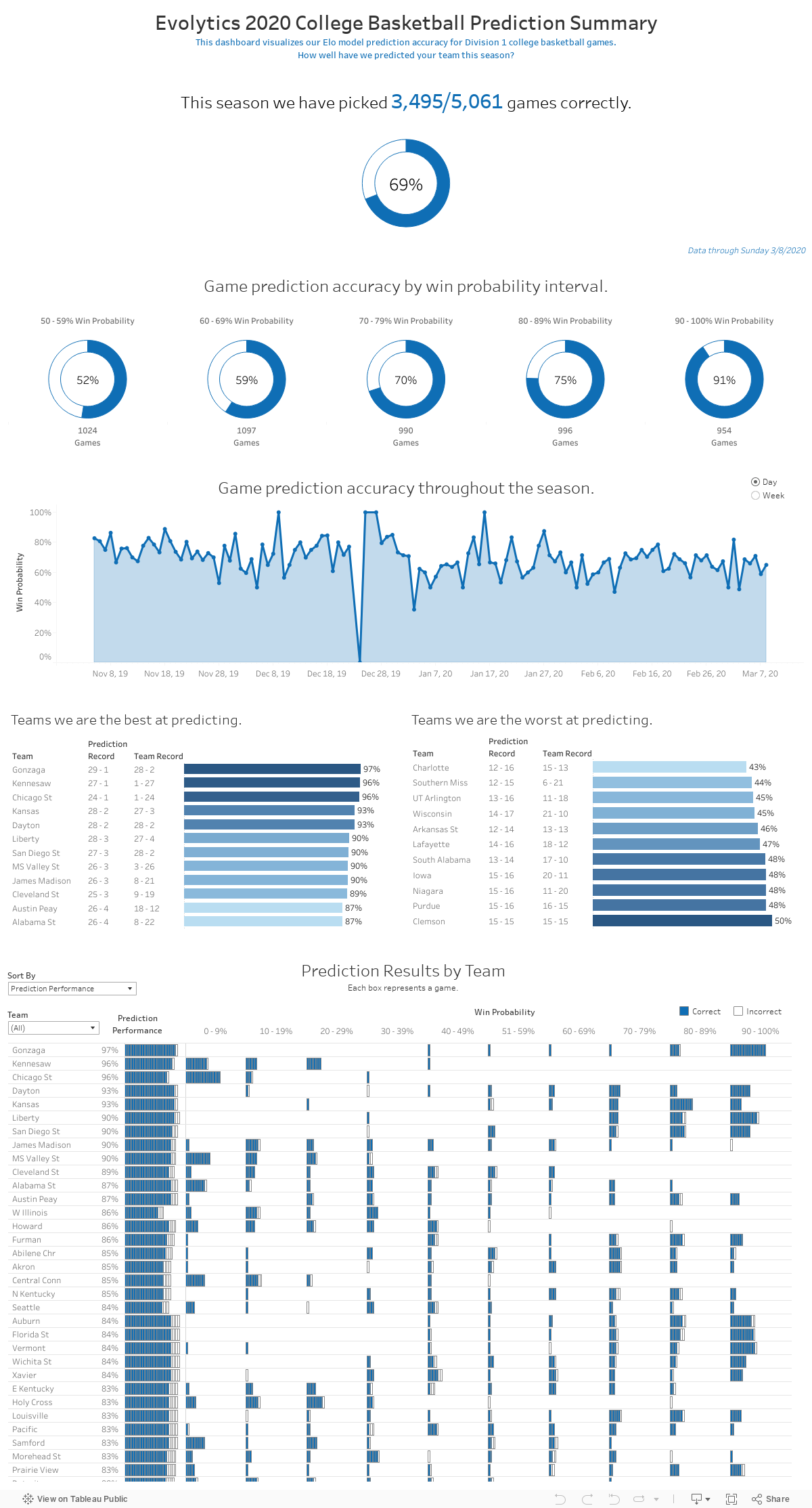
Explanatory Example – Evolytics 2020 ELO Basketball Predictor Performance
This dashboard very clearly tells you its purpose: display how our ELO machine learning model did in the 2020 season at predicting winners of NCAA basketball games. The dashboard becomes a little more granular toward the bottom. If it were a business dashboard, I might put the team table on its own tab.
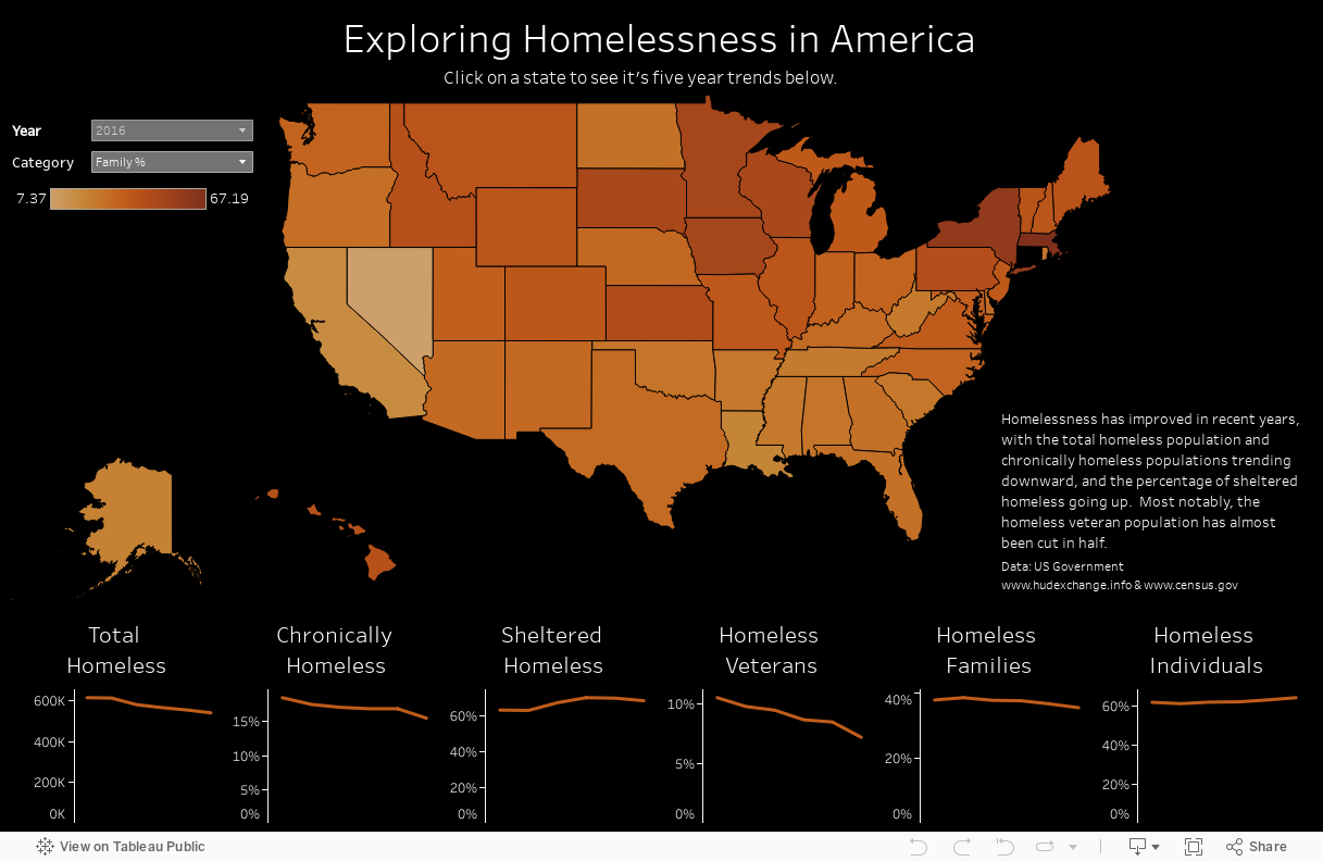
Exploratory Example – Exploring Homelessness in America
This dashboard is much more interactive and allows the user to choose the metric, year, and even select a state to narrow down the trend chart results. It is densely packed with information and takes a little more time to digest than the Explanatory dashboard.
Data Discovery
Here, we try to capture pertinent information about the data for the dashboard. If data engineering is required, then you may want to have a separate requirements gathering session just for that. Below are the main questions we ask around the data –
- Is there currently a data source? If not, what does the ideal data source look like?
- Will data engineering be required?
- At what granularity is the data?
- Are we dealing with a single source or multiple?
- How large is the data set?
Sometimes we encounter a situation where the data source won’t be ready for a while, but the stakeholders want a working dashboard as soon as it is. In these situations we create a mockup data source in Google Sheets, then swap it out with the data sources when they’re ready. This method can also be helpful when you are unsure what the structure of the data source needs to be for Tableau. The data engineering team (or you) can then use it as a template for the SQL output.
Existing Reporting
Frequently, our dashboard projects involve revamping and pivoting existing dashboards to answer new business questions. This gives us the opportunity to understand what the client normally uses and get feedback on their likes and dislikes. If you are building a brand new dashboard, then have the stakeholder show you some examples of dashboard they like, or show some examples of dashboards you have built.
Can you give us examples of what you like and dislike about dashboards you have used or that this is meant to replace/augment?
Publishing/Sharing
While not necessary to ask questions about publishing/sharing the dashboard in the requirements meeting, they are necessary as you approach the completion of the first iteration. Keep in mind that your deadlines may dictate when to ask these questions.
- Where will this dashboard be published?
- What are the target share dates?
- What should it be named?
- Should there be any default filters applied?
Miscellaneous
We use this section for any miscellaneous comments that the stakeholders make during the meeting, and to give them one last chance to share any other pertinent information.
- Is there anything else we need to know about the dashboard/project?
- General Notes
Following this template should jumpstart your dashboards and show your stakeholders that you are organized and prepared for the project. Click here or on the image below to download a starter template with all the questions outlined in this article.

Written By

Jay Farias
Data Visualization Manager Jay Farias is a technology enthusiast who specializes in Tableau. He has years of experience implementing innovative technology solutions in the construction and healthcare industries. He supports Data Visualization strategy and implementation for Kantar Health and Intuit.