In the second of two parts in the Tableau 201: The Making of Odds of Going Pro post, we will show you how to install custom shapes and use the images to filter and navigate dashboards in Tableau. See part one of this post, how to make funnel charts in Tableau, for a detailed explanation on how to make the chart pictured in the interactive visualization below.
Let’s again start by looking at the original dashboard:
Icon-Based Navigation / Filters in Tableau
As we mentioned in part one, we attribute the success of this viz to its simplicity.
Not only does it use just one chart to tell the story about the odds of going pro in sports, it uses a simple, intuitive navigation that allows the end user to filter the funnel by gender and sport.
You can easily create a similar navigation by placing the icons you want to use in your Tableau Repository. Every computer with Tableau has a folder within the documents folder called My Tableau Repository, located at C:Users[Your User Name]DocumentsMy Tableau Repository.
Among other handy Tableau files, the shapes folder in your Tableau Repository holds custom shapes that can be used to create a custom navigation. You might find that using document repository software could help to keep documents in order.
If you like to learn more about document repository software, you might want to visit somewhere similar to https://www.lucion.com/info-document-repository-software.html for more information.
We recommend creating a new folder for each unique ‘shapes palette’ that you want to create, and place the corresponding image files there.
For example, the viz above uses a custom shapes palette we called “Pro Sports Funnel” in my Tableau Repository. Here is how the folder structure looks behind the scenes on my computer:
For maximum flexibility with your custom shapes, it is important to use .png images with a transparent background. By using shapes with a transparent background, you can use shapes as icons or marks. If you do not have a transparent background, shapes may show up as a colored square instead.
Once the .png files are in the “Pro Sports Funnel” folder in my Tableau Repository, they will be available to use as custom shapes when I re-open Tableau.
To create the custom navigation used in the Odds of Going Pro viz, follow these seven steps:
1. On a new sheet, change the marks type from “Automatic” to “Shape”.
2. Drag the dimension that contains the names of the buttons you will be using in your navigation to the “Shape” marks card. In my case, the name of the dimension is “Icon Name”.
3. To adjust the navigation orientation from horizontal to vertical, drag the same dimension on the Shape card to the Rows shelf.
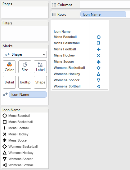
At this point, your view should look like this:
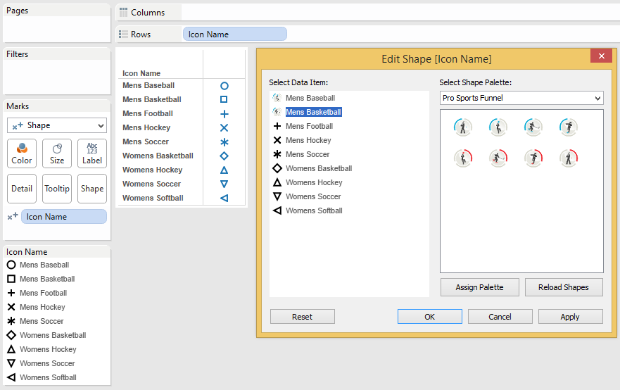
4. Notice that there is now a shape assigned to each of your button names, but these are the default shapes. To map your custom shapes, hover near the top right corner of the shapes legend, click the down arrow, and select “Edit Shapes”.
5. In the dropdown menu where it says “Select Shape Palette”, select the custom palette that you added to your Tableau Repository in the steps above. Note that you will not see your custom shapes unless you either reopen Tableau after saving your custom shapes in your Tableau Repository or select the option to “Reload Shapes” in the Edit Shape interface.
6. Map the correct shapes with their corresponding icon names by clicking each item name individually, then clicking the custom shape that is most appropriate.
7. The last step in making your icon-based navigation functional is to add the sheet to your dashboard view, and add a dashboard action that will filter the rest of your dashboard based on the button that is clicked. From within your dashboard view, you can accomplish this by following these four steps:
a. Navigate to Dashboard > Actions.
b. Click “Add Action”.
c. Choose a “Filter” based action.
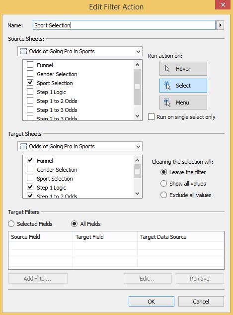
d. Set up logic that basically says “If you click my navigation sheet, I want the dashboard to filter every other sheet”. This is how the logic looks on my dashboard:
You now have a fully functional and aesthetically pleasing icon-based filter in your dashboard.
Be creative and use the combination of these icon-based filters and dashboard actions to filter the view, highlight insights in the data, navigate between worksheets or workbooks, and even open embedded web pages and videos.


