When it comes to having a successful business there are so many things that the business will need to think about – what product will they sell, how will they sell it, what can they do to make things easier for them (e.g. should they be buying punched pockets for all their staff or does it not really matter). But at the end of the day, the important thing is that a business does what works for them.
A lot of the time what works for companies is having that big brand name.
Many of the companies we have worked with are large brands that have many different products under their brand umbrella.
Consider a brand like Tableau that owns several different products including Tableau Desktop: Personal, Tableau Desktop: Professional, Tableau Public, Tableau Online, and Tableau Server, among others.
At times, a brand like Tableau may have a ‘portfolio’ report that compares the performance of each of their products in context of each other across the same KPIs.
In cases like this, one of the most effective tactics we have found for improving user experience is to provide end users with the ability to highlight the individual dimension members that are important to them.
Dimension members are the individual entries within a dimension (i.e. a dimension of Product would have individual members of Tableau Desktop, Tableau Public, etc.).
Tableau has a dashboard action to highlight dimension members, but these only work on dashboards, and further, only the dashboard you are viewing. This post shares a way to highlight dimension members throughout an entire workbook.
In this scenario, the dimension would be the product, and the individual members would be the different products under the Tableau brand umbrella, but this same tactic can be used as a highlighter for any dimension and their respective dimension members. Maybe you are a manager that cares about a certain department within a product offering. Or maybe you are analyzing marketing data and want to highlight different marketing channels in a stakeholder report.
These are just a couple of examples, but we have found the following to enhance analyses in many different business situations.
How to Highlight a Dimension Member Throughout a Tableau Workbook
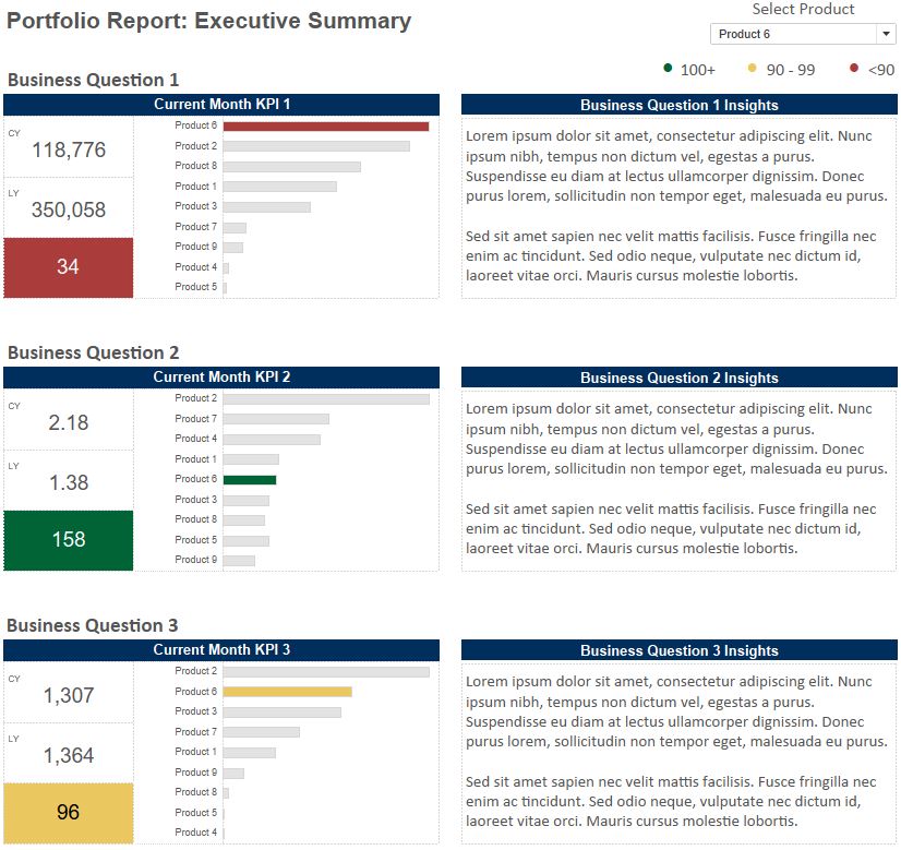
For this tutorial, we will use the following executive summary view for a brand’s portfolio report:

In reality, this is the first page of a four-page report.
Notice that there is a selector in the top right corner that allows the end user to choose the product that the workbook will focus on.
On this executive summary view, the KPI tables are filtered to that specific product and the bar charts highlight that specific product in context of the other products.
In addition, the remaining interior pages of the report are filtered / highlighted in the same way; a user experience that is not possible with dashboard actions alone.
Here’s how it’s done.
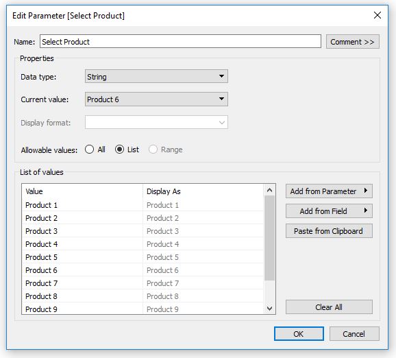
First, create a string parameter with a list of the dimension members that you want the end user to choose from:

Next, create a Boolean calculated field which will tell Tableau whether or not the dimension member on the view matches the dimension member in the parameter. When the result is true, the member will be highlighted on the view.
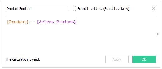
The formula is “[Dimension] = [Dimension Parameter]”.
In this tutorial, we are looking at the Product dimension, and our calculated field looks like this:

To use this logic as a highlight, so that whichever selection is made in the parameter will stand out on a view, drag the calculated field to the Color Marks Card.
Now if the dimension member matches the parameter selection, the mark will be encoded as true and receive a different color than everything else:

Now when the parameter selection is changed, the product that is chosen will be highlighted on the report.
To ensure this functionality is available for end users, make sure you show the product dropdown menu by right-clicking on the parameter on the Parameters Shelf and choosing “Show parameter control”.
In the example shown, we are coloring the marks on a view based on whether or not they match the parameter selection, but the Boolean calculated field can also be used as a filter by dragging and dropping the field to the Filters Shelf. This is useful if you would prefer for some views to look at only the dimension member selected instead of highlighting the dimension member selected in context of the other members.
Any sheet that includes the highlighter or filter will update throughout the entire workbook based on the dimension member selected in the parameter!
In the final report shown at the beginning of this post, the executive summary view and three additional “prescriptive” dashboards on the interior pages of the report include a combination of dimension member highlights and filters. The end user only has to make the selection once in the top right corner of the first page, and the selection will stick as they browse the rest of the workbook.
We have found this tactic to improve analyses as well as the user experience for these types of comparison-based dashboards.
