In the post 10 Data Viz Tips I Learned from Google Analytics, I shared that before I started using Tableau, I began my career in digital analytics using Google Analytics. One of the features I utilize most in my analysis work in Google Analytics is the ability to compare the performance during any date range to the performance during an equal date range immediately preceding it. For example, if I choose a date range of 10 days, I would like to see the performance of those 10 days as well as the 10 days that preceded my selected range. In Google Analytics, this is the first option if you choose a comparison date range, but it is tricky in Tableau.
I have seen a solution to this that uses an axis of number of days, but we have a new solution that leverages a date equalizer calculation to compare any date range to the equivalent prior period on the same date axis – a much friendlier user experience!
How to Compare Any Date Range to Previous Date Range on Same Axis in Tableau
Step 1 – Create Parameters for Date Range
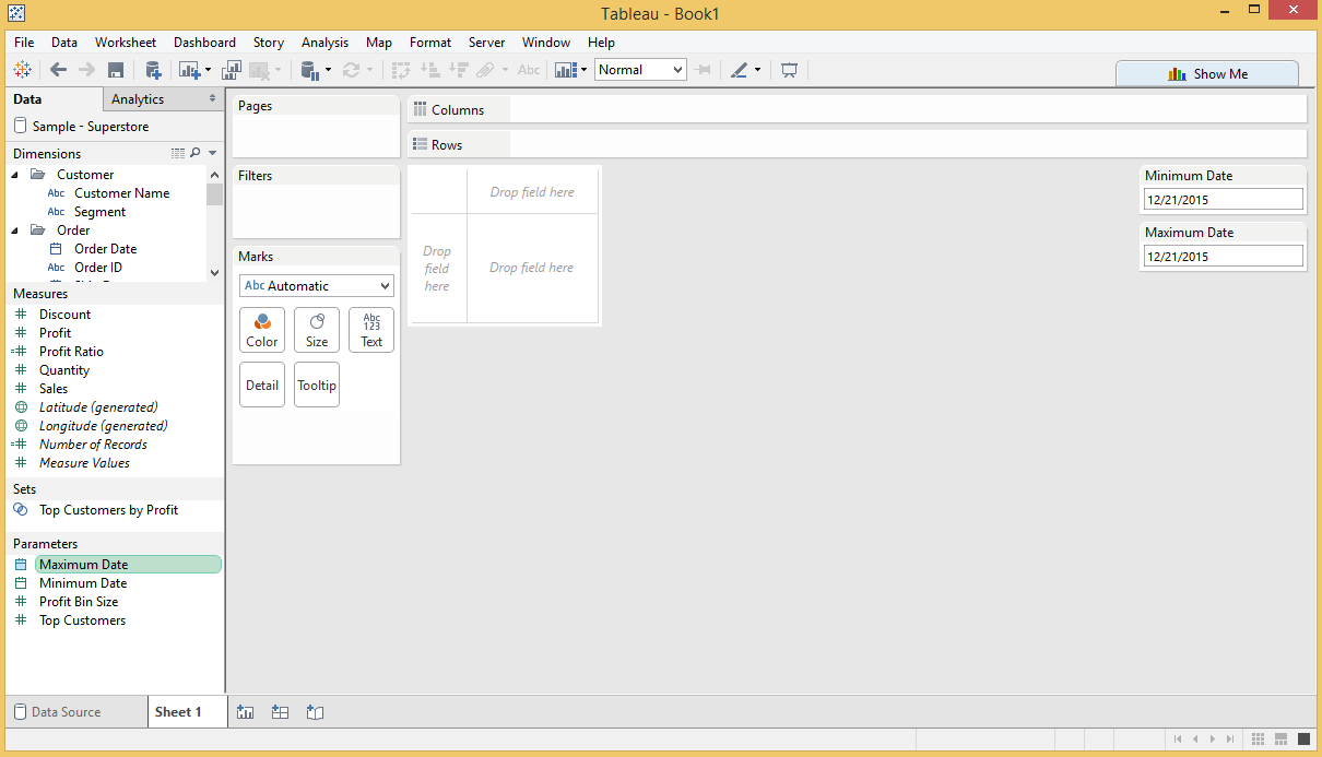
Build two separate parameters with a data type of “Date”; one will be the minimum end of your range, and the other will be for the maximum end of your range. Once these are created, right-click on each one and choose “Show Parameter Control”. If you would like to follow along using the Sample Superstore data source that comes with every download of Tableau, the view looks like this at this point:
Step 2 – Create a Calculated Field for Days in Range
Create a calculated field that uses the DATEDIFF function to calculate the number of days in the selected range. In this tutorial, we are using a granularity of day, so we will want to include a “+1” to ensure we capture the current day. The calculated field looks like this:
DATEDIFF(‘day’,[Parameters].[Minimum Date],[Parameters].[Maximum Date])+1
Note that if you want to spot check that your formula is working correctly and calculating the correct answer, add this calculated field to your view with an aggregation of average. By default, the aggregation will be sum so the calculated field will take the number of days multiplied by the number of records (which is not what we want).
Also note that the Minimum Date parameter is first in our calculation. If you do this backwards, you will get the wrong result.
Step 3 – Create Boolean Calculated Fields for Current Period and Prior Period
The final step in the set-up process is to create two calculated fields: One which will limit the dates to the current period, and one which will limit the date to the period immediately preceding the range selected in the parameters from above.
Calculated Field for Current Period
[Order Date] >= [Parameters].[Minimum Date] AND [Order Date] <= [Parameters].[Maximum Date]
Calculated Field for Prior Period
[Order Date] >= [Parameters].[Minimum Date] – [Days in Range]
AND [Order Date] <= [Parameters].[Maximum Date] – [Days in Range]
Note: The date logic used to create these Boolean calculations could have instead been nested within the calculations in the following steps but I prefer to leave them as their own fields in my data.
Step 4 – Create a Date Equalizer
The date equalizer is a calculated field that will put both the date range selected and the date range immediately preceding the selection on a single axis! The formula is:
IF [Date Filter CP] = True THEN [Order Date]
ELSEIF [Date Filter PP] = True THEN [Order Date] + [Days in Range]
ELSE NULL
END
Step 5 – Create Calculated Fields for Your Measure
We are now ready to use the special date fields we set up before to create the measures that will be used on our view. For this to work, you will need to set up a calculated measure that shows the performance for the current period, and a second calculated measure that shows the performance for the prior period. I am going to use Sales as my measure, but this same approach works for any measure without having to replicate the first four steps. Here are my two calculated measures for Sales:
Current Period Sales
SUM(IF [Date Filter CP] = True THEN [Sales] END)
Prior Period Sales
SUM(IF [Date Filter PP] = True THEN [Sales] END)
Step 6 – Create the View
If you are wanting to create a continuous line graph comparing the performance of a measure to the selected date range and the date range immediately preceding it on the same axis:
- Place the newly created Date Equalizer dimension onto the Columns shelf with an aggregation of continuous day
- Place the newly created Current Period Sales measure on the Rows shelf
- Drag the newly created Prior Period Sales measure onto the same axis as Current Period Sales – you could also create a dual-axis with one measure on each, but this would require you to synchronize the axes; a step that is unnecessary since these two measures should be an apples to apples comparison on the same y-axis.
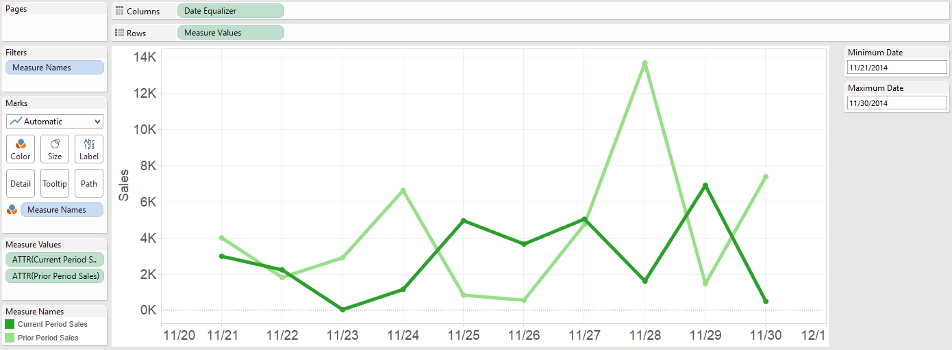
My final product looks like this:
In my example, I have chosen the final 10 days of November 2014. The dark green line represents the performance during my selected range, and the light green line represents the performance during the 10 days prior to my selected range (11/11/2014 – 11/20/2014).
You can now select any date range you want and have Tableau show the performance during the current period to the prior period immediately preceding it – on the same date axis!
Once you’ve got the foundation down, try using parameters to change which metric is being graphed or change the date aggregation of the date equalizer.


