After the bar chart and line graph, we find the scatter plot to be one of the most effective visualization options for analyzing data. A scatter plot displays data points at their respective intersections of two measures, and displays every data point on the same view. The marks can then be further encoded by up to two additional measures and/or dimensions by leveraging the Color and/or Size Marks Cards.
This ability to slice and dice data points in several ways within a condensed space provides an effective means for identifying patterns. Not only that, scatter plots provide a natural way to segment the marks into four quadrants by simply adding a reference line to each of the two axes. You can even take this a step further in Tableau by creating sets for each of the four segments to use for deeper analysis later.
This post shares how to create a scatter plot in Tableau and use the results to create segments.
How to Make a Scatter Plot in Tableau
For this walk-through, we’ll be using the Sample – Superstore data set to evaluate all of our products across the Sales and Profit Ratio measures. When you build a scatter plot, one measure will form the Y-axis and one measure will form the X-axis. The marks on the view will then be plotted at the intersection of the values on the two axes.
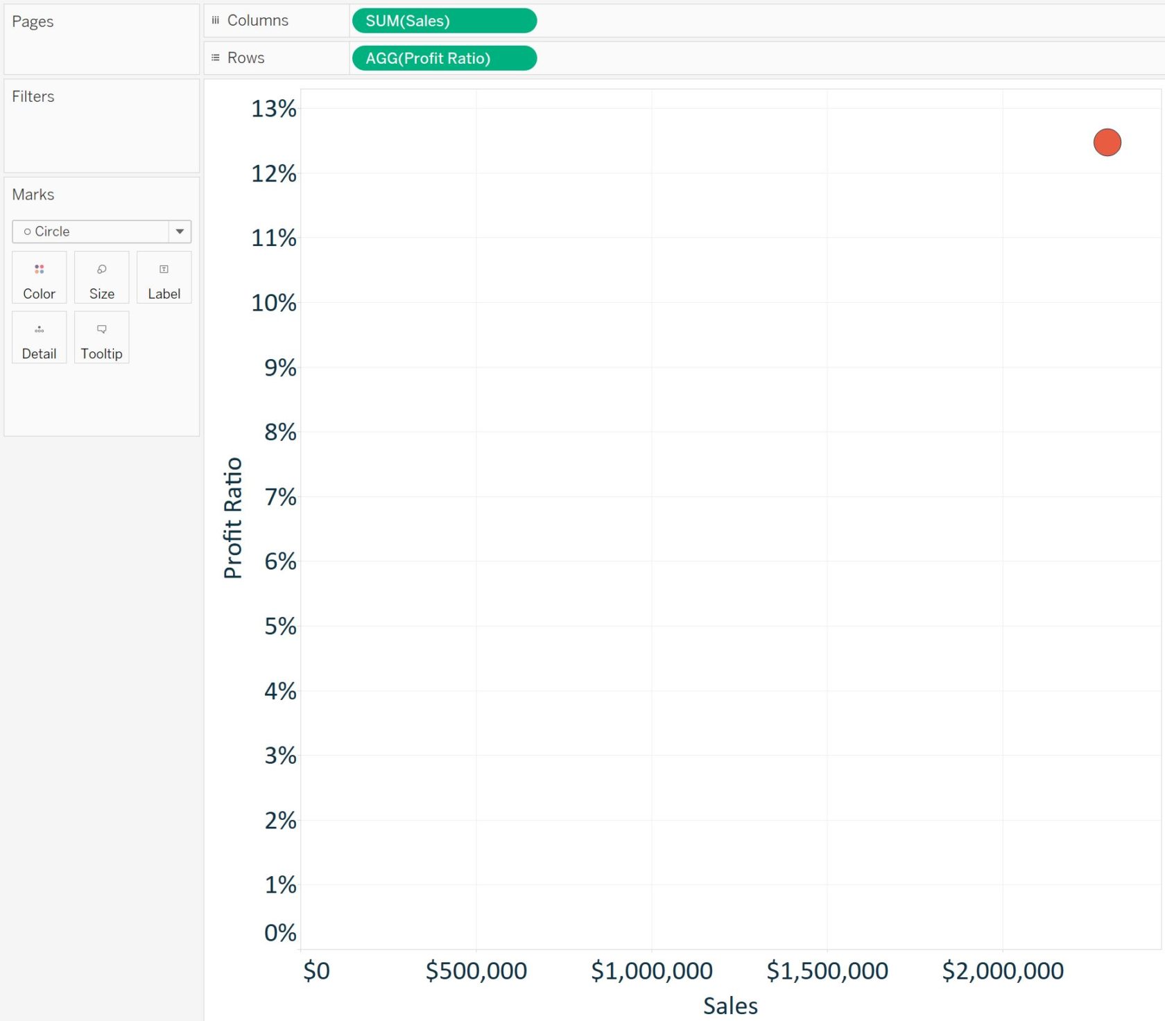
To create a scatter plot, drag and drop the Profit Ratio measure to the Rows Shelf and the Sales measure to the Columns Shelf. Scatter plot is the default chart type in Tableau when two measures are used, so you could have got to this same point by just double-clicking Profit Ratio, then double-clicking Sales to add them to the view. At this point, your view should look similar to this:

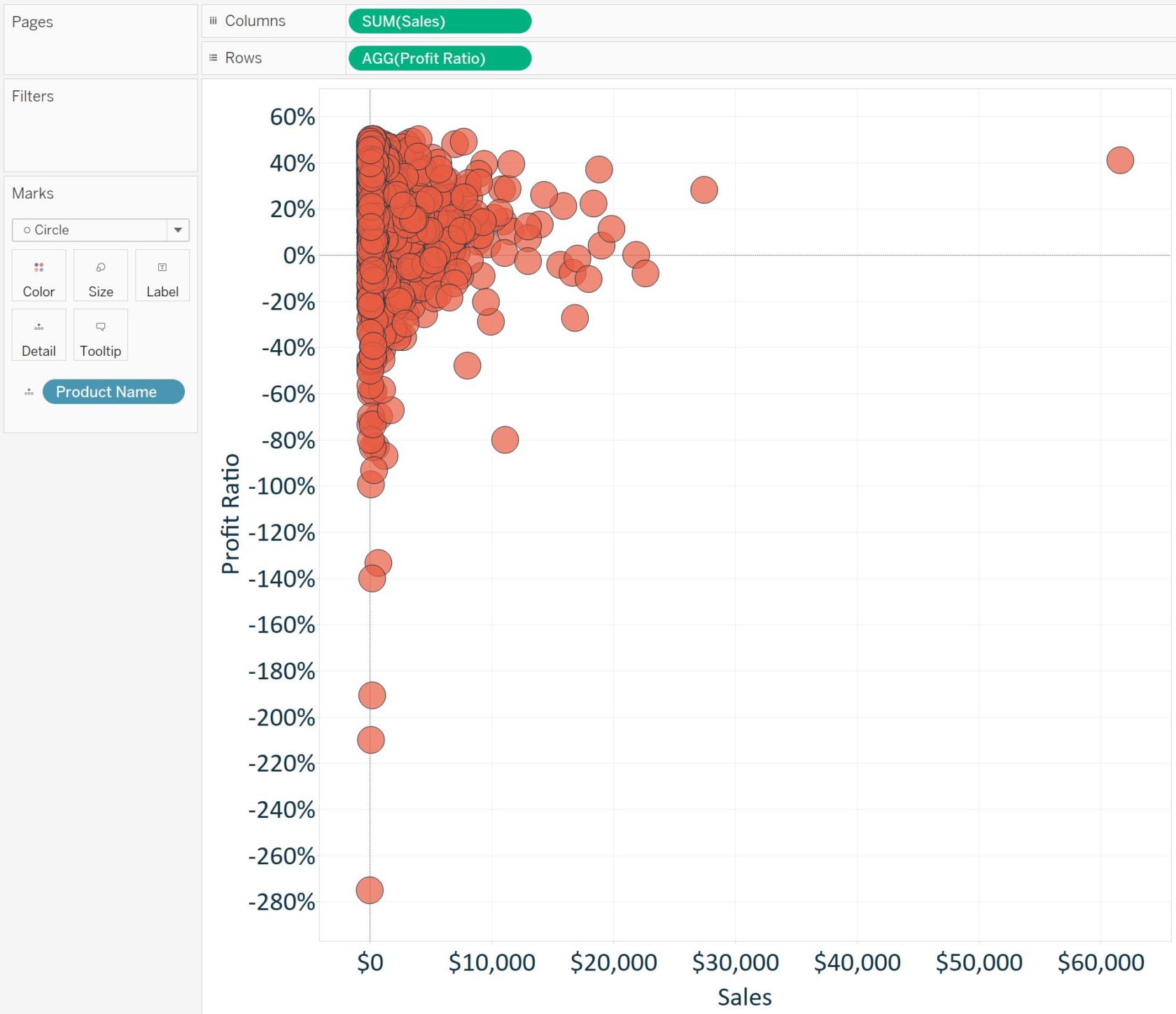
So far, we have just one point that represents the intersection of Profit Ratio and Sales for all of the records in our data set. This is because we have yet to specify a level of detail for our analysis. For more on this topic, you can review our fundamentals post: Tableau Marks Cards, Encoding, and Level of Detail. Our analysis is going to look at products, so change the level of detail by dragging the Product Name dimension to the Detail Marks Card. The view has now been changed to this:

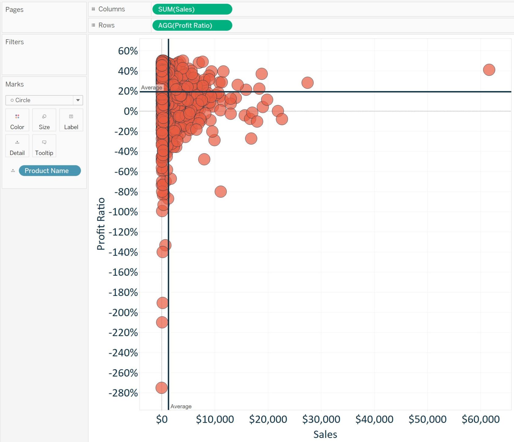
What’s powerful here is that we are looking at all 1,850 of our products at once, which helps us evaluate them quickly in context of each other. You can see outliers, unprofitable products, and segments are beginning to emerge (i.e. high sales / high profit ratio, high sales / low profit ratio, and so on). One way to make the segments more apparent is to add reference lines to each axis. Here’s what the view looks like when we add a reference line for the average of each axis by right-clicking on each axis and choosing “Add reference line”:

These reference lines create four quadrants on the view that can be used to segment the data:
- Top-left quadrant: High Profit Ratio & Low Sales
- Top-right quadrant: High Profit Ratio & High Sales
- Bottom-left quadrant: Low Profit Ratio & Low Sales
- Bottom-right quadrant: Low Profit Ratio & High Sales
This provides some areas to focus on. For example, we don’t want to have high sales of products that are causing us to lose money. Also, are there opportunities to increase the sales of our most profitable items? This example created segments using the averages of each measure, but you can easily change the reference lines to the thresholds of your choice for segmentation.
Lastly, these segments or products of interest can be made more permanent by placing them into sets. In the above example, our two highest-selling products are also above average in profitability. Let’s put these two products into a “positive-outlier” set by selecting them on the view (either through multi-select or dragging a box around them), right-clicking, and choosing “Create set…”. Once in a set, these positive outliers can be highlighted in different visualizations, which can lead to valuable insights for the business.
