Individual worksheets in Tableau can lead to powerful insights that help your business, but many times, it makes sense to combine the worksheets into a single dashboard. By combining varying visualizations into a dashboard, you and your audience are able to analyze different aspects of the data in context of each other. This is a much more intuitive experience than viewing the visualizations individually.
In addition to this one obvious benefit, Tableau comes with several technical features that allow you to control the user experience and even the ability to have the individual components of the dashboard interact with each other. This post offers an introduction to dashboards in Tableau and several ways to share the dashboard after it has been created.
An Introduction to Dashboards in Tableau
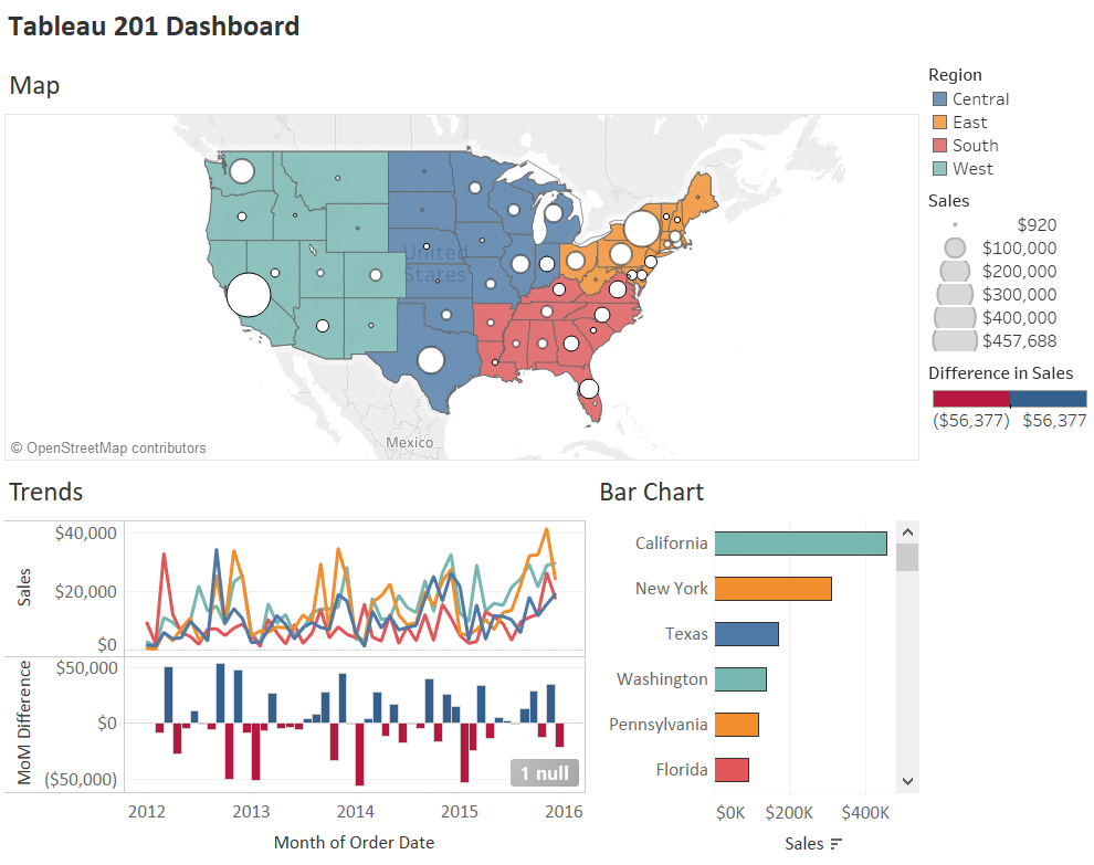
For this introduction, we will recreate this dashboard in Tableau:
To create a new dashboard in Tableau, either click “Dashboard” in the top navigation and then “New Dashboard” or click the New Dashboard icon at the bottom of any worksheet. The New Dashboard icon is the second icon immediately following the existing worksheets in the workbook.
Upon creating a new dashboard, you will be provided a blank slate that looks like this:
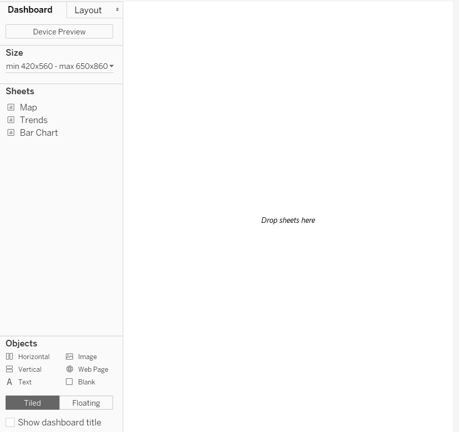
Here’s a quick overview of all the different dashboard options in the left navigation:
Dashboard and Layout tabs
By default, you will be working on the dashboard tab which allows you to set most aspects of the dashboard. The layout tab allows you to set the dimensions and location of individual dashboard components. All sizes on the Layout tab are in pixels.
Device Preview Button
The Device Preview button allows you to see what the dashboard will look like on different devices and you can even save different versions of the dashboard so that it looks different depending on what device it is displayed on. For more, see Designing Device-Specific Dashboards in Tableau 10.
Size
This is where you can set the height and width of the dashboard in pixels. There are several preset size options or you can set an exact size of your choosing. If you choose the Automatic option, the dashboard will change to fill all available space on the screen it is being displayed on and resize the individual components of the dashboard accordingly. While this option sounds good on the surface, beware that it is not truly “responsive”, and the display can be somewhat unpredictable.
Sheets
These are the individual worksheets in your workbook that can be added to the dashboard. Note that to create the example pictured above, there are three sheets in the workbook: Map, Trends, and Bar Chart. It helps to give the worksheets good names so you can easily find them, but you can also get a thumbnail preview of the worksheet by hovering over the name in the left navigation.
Objects
Horizontal: Adds a horizontal layout container that additional objects can be added to.
Vertical: Adds a vertical layout container that additional objects can be added to.
Text: Opens a mini word processor where you can add and format any text you wish.
Image: Adds an image from your computer to the dashboard.
Web Page: Embeds a web page in the dashboard (requires an Internet connection to display the web page).
Blank: Adds blank space to the dashboard which can be helpful when dashboard elements are too close to each other and in a tiled layout.
Tiled or Floating
When dashboard elements are tiled, they fill all available space in their respective tiles. When dashboard elements are floating, you control their exact size and location on the dashboard. Each of these layouts comes with their own pros and cons and the choice is largely dependent on your specific use case. Most Tableau users prefer the automatic resizing that comes with a tiled layout; we prefer the predictability and precision that comes with floating elements.
The dashboard pictured above is tiled in the Desktop Browser size, which is 1000 pixels wide by 800 pixels tall. To create the dashboard, we first ensured the size was 1000 by 800 by clicking on Size in the left navigation, choosing Fixed Size, then choosing the preset Desktop Browser option.
Tiled is the default layout option, so we are ready to go ahead and add individual sheets to the view. We will add the map first, and when there is nothing else on the dashboard, it will fill all the available space on the view:
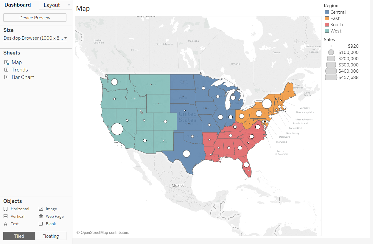
To add a worksheet to a dashboard, left-click and drag the worksheet name from the left navigation to the dashboard. Note that when we added a worksheet that has legends, the legends were added for me automatically. The color legend can be used as a highlighter by simply clicking a color in the legend. To learn how to create the map pictured, see How to Make a Dual-Axis Map.
We will then add the Trends worksheet in the space below the map by dragging it towards the bottom of the dashboard. To learn how to make a line graph, see Line Graphs, Independent Axes, and Date Hierarchies. To learn how to calculate the month over month difference pictured, see An Introduction to Table Calculations in Tableau.
We will then add the Bar Chart worksheet by dragging it near the bottom right-corner of the dashboard. To learn how to make a bar chart in Tableau, see 5 Ways to Make a Bar Chart / An Intro to Aggregation.
Lastly, we added a title to the top by dragging a text object to the top of the dashboard, and ended up with this view:
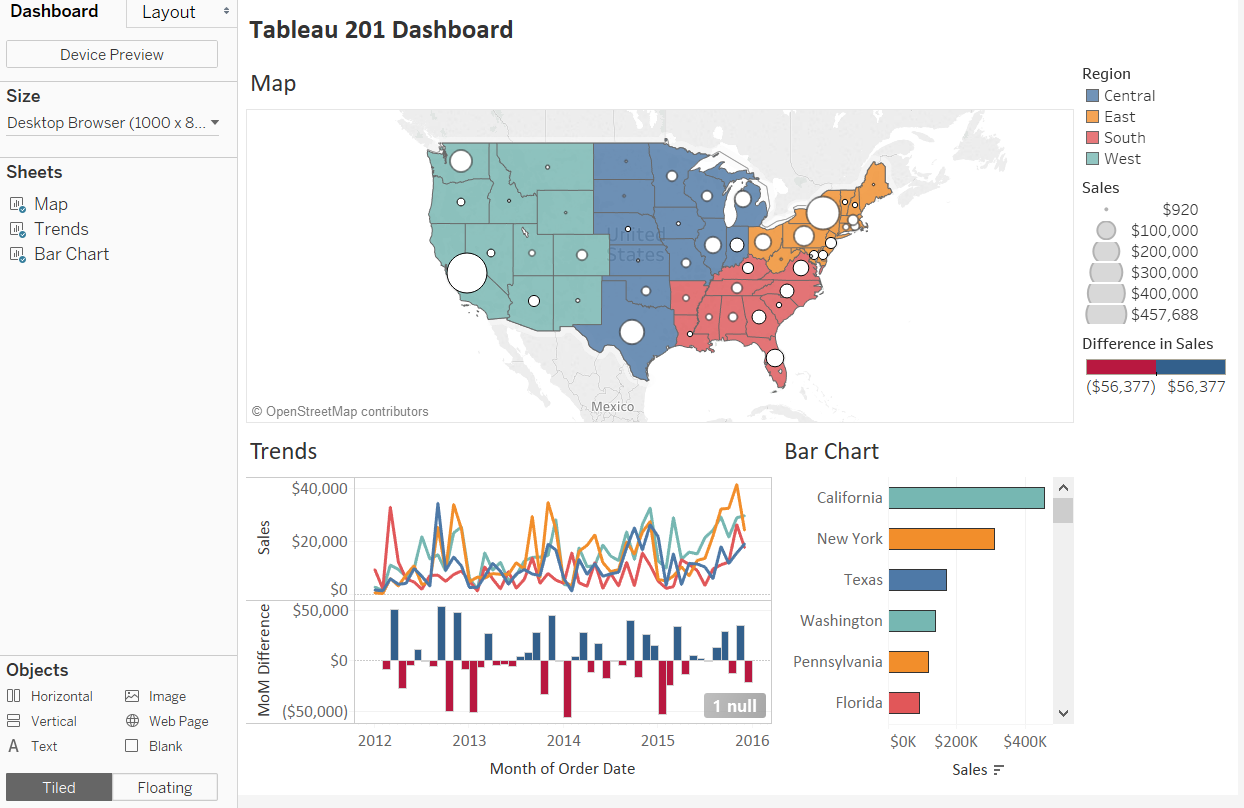
This is a more than serviceable dashboard that we were able to make in a matter of minutes in Tableau. You could add even more value by building in some user interactivity. Perhaps you want the trend lines and bar chart to update when a region is clicked on the map. To learn how to do this, see 3 Creative Ways to Use Dashboard Actions. Another option would be to add filters that allow the end user to filter the three worksheets. For more on filters, see An Introduction to Filters.
Sharing Tableau Dashboards
After you’ve created a dashboard in Tableau, there are several ways the dashboard can be shared for consumption.
Packaged Workbooks
If you have created a dashboard using Tableau Desktop, you can package the workbook for offline sharing. To package a workbook, navigate to File in the top navigation and click “Export Packaged Workbook…”. This will package the data with the instructions for how to visualize the data. Anybody with Tableau Desktop or Tableau Reader can open the file and interact with the visualizations you have created. Note that packaged workbooks do not automatically update so the data within the workbook will only be as recent as the last update.
Tableau Public
Any dashboard built in Tableau Desktop or Tableau Public can be published to the web for public consumption. This is not a realistic approach for sensitive business data, but if you are able to make your data public, this is the perfect solution for sharing your dashboard to the widest audience possible. To publish a dashboard from Tableau Desktop to Tableau Public, navigate to “Server”, hover over “Tableau Public”, and choose “Save to Tableau Public As…”.
Tableau Server
You can also share your workbooks privately in the cloud by using Tableau Server. Tableau Server requires incremental licenses for you and your end users, but is the most scalable Tableau solution for sharing your business-related workbooks. Publishing to Tableau Server is very similar to publishing to Tableau Public, but you will be presented with several additional options including where to publish the workbook within Tableau Server, who has permission to view and interact with the workbook, and if / when you want the data in the workbook to update. To publish a workbook to Tableau Server, navigate to “Server” in the top navigation, and choose “Publish Workbook…”.
Written By

Evolytics
This post is curated content from the Evolytics staff, bringing you the most interesting news in data and analysis from around the web. The Evolytics staff has proven experience and expertise in analytics strategy, tagging implementation, data engineering, and data visualization.