…the only worse design than a pie chart is several of them…
– Edward Tufte
Pie charts have become one of the most recognizable and widely adopted chart types in business and data journalism. Being that the message that pie charts convey is almost universally understood, it is tempting to incorporate pie charts into your own data visualization. However – data visualizer beware – while the message that pie charts convey is immediately recognized (parts of a whole), the insights that pie charts provide are not.
Study after study has shown that pie charts are not the most effective means of communicating data. The pie chart’s primary limitation is that people are much better at comparing lengths and heights, as you would see in a bar or line chart, than they are at comparing areas within a pie. Further, the long tail results, or the thinner pieces of a pie, tend to become unreadable. Pie charts are also a very poor vehicle for communicating changes over time.
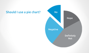
Despite the empirical evidence against pie charts, we continue to see them in some of the world’s most trusted news sources, stock reports, and corporate dashboards, among many other places. It is easy to make fun of people’s use of pie charts (like this one!), but we want to be clear that when you hear people recommend avoiding pie charts, it is not some kind of elitist-data-visualization-specialist credence – it is a best practice based in evidence. We’ve always viewed the prolific use of pie charts as a huge opportunity to educate and improve the data visualization space. While graphical methods of statistics date back over 200 years, we still have a lot to improve – which is a great thing for you if you are reading this and are interested in evangelizing the benefits of data visualization.
Bye Bye, Pie
To help, here is a simple exercise to illustrate the reduction in time to insight from a pie chart to more appropriate chart types.
First, have a look at this series of pie charts, showing the sales by department over a four-year period. Take 15-30 seconds and think of a couple of insights that the charts provide:
You likely gathered that the entire pie was getting slightly larger over time (though it was hard to tell by how much and what that means), but it is pretty difficult to ascertain which pieces of the pie are causing the growth. With an easy tweak in Tableau, look at the exact same data as a line chart. Take the same 15 – 30 seconds to understand what the data is telling you – though it likely won’t take you nearly that long.
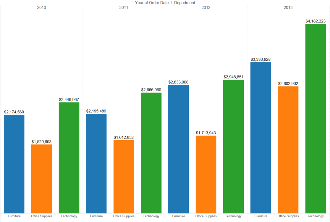
Much easier, right? By converting our pie chart to a line chart, we can easily see that all three categories are on the rise, and by how much. We were able to process the visual and get to the insight much faster. If you are not as interested in the performance over time, and want to see how each category performed compared to each other each year, use a bar chart:
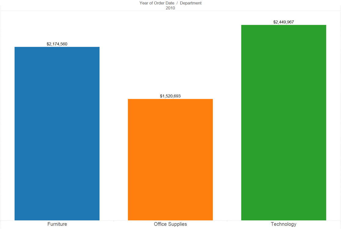
Again, your brain processes heights of bars more easily than it can process areas in a pie. Using a bar chart also provides you more real estate to display the values, either as dollar amounts and/or percents of the whole (as you were trying to convey by using a pie chart). To take this one final step further, if you only care about comparing how each category performed against the others for one period in time, you can isolate the bar chart to show just the year in question:
Just Can’t Let Go?
We understand that you may have a stakeholder that has a hard time letting go of pie charts. If you or a boss can’t quite go cold turkey, here are a couple of tips for using pie charts while you transition away from them:
- Stick to five slices or less, including the “other” category. As mentioned previously, the thinner, long tail, slices become unreadable. If you find yourself saying, “but I have to represent all fifteen of my categories”, that is another vote for you moving away from pie charts.
- Only use pie charts to show comparisons for one point in time. Avoid using them in a time series analysis as shown above.


