A tree map is a visualization that nests rectangles in hierarchies so you can compare different dimension combinations across one or two measures (one for size; one for color) and quickly interpret their respective contributions to the whole. When used poorly, tree maps are not much more than an alternative pie chart. When used well, they provide at least two big benefits:
- Depending on the analysis, some portions of the tree map will be composed of large rectangles where additional context can be added as labels. This is beneficial when the visualization will not be interactive and you still want the written information represented.
- In addition to the scatter plot, tree maps are one of the only visualization types that allow you to reasonably communicate and consume hundreds of marks on a single view. This makes it easier to spot patterns and relationships that you would not otherwise be able to see.
For this tutorial, we will be making the following set of tree maps using the Sample – Superstore dataset:
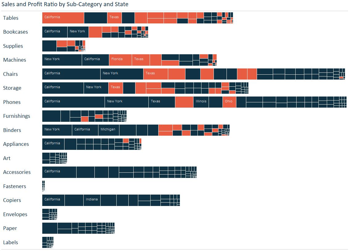
This analysis shows not only the sales amount by sub-category, but the sales contribution of each US state per sub-category and whether or not those states were profitable within each sub-category.
By changing the level of detail to make our analysis more granular and encoding the marks by a second measure of profit ratio provides more context to the view and helps us avoid the dreaded question, “So what?”.
How to Make a Tree Map in Tableau
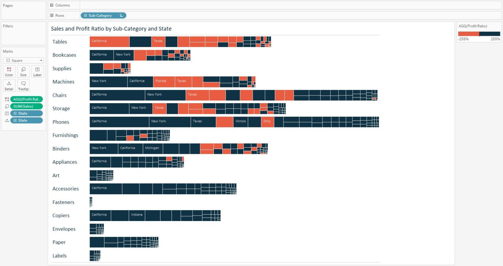
Tree maps are one of the out-of-the-box Show Me options in Tableau, but as with most charts in Tableau, we find building them from scratch helps us not only understand how they work, but also helps us get to our desired output faster.
To make a tree map in Tableau, begin by changing the mark type for a view from Automatic to Square. Then drag the primary measure that you want to evaluate to the Size Marks Card and the secondary measure to the Color Marks Card. Just as it sounds, the primary measure will control the size of the squares on the view, and the secondary measure will control the color of the squares. In our case, we’ve dragged Sales to size and Profit Ratio to color.
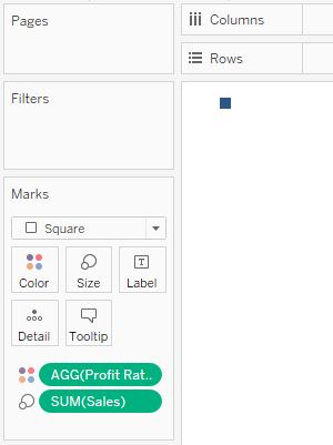
At this point, we’ve simply laid the foundation of the tree map. There is no detail, so we just see one square colored by the overall profit ratio in the Sample – Superstore dataset. To create a square for each state, drag state to the Detail Marks Card.
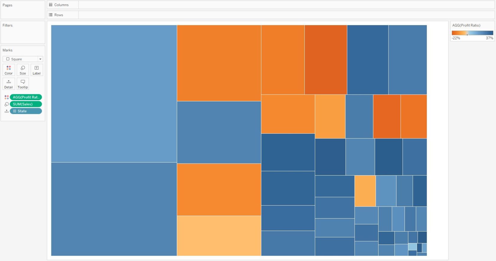
At this point, we have a tree map and a solid analysis. You can see there is quite a bit of real estate to add information to the Label Marks Card and have it displayed on the view; the first benefit mentioned in the introduction.
If we wanted to see this same analysis done at the Sub-Category level as pictured above, drag the Sub-Category dimension to the Rows Shelf. This will create a row with the sales and profit ratio by state tree map for each sub-category.
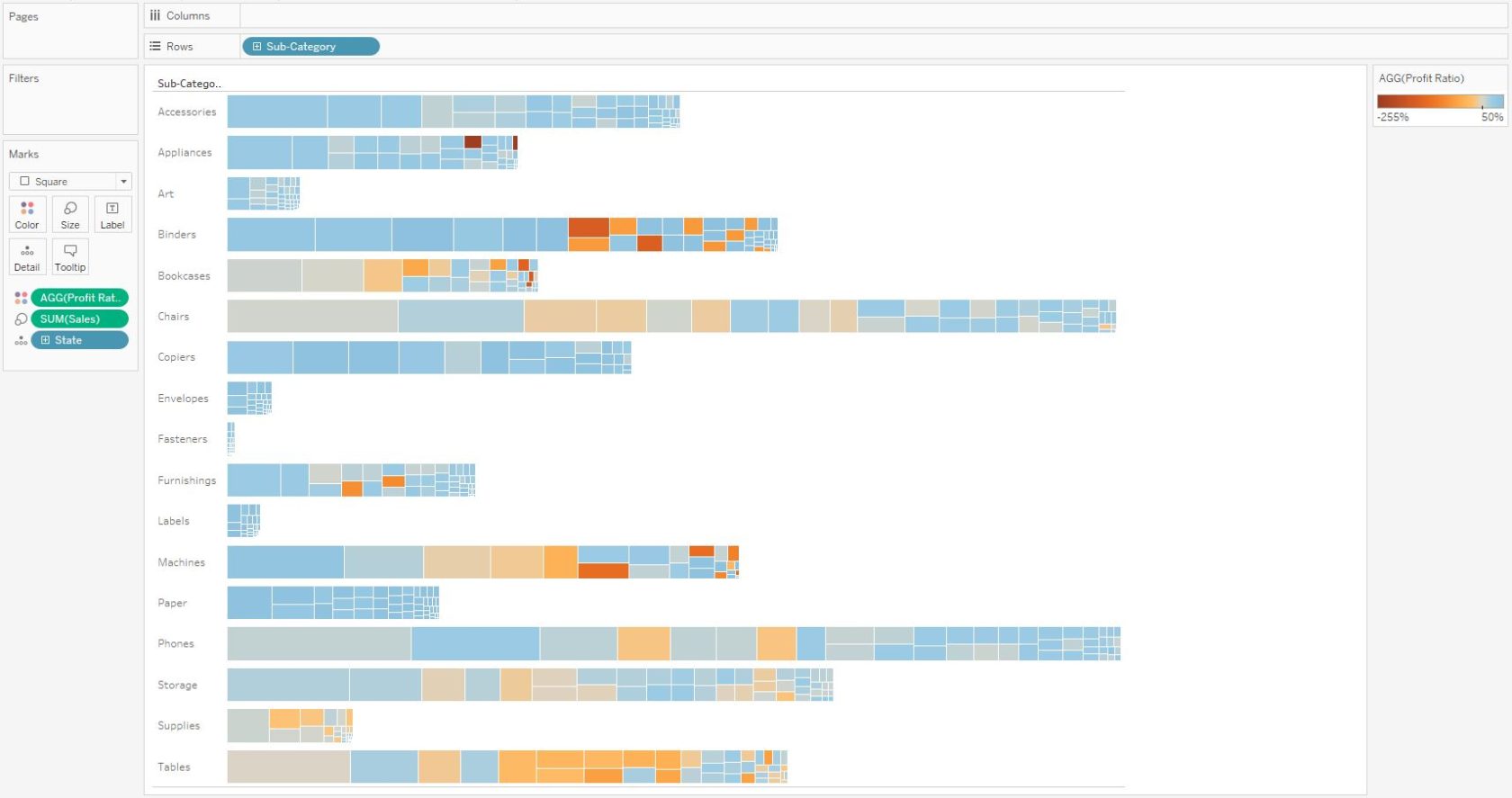
The final steps required to match the example would be to drag the State dimension to the Label Marks Card and double-click on the color legend to choose the colors and steps. We changed the steps to 2 and changed the colors so that any state with a negative profit ratio per sub-category would be colored orange and any state with a positive profit ratio per sub-category would be colored navy.
This tree map provides several insights, including:
- The overall sales are strongest in the Chairs and Phones sub-categories. This is the main insight we would see when looking at a simple Sales by Sub-Category bar chart.
- The Tables sub-category is largely composed of unprofitable states, and two out of the top three highest selling states are unprofitable.
- The overall best-selling state and sub-category combination is Phones in California, which was profitable.
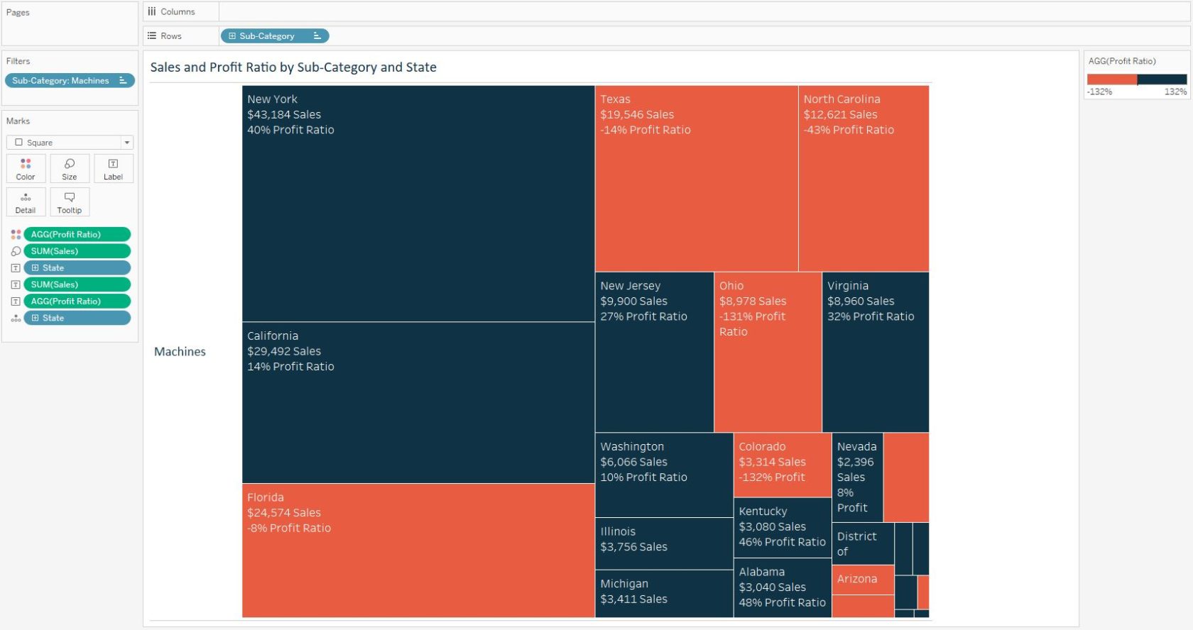
We also see that California is the highest selling state in all sub-categories except for Machines and Binders. Note that we were not able to see that insight in the screenshot alone, but by hovering over marks in the interactive version of the workbook. You can also simply provide a filter that looks at one sub-category at a time and add even more context to the mark labels:
These are just a few examples of the insights gleaned from this visualization, and a couple of limitless applications of tree maps.
