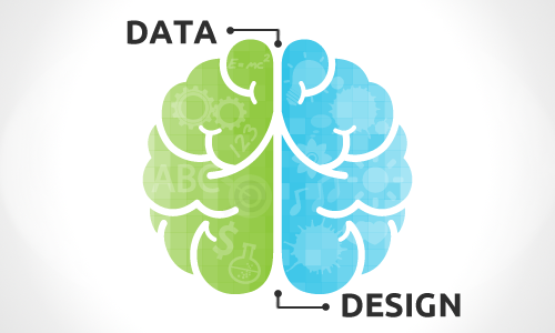
Data should always be the heart of any data visualization. Obviously, you cannot have a data visualization without data – and it is imperative that the data is accurate and honest. If we had to choose one element of a new data visualization to focus on between its data or design, we would make sure the data is right first every single time.
Now that our disclaimer is out of the way, we’re going to explain how without making some design considerations, your data visualization is doomed to falling short of its full potential. Balancing data and design is another tip that we take personally because we often hear criticism from data purists that do not see the value in complementing the data with an appealing design. Our opinion on the topic stems from Seth Godin’s principle of being remarkable – which means your work is good / unique / interesting enough to cause the audience to make a remark about it. In today’s age, making a remark means sharing it on social media, or in a corporate setting, it may mean passing your story up the ladder.
What is the purpose of data visualization?
Our answer is that the purpose of data visualization is to find and share actionable stories that are based in quantitative evidence. To make your insights actionable, this means sharing them with the most relevant, and many times, largest audience possible. If you don’t provide your data stories in a well-packaged design, you drastically minimize the chances of your work spreading, and thus, it is consumed and acted on by fewer people.
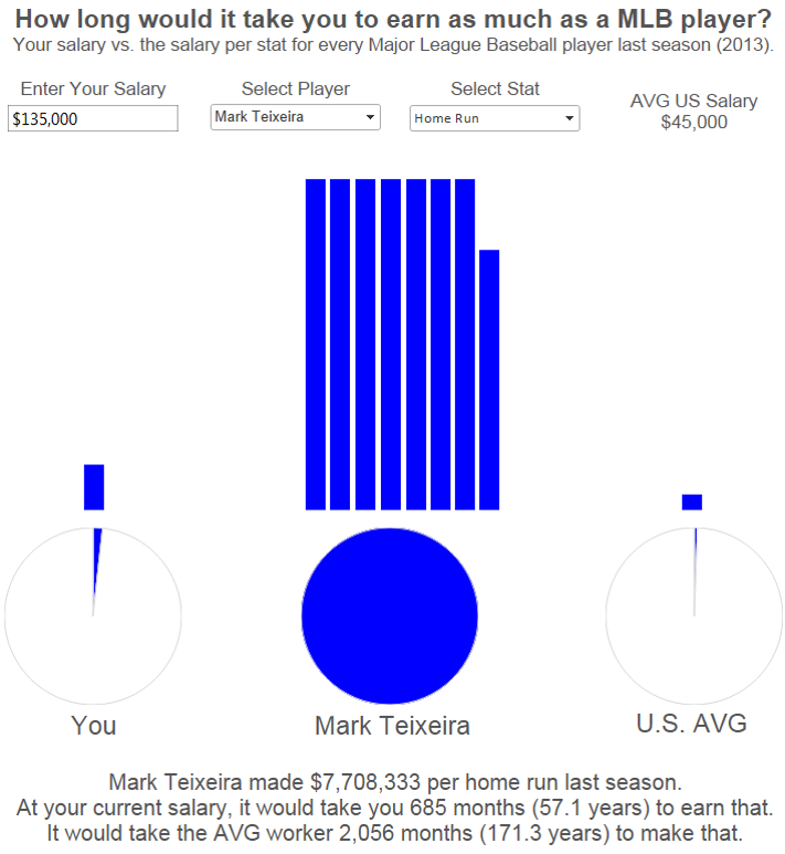
To help illustrate, we stripped out most of the design elements in my viz, Your Salary vs. a MLB Player’s Salary. In this dashboard, the end user can enter their own salary and compare it to the salary of any Major League Baseball player across several different hitting and pitching statistics. The data is extremely fascinating – if not depressing – on its own, but we believe it is the design that helped this become my most shared data visualization on Twitter to date.
Before
After
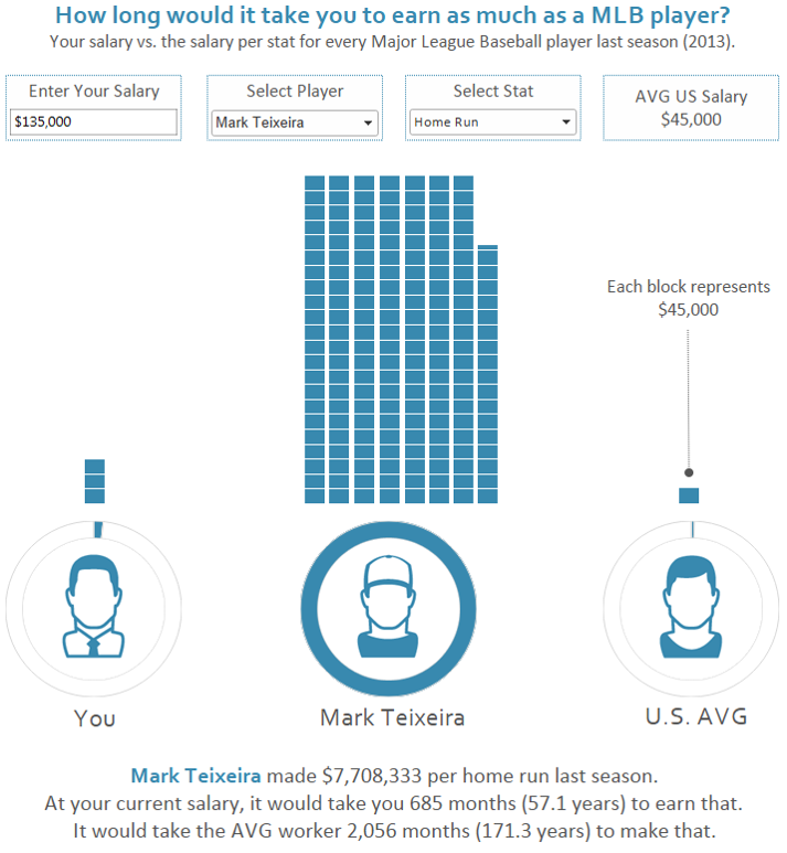
We want to point out that the only elements in this entire design that required any Adobe Photoshop or Illustrator skills are the three icons, and even the foundation of those were built using stock Illustrator files from iStockPhoto.com. The chart type surrounding the icons were built in Tableau. If you would like to learn how, see our Tableau 201 post, How to Make Donut Charts in Tableau. There are plenty of techniques you can use to balance data and design, even if you’ve never used Photoshop or Illustrator.
Design enhancements you can make immediately without any graphic design experience:
1. Put some thought into your color selections. Choose simple color palettes and “mute” them by adding some transparency. For more on color, see tip three, Leverage Color.
2. Switch up the typography. Choose some unique fonts that are easy to read and visually-appealing. Make key elements different point sizes to denote your priorities in a subtle way.
3. Lay your data visualization out in a way that guides the end user through your story and provides some spacing for each element. For more on dashboard layout, see tip five, Use the Golden Ratio.
4. Pay attention to the details. This is perhaps the easiest way to make your data visualization stand out. Whenever end users think a data visualization looks really good, but they can’t quite explain why, it’s because of the details. Clean your dashboards up by minimizing lines. Add borders to marks such as bars and shapes. Add some transparency to show overlapping values.
These are just a few of probably dozens of tiny changes you can make to your work. These details add up quickly, resulting in a polished, professional piece that will maximize the chances of your story being shared.
Written By

Evolytics
This post is curated content from the Evolytics staff, bringing you the most interesting news in data and analysis from around the web. The Evolytics staff has proven experience and expertise in analytics strategy, tagging implementation, data engineering, and data visualization.