Chartjunk is a term coined by Edward Tufte in his book, The Visual Display of Quantitative Information. In it, Tufte defines chartjunk as “non-data-ink or redundant data-ink”. Our interpretation of chartjunk is that it is any design element that is counterproductive, actually detracting from a data visualization rather than adding value to it. Chartjunk can be as brash as charts that are made to fit within a graphic, with the data almost a complementary element to an illustration (see the work of Nigel Holmes). It can also be as subtle as a three-dimensional bar or extra gridlines. Calling non-essential elements ‘chartjunk’ is a fair criticism, but the same person who invented the term also said the following:
Only a picture can carry such a volume of data in such a small space.
– Edward Tufte
Landing in the Middle
As with most debates, the truth probably lies somewhere in the middle. When the design becomes the primary purpose of a data visualization, it can become distracting and even misleading. Neglecting design completely and a data visualization can be unengaging. In our last tip, we explained the importance of balancing data and design in data visualization. The tasteful use of graphics is one way to do that.
Chartjunk is not always composed of graphics. There are several examples of ‘non-data-ink’ outside of graphics including extra gridlines, shading, and three-dimensional marks. In the same way, graphics do not always create chartjunk. In fact, graphics are one of the most powerful ways to communicate information in a small space, and they also help engage an audience.
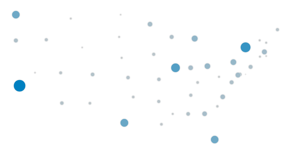
Consider the following ‘symbol map’ showing sales by US state. This is technically a scatterplot with a circle on each combination of latitude and longitude. The circle is sized and colored by the sales amount. Here is the scatterplot with no image:
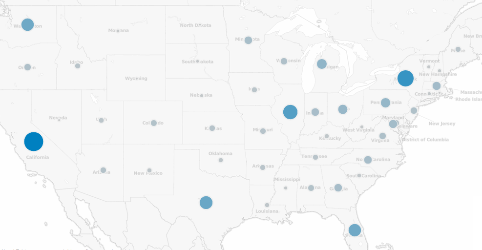
Now see what happens when we add a background image to the exact same scatterplot:
The map graphic helps you decode dozens of latitude / longitude pairs almost instantly, leveraging schemas for state locations that you have been building up in your mind over many years. The map also provides geospatial context which can lead to additional insight that you may not have uncovered looking at a crosstab or bar chart view. This would be especially powerful with an additional data layer, such as showing sales by zip code in relation to store locations.
How to Engage with Graphics
Research shows that people process visuals 60,000 times faster than text descriptions. To help communicate more efficiently and engage your audience, consider using graphics to help complement your data visualization in these three ways:
Background
An attractive background can be a great way to contain a data visualization while communicating what the piece is about. A background with a clear interior container for the charts and graphs is not a distraction, but we do caution you to leave the background as the background. Once background elements overlap or become the primary message of a data visualization, it is counterproductive and takes the end user longer to find the story that your data is sharing.
Icons
By using icons instead of words to communicate what a number represents helps end users understand what’s happening in your data visualization without them even having to read. For example, a dollar icon could be used to represent sales. Icons also help reduce language barriers in the case that your data visualization is viewed internationally.
Marks
Think about a scatterplot showing the sales by three departments: furniture, office supplies, and technology. You could use a unique shape to represent each of the three departments, but this would cause the end user to look back and forth to the legend to determine which shape represents which department. One alternative would be to use graphics as your marks to cut out the middleman and help your end user process the view faster. For example, a chair, stapler, and phone could represent furniture, office supplies, and technology, respectively.
Using graphics is about first engaging your audience, and then helping them process your data visualization more efficiently.


