Propaganda is defined in Merriam Webster’s Dictionary as:
Manipulation of information to influence public opinion.
By this definition, propaganda can be intentionally or unintentionally spread, with the repercussions being an uninformed/misinformed public . This is the basis for my ‘Data Propaganda’ series, to look past opinion, let the data dictate the story, and accurately represent the data.
Much like statistics, data discusses precise numbers and can sound quite authoritative. Therefore, we are more likely to instantly believe this information, rather than question it. Examples of data propaganda can be found in just about any media fixture, and any environment. Advertising, sports, and news outlets among others are in frequent violation of presenting data in a way that is inaccurate or oversimplified. Though data propaganda exists in areas other than data visualization, this is an area in which there is great power in changing it. Below are some common data propaganda pitfalls, and how to avoid these in your own data visualizations.
Truncated Axes
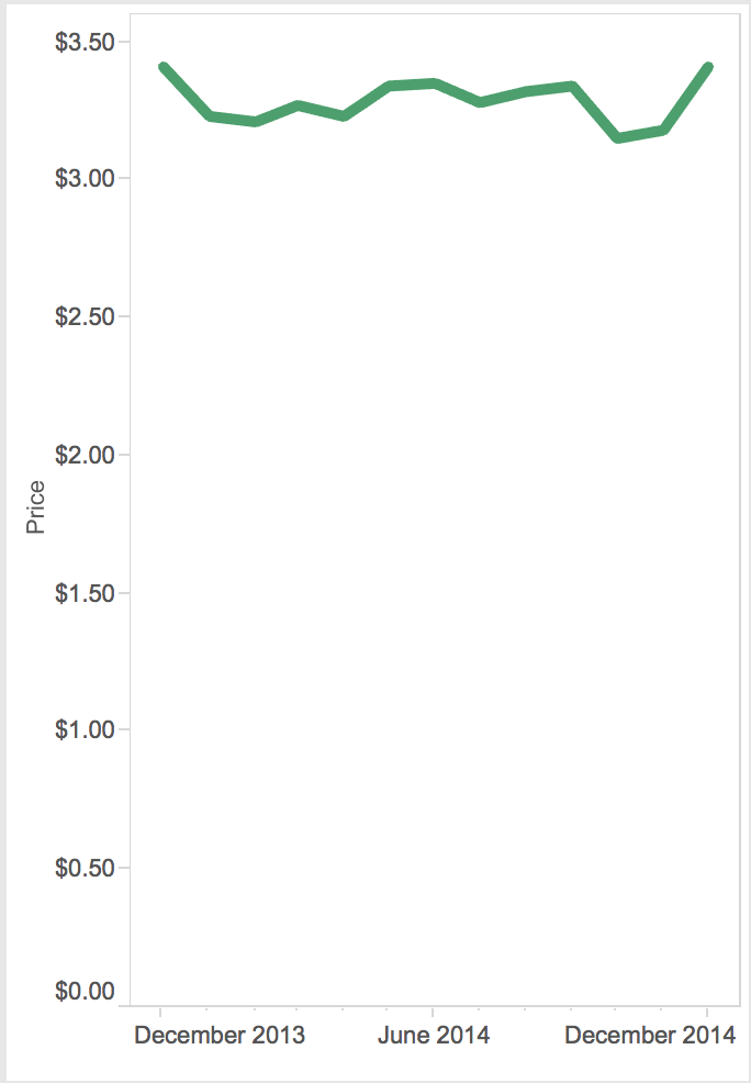
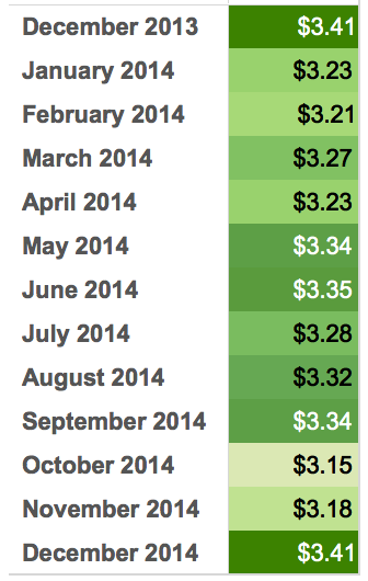
One of the most common ways that data visualizations are skewed is by using a truncated axis. This is when an axis has been altered to start at a number other than zero. Below, the price of a certain (imaginary) cereal is represented over 13 months, but notice the axis starts at $3.10. While this may make sense in some cases, beware; setting your axis to a fixed range to visualize your data may cause more undue panic than is intended. The volatile ups and downs dramatize the changes throughout the year.
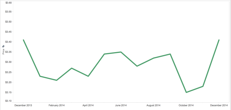
Let’s take another approach; Try changing the width of your chart to show volatility in price over time to more of a sparkline. This accomplishes a similar effect without distorting the view of the data. For more on sparklines, visit our Tableau 201: How To Make Sparklines post.
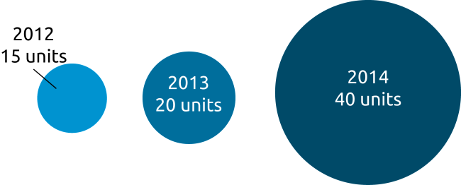
Scale
Scale, or relative size, is a surprisingly often overlooked component to accurate data visualization. This is regularly a tactic used to exaggerate differences between two data points to further a story or cause. The difference in some cases is more subtle or hard to tell. In the bubble chart below, the 2014 bubble shows 40 units – twice the amount in the 2013 bubble, and 2012 at 15 units. However, the relative size of the 2014 bubble is larger than two times (2.375) as big as the 2013 bubble, and the 2012 bubble appears much smaller than 2013, despite only having a difference of 5 units.
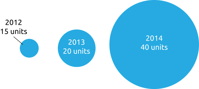
To correct this, the author should scale shapes to be sized relative to the other shapes in the view. To add context, you can also color your shapes by the same data used to determine the size. For example, the 2014 bubble in this example is both sized and shaded to scale. For more data visualization tips on color, visit our Leverage Color post.
Selective Sampling
Another way that true data can be made to be misleading is selecting only data points that support a certain narrative. Let’s take that cereal example again, but look at only the last 3 months of 2014. One could say that the price has risen 8% and increased by 26 cents.

This could sound like a significant increase, but when looking at the year over year data, the price of the cereal was the same in December 2013, as it was in December 2014, with relatively little fluctuation throughout the year. Looking at a larger data set over time gives context to not only the visualization, but also the story the data is telling as a whole.
Data propaganda has a large reach, and it can be hard to address without being labeled as a skeptic, pessimist, or conspirator of sorts. However, as an analyst, it is necessary to question the material presented to you, and by doing this you counter data propaganda. Keep fighting the good fight you data enthusiasts, truth seekers, and myth busters!
Written By

Evolytics
This post is curated content from the Evolytics staff, bringing you the most interesting news in data and analysis from around the web. The Evolytics staff has proven experience and expertise in analytics strategy, tagging implementation, data engineering, and data visualization.