This post is part of our Six Favorite Tableau Tips, Tricks and Hacks to Enhance Dashboards collection.
Tableau is a powerful data visualization and analysis tool that can easily represent several metrics in one visual. Sometimes you may want to include multiple metrics in a visual but display them individually when selected. Depending on your visual however, metrics with different units are sometimes difficult for Tableau to display accurately without some customization. This can be fairly tedious, and if you’re new to Tableau, or on a tight deadline, you need a quick solution.
Let’s imagine a stakeholder wants to view a series of metrics as individual line graphs, including sales and profit ratio. Sales is a whole number in the currency format, and profit ratio is a percentage. We can create a parameter to select a desired metric and then use it in a calculated field to display the corresponding metric. You can learn how to do this from our blog post called Tableau 201: Allow Users to Choose Measures and Dimensions.
The default format for the axis will not change from currency to percent as our metric changes. The calculated metric swapper will always be formatted as a regular number. We can manually set the axis format to either currency or percentage, but then the format will be wrong for one of the metrics.
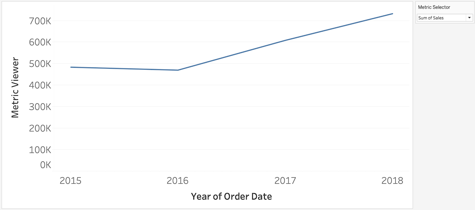
Default – Sales
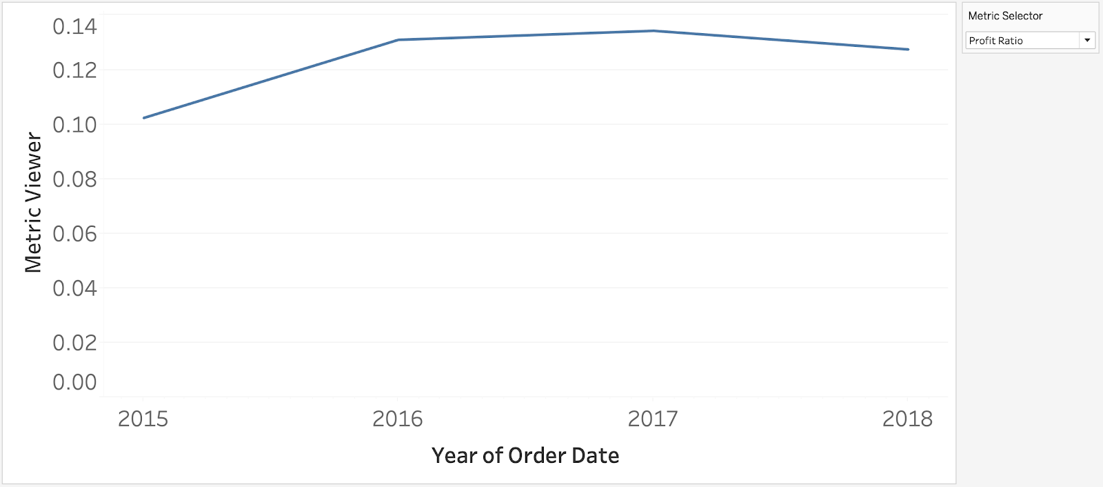
Default – Profit Ratio
So how do we solve this problem? By connecting our existing metric selector parameter to a sheet swapper filter! We create two different sheets, one for each metric. We can then set the axis format for each metric and display the correct sheet while hiding the other. This looks like we’re swapping the metric on a single chart, but we are actually swapping the entire sheet.
Creating a Sheet Swapper to Display Metrics of Different Units
Step One: Create Sheets for Each Metric
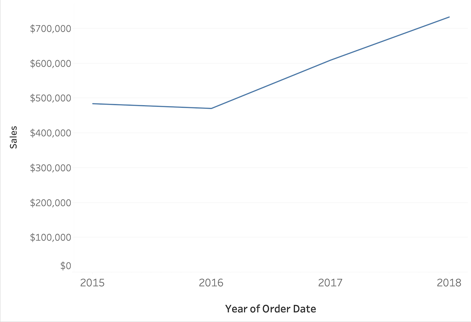
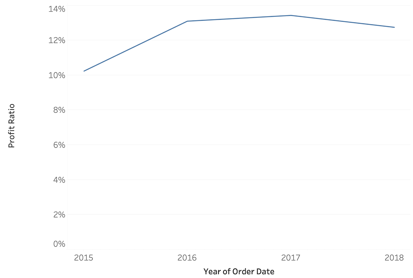
First, create two separate sheets for each metric you want to display. You can duplicate functionality from one sheet and then format each y-axis appropriately. For the Sales chart, we format as currency, and for Profit Ratio, we format as a percentage.
Sales Sheet
Profit Ratio Sheet
Step Two: Create a Calculated Field for Custom Filtering
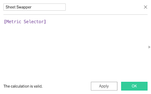
Next, create a calculated field that uses the value of your existing metric selector. You can call this field “Sheet Swapper” in your workbook.
Step Three: Use Calculated Field to Filter Worksheet for Individual Metric
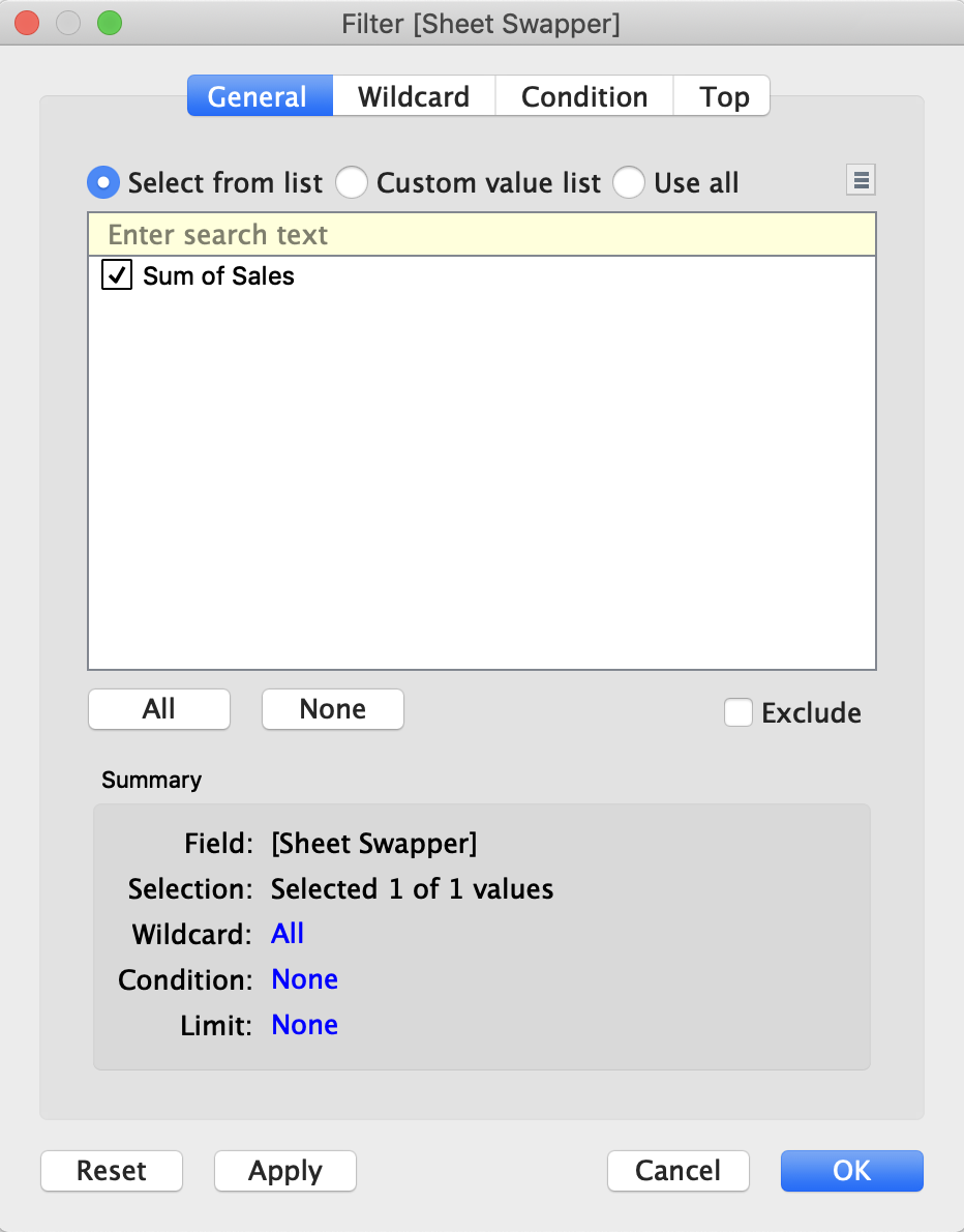
After creating the “Sheet Swapper” calculated field, drag it to the Filters shelf of your Sales sheet. Make sure “Sum of Sales” is selected in your Metric Selector parameter, so the value is an option in your filter. When the dialog box appears, select the “Sum of Sales” value.
Repeat the same steps for the Profit Ratio sheet, ensuring that you change your parameter so the correct value is displayed. You can also use the “Custom value list” option and manually enter values. This is handy if you have multiple values and don’t want to change the parameter to display each value while setting the filter.
Step Four: Create the Dashboard with Sheet Swapper
After creating individual sheets and formatting to the correct unit, we can build out the sheet swapping functionality in a dashboard. Select Dashboard > New Dashboard, and from the Objects section in the bottom-left of the screen, we pull in a vertical or horizontal container – either will work.
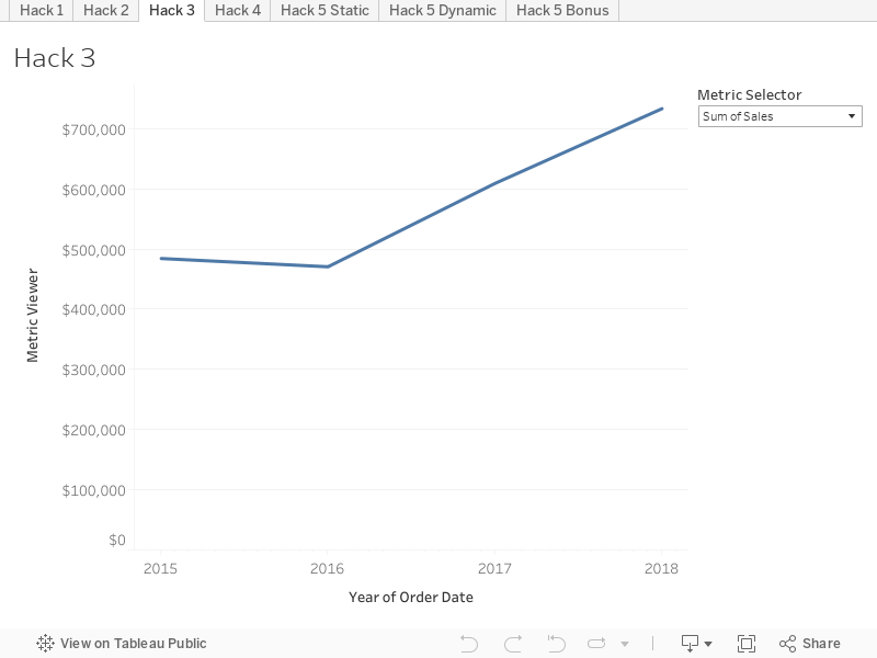
Next, we individually add each sheet into the container. Right click and select Hide Title from both sheets. Only the sheet corresponding with the Metric Selector value should show a chart. Display your Metric Selector parameter and toggle your selections to see the sheet swapper magic happen!
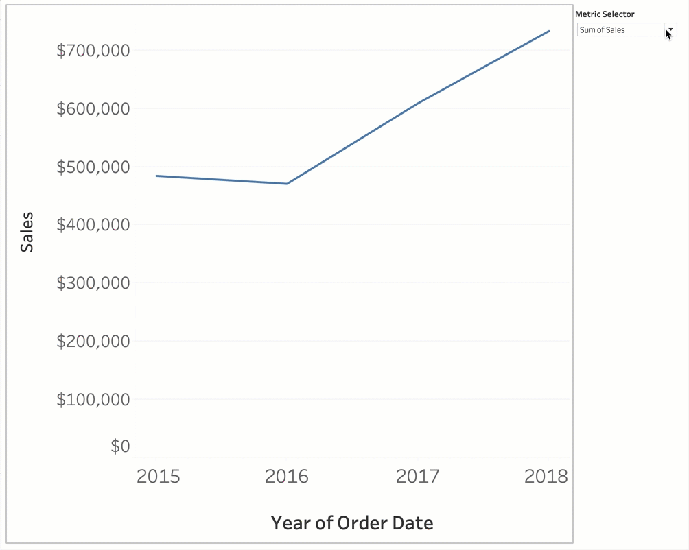
When toggling between Sum of Sales and Profit Ratio, the entire sheet changes to the chosen metric while the other one disappears. You can also use a similar method to insert entirely different visuals of various data in one container as referenced by Tableau.
We hope this post inspires you to keep learning the ins and outs of Tableau to keep building awesome dashboards!
Final Workbook on Tableau Public
Written By

Evolytics
This post is curated content from the Evolytics staff, bringing you the most interesting news in data and analysis from around the web. The Evolytics staff has proven experience and expertise in analytics strategy, tagging implementation, data engineering, and data visualization.