In this post, I expand on a previous Tableau tutorial on How to Make Bullet Graphs. I cover a common request we get from clients to show the current year value, prior year value (or goal), and the index. If you have a large number of dimension values or metrics to display, this can generate a lot of marks, which becomes overwhelming when trying to explicitly label each value. With an Index Bullet Chart, we leverage mark types, color, and labels to create a clean visualization with a lot of information.
If you’re not familiar with indexes, check out another one of our Tableau tutorials on How to Make a Stoplight 100 Point Index. That post also explains how to create a custom step color palette for assigning index colors.
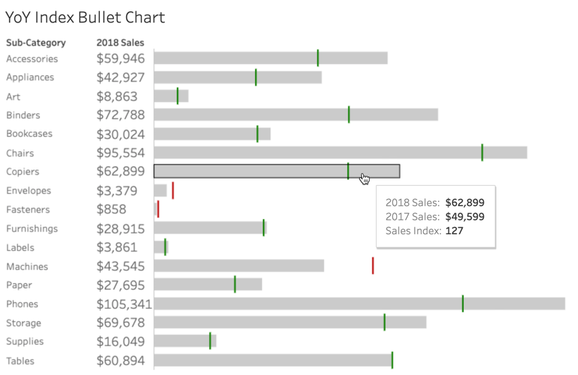
Here’s what we’ll build together in this tutorial:
Index Bullet Chart
Click here to access the workbook on Tableau Public.
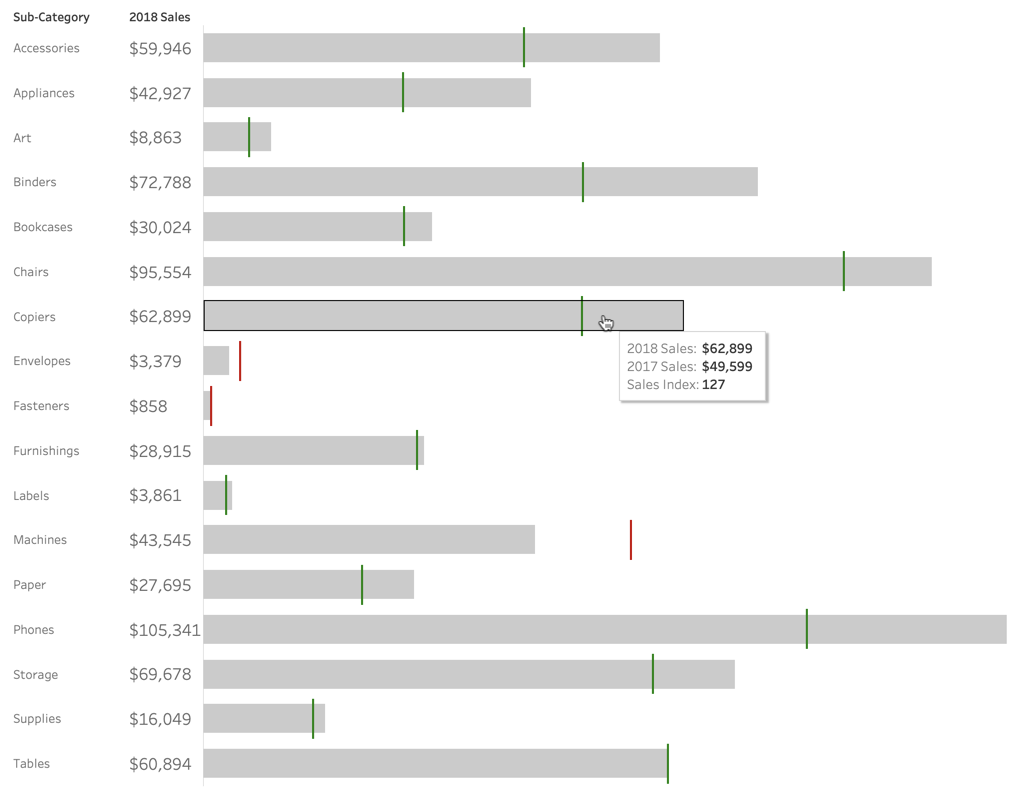
Index Bullet Chart Explanation
Let’s dissect the chart so it’s clear what’s being shown:
- The number and grey bar represent 2018 Sales.
- The colored gantt bar represents 2017 Sales on the same scale as 2018 Sales.
- The color of the gantt bar represents where it falls in our index scale.
- Green = 100+
- Yellow = 95-99
- Red = 0-94
- The tooltip displays exact figures for 2017 & 2018 sales, as well as the index value.
- (Optional) If your stakeholder wants to see the index value without hovering, you can place it to the right of the gantt bar like this:

Create Sales and Index Fields
As in the previous tutorial, we pretend we are in a different year (2018) since the sample superstore data set only runs through 2018. We create calculated fields to isolate sales from 2018 and 2017.
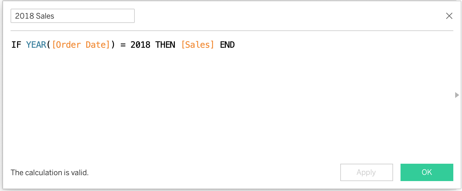
Repeat this calculation for 2017 sales.
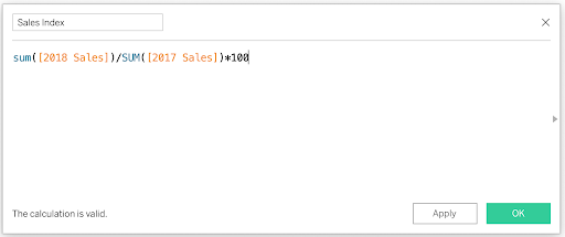
To create our sales index field, we need to take the sum of 2018 sales divided by sum of 2017 sales, and then multiply by 100.
Visualize Each Year of Sales with Bar and Gantt Charts
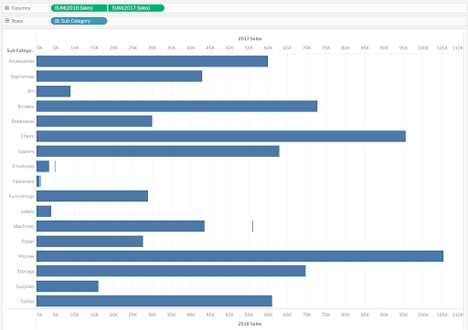
To visualize each year of sales, we use a dual-axis chart consisting of a bar showing 2018 sales and a gantt bar showing 2017 sales. First drag 2018 Sales and 2017 Sales measures to the columns shelf, and Sub-Category to the rows shelf. Change 2017 Sales from bar to gantt bar. In the original bullet chart tutorial, we used a reference line for previous year sales, but since we want to dynamically color based on the index value, we need to use dual-axis on this visualization.
At this point, you should have a visualization that looks like this:
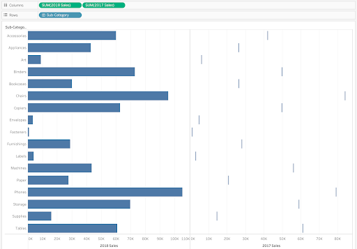
Next, right-click on the 2017 Sales pill and select Dual Axis. Tableau will probably change your 2018 Sales mark type to a circle, so change that back to a bar. Also remove the Measure Names field from the color of both pills. Right-click one of the axes and select Synchronize Axis. This will put both sales measures on the same scale. You should end up with the following:
The last step in creating the chart is adding a label for 2018 Sales. Instead of using the label mark of the bar chart, I like to use a discrete measure pill on the rows shelf, so it doesn’t interfere with the bullet chart. Drag your 2018 Sales measure to the rows shelf, make it discrete, and set the format to currency. Your visualization should now look like this:

Format the Visualization
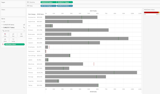
We need to format our chart to clearly indicate what info we want to convey. First drag the Sales Index field onto the color mark for the gantt bar (2017 Sales). Format the color based on your organization’s standards (see this post for how to create a custom color palette for a continuous measure). We often set >100 to green, 95-99 to yellow, and <95 to red. Coloring the gantt bar by Sales Index should look like this on your visualization:
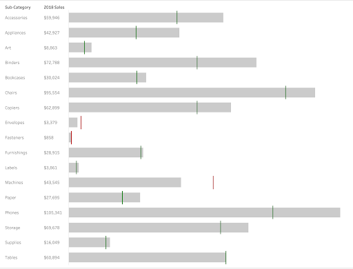
Next reduce the opacity of 2018 Sales bar to 50% and bring down the size a touch. This let’s the gantt bar pop when it sits on top of the bar. You can also make the gantt bar a bit bigger to increase the effect. Remove axes, grid lines, and row dividers for a cleaner look. Here’s what a cleaned-up version of the viz looks like:
To highlight the 2018 Sales numbers, increase the size of the label to 12. Then feel free to adjust tooltips as you see fit. Here’s an example of a relevant streamlined tooltip:
Benefits of Using Bullet Charts for YOY Comparison
This chart conveys a large amount of info in a clean manner, quickly becoming a client favorite. It displays goal progress, with a color-coded quick and easy indicator of KPI performance year over year. This allows a stakeholder to quickly identify which product subcategories are over or under performing from the previous year for deeper analysis and optimization.
I hope this visualization helps you uncover insights in your own data and optimize your KPI performance over time.
