Have you ever needed to show measures from different sheets on the same scale? You might be in this situation if you are leveraging a dual-axis (such as an Index Bullet Chart) and cannot use the Measure Values pill to stack horizontal bars on top of each other to show different time frames of the same measure. While a rare use case, this hack demonstrates Tableau’s versatility nicely.
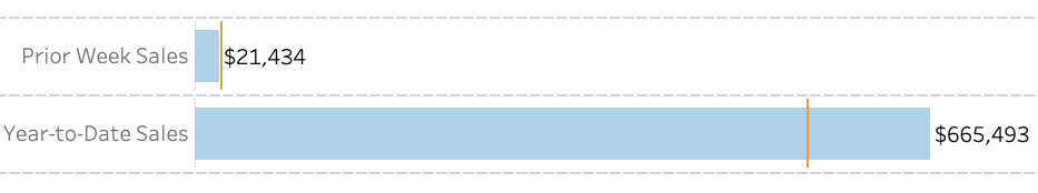
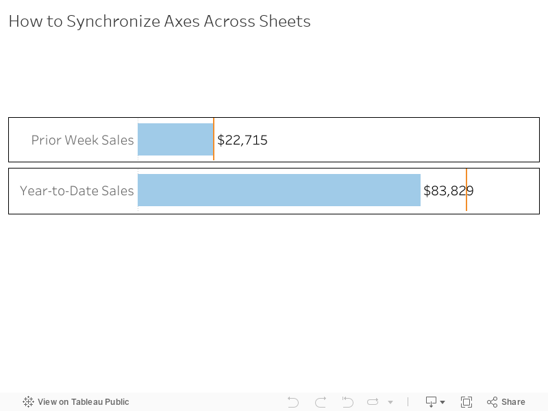
Here’s what the final product looks like. Two (or more) sheets on one dashboard with the same scale. The trick here is leveraging a hidden reference line.
Click here to access the completed workbook on Tableau Public.
Prep the Data
For my example, I will use the standard Sample Superstore data set that comes with 2019.3 to build the foundation of an Index Bullet Chart. One of the most pertinent use cases for synchronizing axes across different sheets is showing the same measure in different time aggregations. I’ll use prior week and year-to-date for this example. Since the Sample Superstore data set only goes through 2018, I will first show you a trick for updating the sample data dates relative to today so our date filters work as intended.
Create a calculated field called NEW Order Date and input the syntax below.
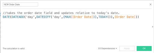
This calculation finds the maximum date in the data set and the difference from today’s date. It then adds that value to every date. Keep in mind your numbers will not match mine, and my numbers may vary from screenshot to screenshot because the date filters are relative.
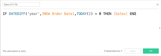
Create the Calculated Fields
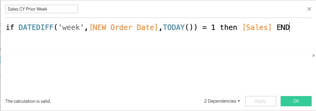
There are a multitude of ways to calculate measures at different time aggregations. I usually use the CP/PP and Date Equalizer method (outlined in How to Compare Two Date Ranges on One Axis) in conjunction with filters. To keep it simple for this example however, I’ll use calculated measures. Create a calculated field called Sales CY Prior Week. This gives us the current year sales numbers for last week.
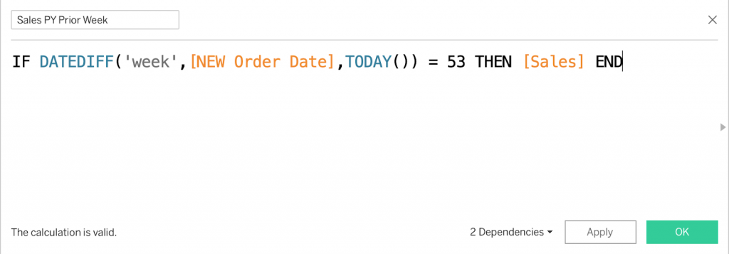
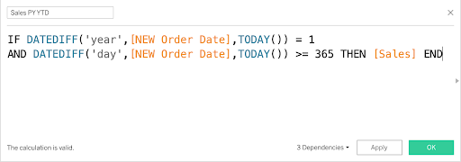
Create another calculated field for last year’s sales for the same period called Sales PY Prior Week.
Next we need to create year-to-date sales fields for both the current year and prior year.
Lastly, create label fields to use as row headers so it is clear what fields are represented in the chart.
Build the Worksheets
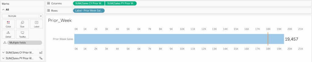
Create a new worksheet for the prior week sales measures. Drag both fields onto the Columns shelf and right-click on the second one to create a dual-axis. Then right-click on one of the axes, and select Synchronize Axis. Set the current year measure to a bar mark type and the prior year measure to a gantt bar. Remove the Measure Names pill from the color mark on each pill and set the bar to light blue and the gantt bar to orange. Drag the Label – Prior Week Sales pill to the Rows shelf. Since our focus here is synchronizing axes on different sheets, I won’t go into detail on formatting.
Right-click on the prior week worksheet and select Duplicate. In the new sheet, drag the Sales CY YTD field and place it on top of the Sales CY Prior Week pill. Do the same for the PY YTD measure. This should preserve your mark types and formatting.
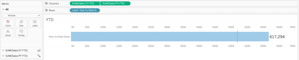
We can see in this example that sales for both the prior week and year-to-date are greater than last year’s figures for the same time period. Keep in mind that this is relative to my sample data point of reference for TODAY() and your results may differ.
Build the Dashboard
Create a new dashboard and drag a vertical container onto the canvas. Drag each worksheet into the container, placing the prior week sheet on top. Hide the titles on both sheets.
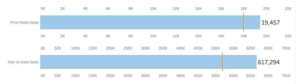
Now we discover the challenge with this approach. The bars are the same size, even though they represent vastly different volumes in sales. To correct this, we need to synchronize the axes across the two sheets. We can do this with a calculated field and a hidden reference line.
Synchronize Axes Using a Reference Line
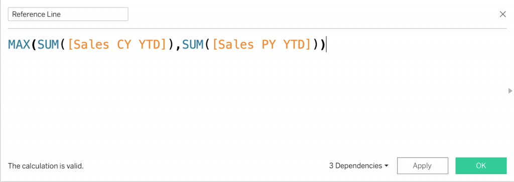
Our objective is a reference line that equals the maximum value across the two sheets. The key here is maximum value. Since the prior week will never be larger than the year-to-date value, we only need to evaluate year-to-date values for prior and current year to find the maximum. Create a calculated field called Reference Line with the following syntax.
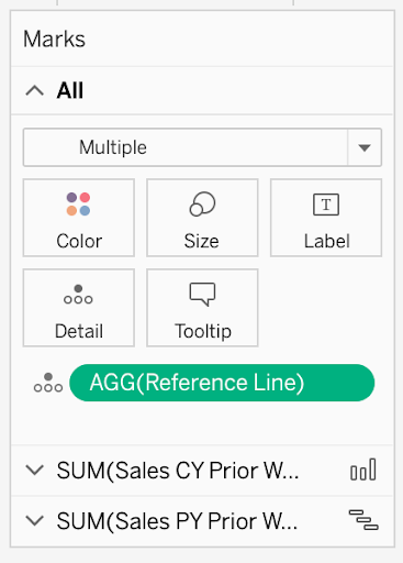
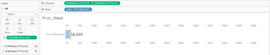
Go to the Prior Week sheet, and drag this field onto the Detail shelf for all marks so it can be used as a reference line.
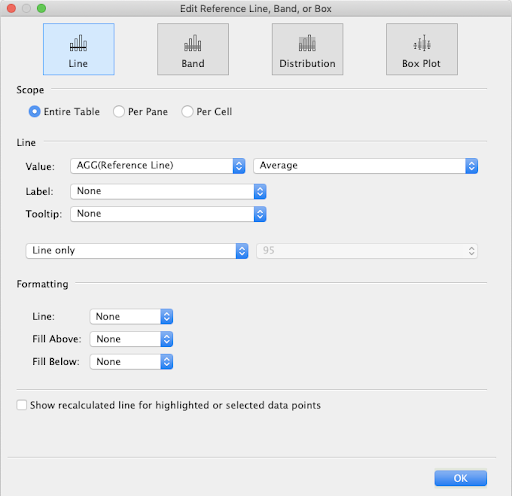
Next, navigate to the Analytics pane, and drag a reference line out for one of the pills and set the scope for the entire table.
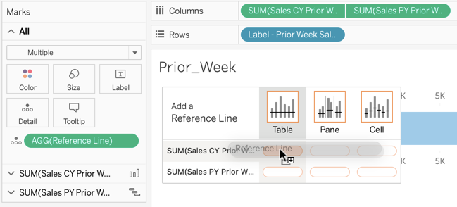
In the pop-up menu, change the value to the Reference Line field. The aggregation here doesn’t matter since the field is already using a MAX aggregation. We don’t want this line to show, so set the label, tooltip and line to None. Be sure to uncheck the Show recalculated line… box as well.
Your Prior Week sheet should now look like this.
Navigating back to the dashboard, we see the axes are not perfectly synced because of the length of the year-to-date bar label, but we can adjust this with formatting if needed. The important thing is we achieved our goal of making the prior week bar proportional to the year-to-date bar.
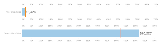
After hiding headers, the difference is unnoticeable.
Flexible Building Blocks in Tableau
While this is a niche hack that you may only use rarely, it highlights Tableau’s flexibility and versatility. You can combine Tableau’s vast and robust array of features to achieve almost any desired result. Understanding each feature and how they combine in different ways to customize your dashboard will take you to the next level of Tableau development.
I hope this trick helps you better understand the power of Tableau and adds another tool to your data viz toolbox. For more tips and tricks, check out the rest of our data viz and Tableau blog posts.
Final Workbook on Tableau Public
Written By

Jay Farias
Data Visualization Manager Jay Farias is a technology enthusiast who specializes in Tableau. He has years of experience implementing innovative technology solutions in the construction and healthcare industries. He supports Data Visualization strategy and implementation for Kantar Health and Intuit.