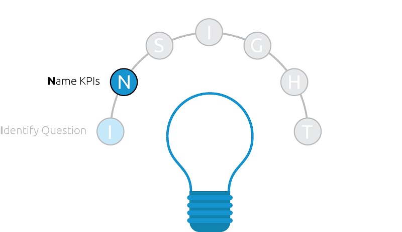
The second step in the INSIGHT framework for data visualization is to name the key performance indicators, or ‘KPIs’, that will help answer the business question identified as the focus for the dashboard. More specifically, the KPIs should be documented, which serves three key purposes:
- Aligning stakeholders on the data they agree will help answer the business question that is important to the organization. It is much easier to debate the merit of each KPI and make modifications to the list at this point rather than waiting until you have a data visualization developed. Some websites like thefinalstep.co.uk are helping businesses identify some key metrics and KPIs that they can use to benchmark and analyse the performance of any business strategy over time. Why not visit their site for more information!
- Informing the dashboard design. Once a consensus is reached on the KPIs that should be included in a data visualization, you basically have a blueprint in terms of what should be included in the final product.
- Providing a historical record so you can review how requirements change over time. It is common for a business environment to change to the point where new KPIs or ways of looking at the data emerge. You may discover a customer segment you want to focus on or realize that a KPI is no longer helping answer the business question. Allowing some room for change is okay, but it helps to maintain a record of the dashboard evolution.
The KPI-naming exercise is not a one-size-fits-all task. It’s possible that a single KPI can answer the question at hand. Other times, several more KPIs will be required.
We try to limit our dashboards to twelve total components, including KPIs. They are called key performance indicators for a reason.
If you are finding you have more than five or six key metrics, you likely need to put some thought into what is really moving the needle for your business and differentiate between key and secondary indicators. The secondary indicators may be better served in a drilldown type of view, or you may run the risk of them muddying up the primary focus.
So how do you name the KPIs?
The best KPIs come from one of two places, or a combination of both:
- Measurement planning. Putting some thought into how success should be measured and what information is required to answer a business question is half the battle when it comes to building valuable data visualizations for your organization. Many times, this step alone provides enough to inform a dashboard’s requirements.
- Discovery analytics. If you’re attempting to answer a new business question, it is not always known what KPIs are most equipped to help answer that question. By using data visualization tools such as Tableau, there is an opportunity to quickly pivot through many metrics to get a better feel for which may be most helpful.
Let’s take another look at the data visualization, Do Old Movies Get Better With Age?; this time to see how the KPIs ladder up to answering the identified question.
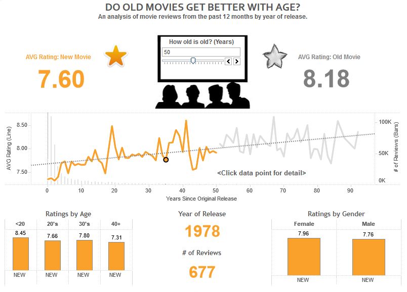
In the case of this question, “Do old movies get better with age?”, there is at least one metric that should be obviously required to help answer the question: Age.
From here, there was a choice on how success should be measured, or what constitutes a movie being “better”. Should the measurement of success be money the film grossed? Oscar nominations? Times it made me laugh? All potential choices (assuming the data are available), but let’s focus on average IMDb movie rating.
Also included is a third metric for number of reviews, as older movies tended to have a smaller sample size of reviews.
But that’s it – three “KPIs”.
The rest of the dashboard looks at those three KPIs in different ways in an attempt to help answer the question.
The first and second third of the dashboard are descriptive in nature, providing the answer and a trend right off the bat. The final third is more prescriptive in that it slices and dices average rating by demographics, which helps answer the ‘why’ behind the results.
The next post will share how to prepare the KPI data set so that it’s usable in your data visualization.
Written By

Evolytics
This post is curated content from the Evolytics staff, bringing you the most interesting news in data and analysis from around the web. The Evolytics staff has proven experience and expertise in analytics strategy, tagging implementation, data engineering, and data visualization.