The second thing we wish we knew, the first day we used Tableau, is that there is an optimal way to shape data for use with the software.
The first thing every one of us tried to do when first working with Tableau was to connect to an existing Excel report and recreate it in Tableau. After all, this was supposed to be intuitive – perhaps even magical – software, right?
We quickly found out that nothing worked as we expected, we couldn’t figure out how to make a single chart, and we had to fight the temptation to immediately revert back to our familiar Excel experience.
It’s fun to look back, and this now seems like a simple problem to solve, but the scenario we experienced in our first time with Tableau is not uncommon. In fact, it’s the most common barrier to Tableau adoption that we have come across:
First-time users connecting to an existing Excel report without any consideration to the format of the data.
Most existing Excel reports are not set up to work well with Tableau, and if this is the first data source that a first-time user attempts to work with after their data preparation, they are setting themselves up to fail.
But don’t despair – we can attest to what it’s like to start using Tableau without any data or visualization software experience. We have always said that there are three or four key things to know when getting started with Tableau, and sometimes you just need somebody to share them with you so you can connect the dots and get started.
Actually, that’s the inspiration behind the Five Things I Wish I Knew the First Day I Used Tableau series and the post you are reading now.
Shaping Data for Use with Tableau
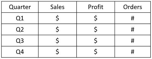
This topic is easiest to illustrate, so take a look at the first image, which is meant to be similar to a typical report in Excel:

There is a title along the top, a column header for each quarter, and a row for each KPI (Sales, Profit, and Orders).
In addition, there is a total for each row on the right-hand side of the table.
The format of this report poses several problems for Tableau which, upon connecting, will try to interpret the data source, classify the fields, and set up your workspace:
- There is a title in the first row. The first two rows are critical for Tableau to interpret the data source, so we’ve immediately gotten off on the wrong foot.
- The column headers are quarters, which will cause Tableau to create a field for each quarter, when in fact the quarters should all be consolidated into one field for date / quarter.
- The KPIs are running down the first column so, by default, Tableau will not interpret these KPIs as unique fields.
- There is a total in the right column. As Tableau totals fields for you, not only is this unnecessary, it will likely lead to double-counting.
The ideal format for Tableau looks like this:
Each column now represents a unique field, so the layout is vertical instead of horizontal. The title and totals have also been removed.
With the data in this shape, Tableau will be able to look at the first row to determine the fields and the second row to classify the data (i.e. type, discrete vs. continuous, dimension vs. measure). We will discuss the ways Tableau classifies data in the next two posts in this series.
As one additional tip, if your data set includes a date field that is not in a traditional date format (as we’ve shown here with quarters), we recommend adding a column that looks like an actual date.
In this case, we have added a column for quarter as date, and chosen the first date in each quarter as the entries:
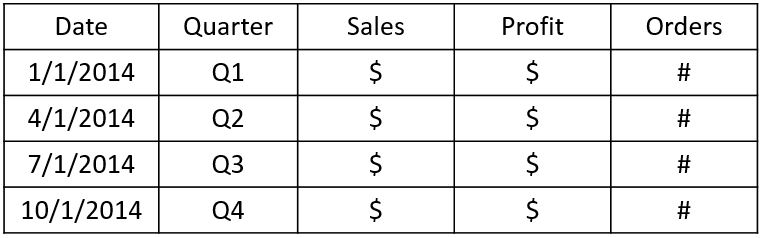
Dates are a special data type in Tableau and by having dates in a date format that the software recognizes, the full functionality of date fields is unlocked.
Finally, if data reshaping is required for you to work with a data set in Tableau, you can reshape it prior to connecting – which is our preference – or use Tableau’s data interpreter and data pivot tools when you connect.
Regardless of the method you choose, putting some thought into the shape of your data will help you get off to a strong start with your analysis in Tableau.
Written By

Evolytics
This post is curated content from the Evolytics staff, bringing you the most interesting news in data and analysis from around the web. The Evolytics staff has proven experience and expertise in analytics strategy, tagging implementation, data engineering, and data visualization.