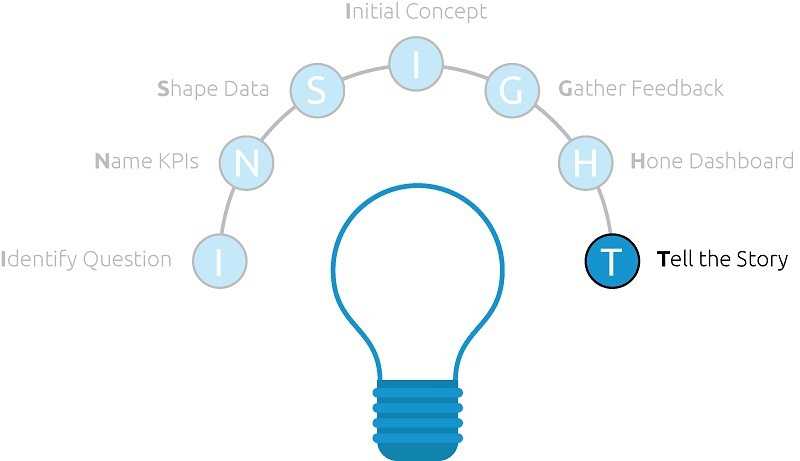
Once you have honed your dashboard and possibly iterated a couple of times to land on a final product, you are ready to distribute your data visualization. We call this step, “Tell the Story”, because you have hopefully integrated some storytelling tactics into your dashboard and your data has a compelling story to share.
Further, we believe that the entire purpose of data visualization is to find and share actionable stories that are based in quantitative evidence. If your dashboard does not provide insights that can help inspire action in your organization, it’s probably not worth sharing to begin with.
There’s not always an earth-shattering realization that comes from every single weekly report you may create. That being said, if you have put some strategic thought into identifying the business question that your dashboard is answering and how the KPIs you’re measuring will answer that question, you drastically increase the chances of your dashboard providing actionable insight.
Your Audience
Assuming you’ve followed the INSIGHT framework to this point and your dashboard is sure to provide valuable insights, your method of distribution once again comes back to the largest factor when creating a data visualization: the audience.
Dashboards are almost as diverse as the factors that go into creating the dashboard itself. They truly live on any and all points of a spectrum in terms of both their analytical sophistication and their technical infrastructure.
For example, we have created dashboards for audiences that have never heard of Tableau. With one specific analytics partner, we refreshed the dashboard data once a month and sent this as a PDF via email.
On the other end of that spectrum, we have worked with several partners that have a very robust Tableau Server implementations in place where we can post the dashboards and set them up to automatically update. This makes it a little easier to tell the story because users can subscribe for periodic email updates, and starting with Tableau 10, you can even subscribe other people to receive your dashboards with the most up-to-date data available.
Useful Tactics
Regardless of your audience, there are a few specific tactics you can use to help tell the story that emerges in your dashboard:
- Context – You won’t always be around to explain your dashboard to end users.
- Be sure to provide some context for your dashboard so your end users have an idea of what they should be looking for as they navigate your work.
- This context can be as simple as a title and subtitle on the dashboard itself, but could include additional information such as the source of the data or the date range being applied to the visualizations.
- Inline Insights – One of the most effective methods of providing findings and recommendations for next steps is to explicitly write them out within the dashboard.
- One way to do this is to design in a text box for “inline insights” that the developer or analyst can modify with their own thoughts.
- Some insights can even be automated through the use of calculated fields that will display a sentence based on the performance of the data.
- Annotations – If a dip on a line graph, for example, is influenced by an event that is not readily apparent in the dashboard, add an annotation to the line graph to provide additional context.
- In just one hypothetical example, let’s pretend that the line graph is looking at daily production. If you know the factory was closed for two days due to unforeseen circumstances, but this is not data that is normally tracked or reported to the audience, help provide this context by annotating the graph.
Storytelling Is Key
We will close the INSIGHT framework for data visualization series by using the Do Old Movies Get Better with Age? example – the winning visualization in the 2013 Tableau Iron Viz Championship – one more time – from Ryan Sleeper.
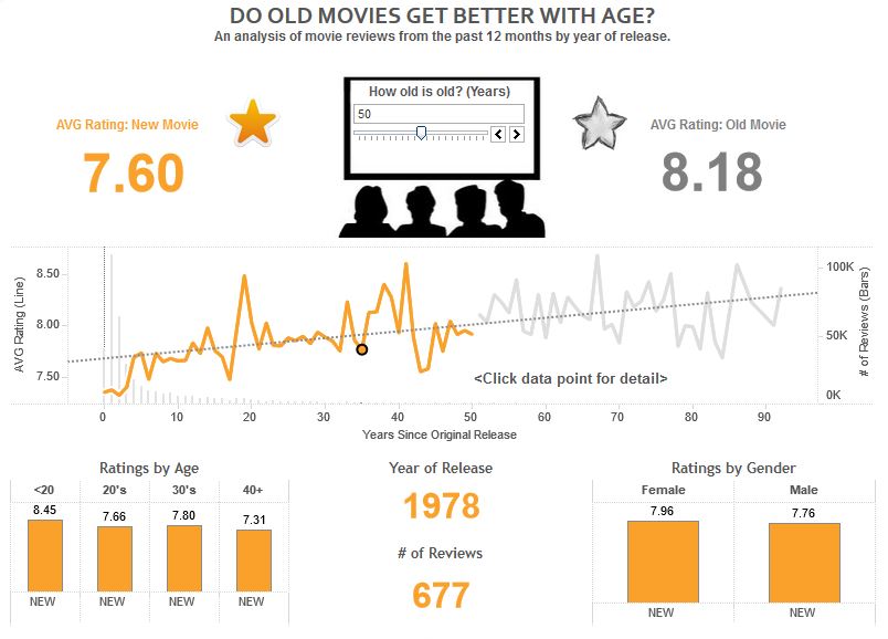
The three Iron Viz finalists each year are among the best of the best Tableau users in the world. Ryan prided himself on balancing data and design, and considered one of his competitors more skilled at design and the other competitor more skilled with data. While he thinks the balance between the two was a large factor in his victory, he believes the primary reason for winning was his storytelling ability.
At the end of the Iron Viz contest, each contestant gets to explain their data visualization. While the other two contestants used their time to walk through the technical aspects and user experience of their dashboards, Ryan told the story behind what motivated his approach. He believed this helped him connect with the judges and gave a purpose to the data visualization, an edge which allowed him to pull off the win.
In a corporate environment, the judges from the Iron Viz are the audience, and pulling off the win equates to finding and sharing a valuable insight that causes positive change for your business.
See the Data-Driven Storytelling series for more storytelling tactics you can integrate into your dashboard development process.
Written By

Evolytics
This post is curated content from the Evolytics staff, bringing you the most interesting news in data and analysis from around the web. The Evolytics staff has proven experience and expertise in analytics strategy, tagging implementation, data engineering, and data visualization.