Blog


Sharing analytics tips, expert advice and industry insights.

Data Driven Storytelling Tip #10: Use Callout Numbers

Callout numbers are one of the easiest ways to communicate what is most important to you in your data-driven story. A Google Images search for “callout” provides several examples of speech bubbles, thought bubbles, and …
Tableau 201: How to Make Bullet Graphs

How to Make Bullet Graphs is the third of a three-part post from “Use Corporate Chart Types”, tip nine in the Data-Driven Storytelling: Tips from an Iron Viz Champion series. Bullet graphs are a variation of …

Tableau 201: How to Make Small Multiples

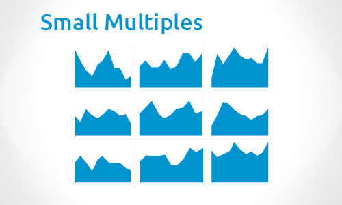
How to Make Small Multiples is the second of a three-part post from “Use Corporate Chart Types”, tip nine in the Data-Driven Storytelling: Tips from an Iron Viz Champion series. Small multiples are a group …

Tableau 201: How to Make Sparklines

How to make sparklines is the first of a three-part post from “Use Corporate Chart Types”, tip nine in the Data-Driven Storytelling: Tips from an Iron Viz Champion series. Sparklines are condensed graphs or charts …

Data Driven Storytelling Tip #9: Use Corporate Chart Types

As data visualization becomes increasingly popular and designers and analysts alike look to put their own spin on the practice, sometimes we lose sight of the fundamentals. In many ways, data visualization has become a …

Data Driven Storytelling Tip #8: Don’t Use Pie Charts

…the only worse design than a pie chart is several of them…– Edward Tufte Pie charts have become one of the most recognizable and widely adopted chart types in business and data journalism. Being that the …

Introducing Tableau 201: A Resource for the Aspiring Data Viz Practitioner

Evolytics recently relaunched the site you are using, and there is now an entire section dedicated to data visualization posts – a perfect place for us to share some of our fun Tableau work, along …

Data Driven Storytelling Tip #7: Don’t Neglect the Set-Up

If content is king, then context is God. – Gary Vaynerchuk When you work closely with a set of data for a long time, the insights that emerge may begin to feel intuitive. It is natural …

Tableau 201: How to Create Icon-Based Navigation or Filters

In the second of two parts in the Tableau 201: The Making of Odds of Going Pro post, we will show you how to install custom shapes and use the images to filter and navigate dashboards …

Data Driven Storytelling Tip #6: Retell An Old Story

Our stories are not new; yet, in the retelling we are reborn as heroes. – Harley King We’ve all been there – a few months after introducing a new reporting format, you may start to …