Blog


Sharing analytics tips, expert advice and industry insights.

Data Driven Storytelling Tip# 5: Use The Golden Ratio

Without mathematics there is no art.– Luca Pacioli The Golden Ratio, or 1 : 1.618, is a number found in patterns that we see all around us every single day. In fact, the shape of …

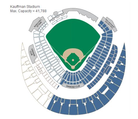
Data Viz Exploration: Visualizing the 4,627 Royals Games Since 1985

As lifelong Kansas City Royals fans, it has been a long time the last time the boys in blue were spotted in the MLB Playoffs. As you can imagine, twenty-nine seasons, particularly in baseball, provides …

Data Driven Storytelling Tip #4: Keep It Simple

I didn’t have time to write a short letter, so I wrote a long one instead. – Mark Twain We love this quote from Mark Twain because the author is putting a value on prioritizing …

Data Driven Storytelling Tip #3: Leverage Color

I found I could say things with color and shapes that I couldn’t say any other way – things I had no words for.– Georgia O’Keeffe During his keynote presentation at the 2014 Tableau Conference, …

Tableau Conference 2014: A Newbie’s Perspective

Am I really at a conference? This thought persisted through former team member Rob Harrison’s mind, throughout the 2014 Tableau Conference. From the moment he entered the building, he could tell this was not a …

Data Driven Storytelling Tip #2: Smooth the Excel Transition

Tableau is not Excel. Excel is not Tableau. One of the most common barriers to Tableau adoption is the belief that similar data visualizations can be created more easily in Excel. This may be true …

Data Driven Storytelling Tip #1: Know Your Audience

There are not many tactics that are going to improve the chances of your data visualization making a difference around the workplace more than tip number one: Know Your Audience. In fact, the tips listed in …

Evolytics Speaking at Tableau Conference 14

Evolytics is proud to announce that we will be speaking at the Tableau Conference for the second consecutive year. In fact, you will have two chances to hear from our resident Iron Viz Champion, Ryan …

Data Driven Storytelling: How Tableau’s Iron Viz is an Analogy for Data Visualization

An Analogy for Data Visualization: Tableau’s Iron Viz Championship If you have ever seen me present on the topic of visual analytics, you have heard us use Tableau’s Iron Viz Championship as an analogy for …

Tableau 201: How to Make Funnel Charts

The Odds of Going Pro In Sports viz has generated more questions around how it was created than any other viz in our history of using Tableau. With its one dominant funnel chart and icon-based …