Blog


Sharing analytics tips, expert advice and industry insights.

Tableau 201: How to Make a Heat Map

Heat maps are a visualization where marks on a chart are represented as colors. As the marks “heat up” due their higher values or density of records, a more intense color is displayed. These colors …

Tableau 201: How to Make a Box-and-Whisker Plot

The Box-and-Whisker Plot, or Box Plot, is another effective visualization choice for illustrating distributions. Along with histograms and stacked area charts, Box-and-Whisker plots are among my favorite chart types used for this purpose. They work …

Tableau 201: How to Make a Stacked Area Chart

A stacked area chart ‘stacks’ trends on top of each other to illustrate how a part-to-whole distribution is changing over time. When combined with a table calculation that computes the percent of total for each …

Tableau 201: How to Filter Out Partial Time Periods

One of the most panic-inducing visuals in data visualization is a line graph that has a sudden, and steep, decline. When there is truly an issue with the business that needs to be addressed, it …

Tableau 201: How to Equalize Year Over Year Dates

Comparing an exact date in the current year to the same date in prior years – at least on the same date axis – is tricky in Tableau. The challenge comes from the lack of …

Tableau 201: How to Compare Unequal Date Ranges on One Axis

In a previous post, we’ve shared a technique for comparing any date range in Tableau to the equal date range that immediately preceded the selection. But what do you do if you want to pick …

Tableau 201: How to Make a Waterfall Chart

This post shares how to make a waterfall chart in Tableau – a visualization that helps understand how positive and negative values of dimension members are contributing to a total. What makes waterfall charts different …

Tableau 201: How to Make a Gantt Chart

Gantt charts are traditionally used for visualizing project schedules. They are effective for illustrating task durations and dependencies in context of the larger business operation. As with several visualizations that can be built with Tableau, …

Tableau 201: How and Why to Make Customizable Jitter Plots

“Jittering” is a technique for separating overlapping marks on a view. By giving marks some extra room by separating them into different columns, hidden data is often revealed and it is easier to visualize how …

Tableau Fundamentals: An Introduction to Table Calculations

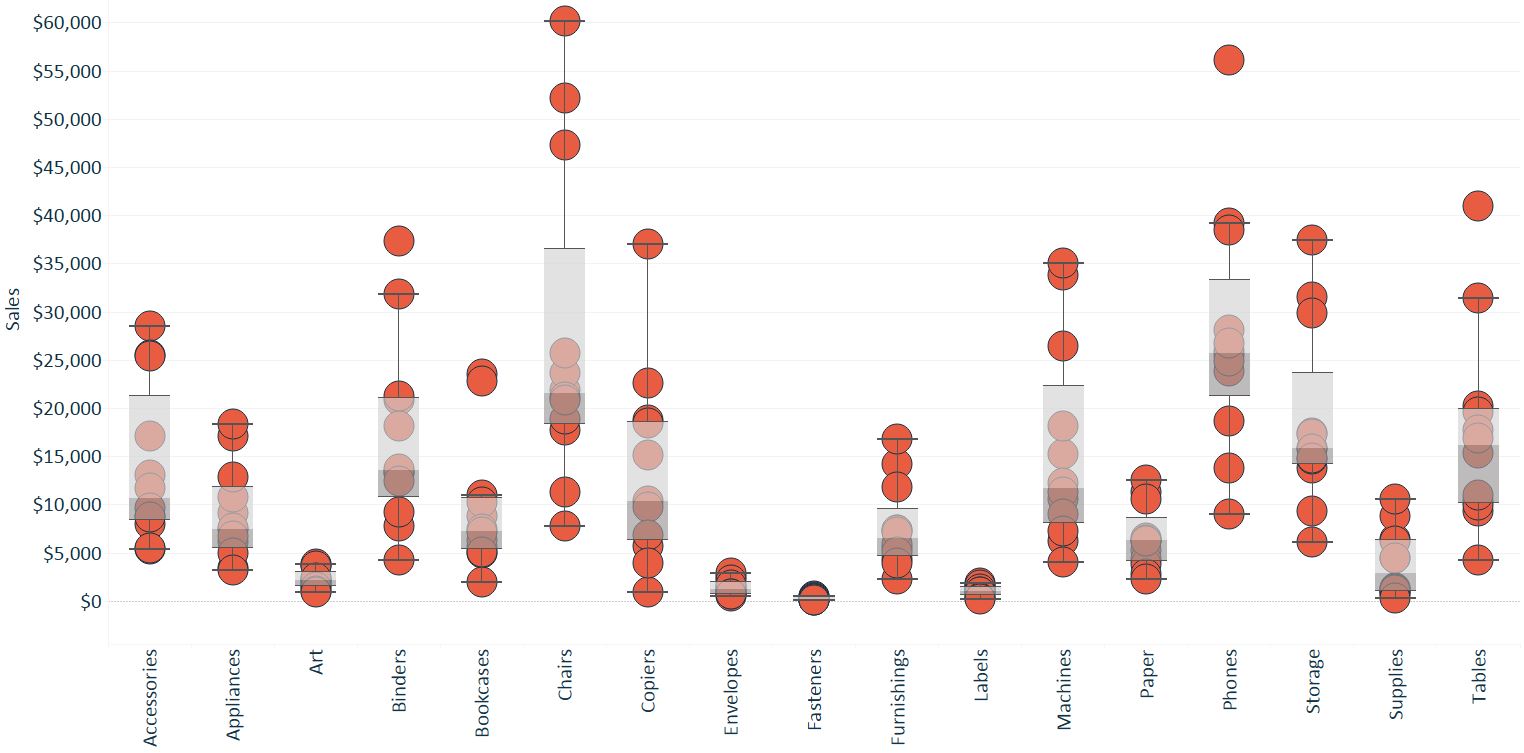
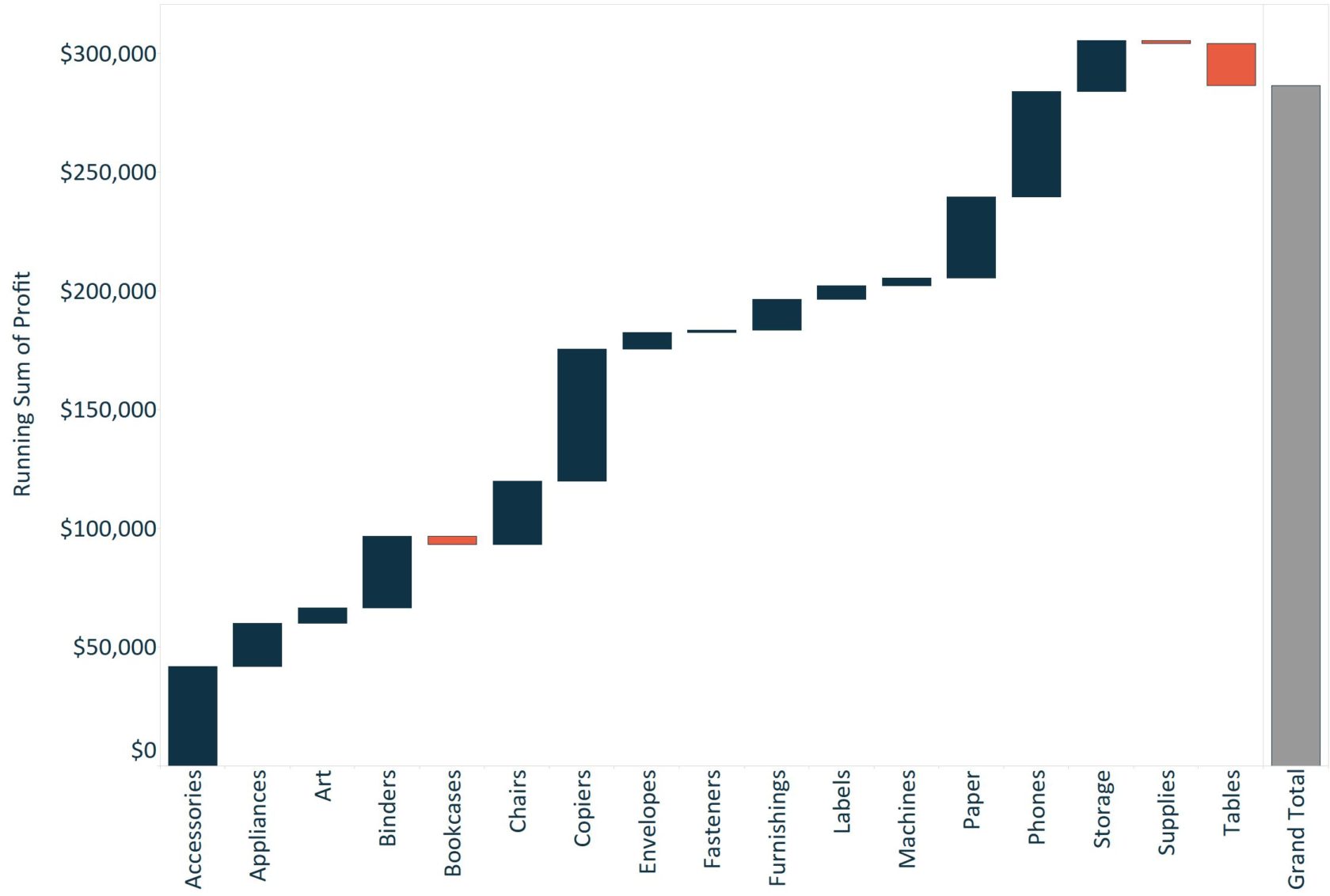
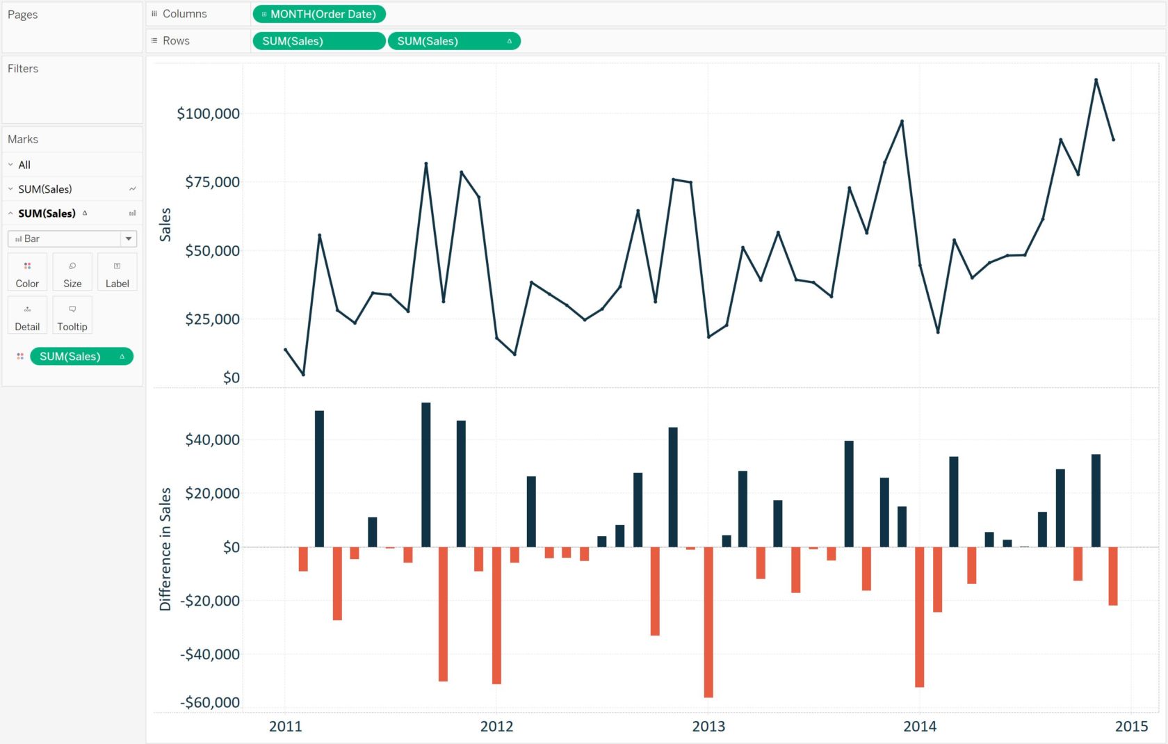
Tableau comes with several preset calculations that you can compute with the numbers on a view including running total, difference, percent difference, percent of total, moving average, and more. These predefined calculations are called table …