Blog


Sharing analytics tips, expert advice and industry insights.

Tableau Fundamentals: An Introduction to Parameters

As you make your way through the Tableau 201 series, and especially the Tips & Tricks section, there is one functionality that you will hear about over and over: parameters. Parameters are the solution to …

Tableau Fundamentals: An Introduction to Calculated Fields

Possibly the most powerful feature of Tableau is its ability to allow authors to create new data from existing data through calculated fields. Calculated fields can be used to create new dimensions such as segments, …

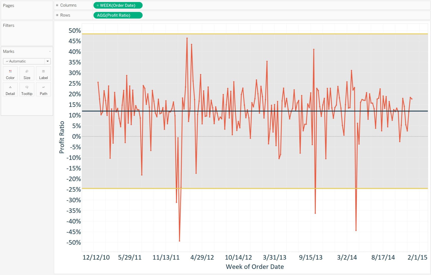
Tableau 201: How to Make a Control Chart

Control charts, or Shewhart charts, were designed to evaluate whether production is in a state of statistical control. Along with Pareto charts, histograms, and scatter plots, they are one of the seven basic tools for …

Tableau 201: How to Make a Scatter Plot

After the bar chart and line graph, we find the scatter plot to be one of the most effective visualization options for analyzing data. A scatter plot displays data points at their respective intersections of …

Tableau 201: How to Make a Histogram

Histograms are one of the most effective chart types for showing a distribution of quantitative data at one point in time. Similar to a bar chart, the important distinction is that histograms are used to …

Tableau 201: How to Make a Pareto Chart

A Pareto Chart, named for Vilfredo Pareto, is a dual-axis combination chart used to highlight dimension members that are having the biggest impact to the measure in question. On the primary axis, bars are used …

Tableau 201: 5 Tips for Creating Efficient Workbooks

One of the most common questions we receive from new Tableau users is, “How much data can Tableau handle?” Further, we commonly undertake Tableau engagements with the exclusive goal of making workbooks run more efficiently. …

Tableau Fundamentals: Line Graphs, Independent Axes, and Date Hierarchies

In the last Tableau Fundamentals post, we shared five different ways to make a bar chart in Tableau. This post walks you through how to build another kind of data visualization: the line graph. For …

Tableau 201: How to Highlight a Dimension Member Throughout a Workbook

When it comes to having a successful business there are so many things that the business will need to think about – what product will they sell, how will they sell it, what can they …

Tableau Fundamentals: Marks Cards, Encoding, and Level of Detail

The Marks Cards in Tableau provide some of the most powerful functionality in the program because they allow you to modify a view’s design, visualization type, user experience, and granularity of analysis all in one …