Now that we’ve gone through some fundamental topics such as dimension vs. measure, discrete vs. continuous, and you have an overview of the authoring interface, you’re ready to start creating visualizations in Tableau.
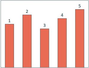
This post shares five different ways to create a bar chart and provides an introduction to the topic of aggregation.
Perhaps the most important lesson from this post is a line we hear ourselves saying almost every day: there is always more than one way to do something in Tableau.
You will find your own techniques, form your own habits, and hear different opinions – and they likely will all have merit. You truly can take multiple paths to get to the same end result in Tableau.
We are about to discuss five different ways to create a bar chart, and it’s not even a comprehensive list!
This tutorial will be using the Sample – Superstore data set in Tableau and will show five techniques for creating a bar chart out of the Sales measure.
Five Ways to Create a Bar Chart in Tableau
- The easiest way to start a bar chart in Tableau is to simply double-click on the measure you want to visualize from the Measures Shelf. By default, this will place a continuous pill for Sales on the Rows Shelf, which creates a vertical bar.
- You could have got to this same place by left-clicking and dragging the Sales measure from the Measures Shelf to the Rows Shelf.
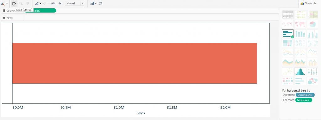
- ‘Pre-select’ the Sales measure by clicking on it, then click ‘horizontal bars’ in the Show Me options. This creates a different orientation than the first two approaches because the Sales measure is placed on the Columns Shelf instead of the Rows Shelf. If you prefer the vertical orientation, you can click the Swap icon (pictured below), use the Ctrl+W shortcut, or drag and drop the Sales measure from the Columns Shelf to the Rows Shelf.

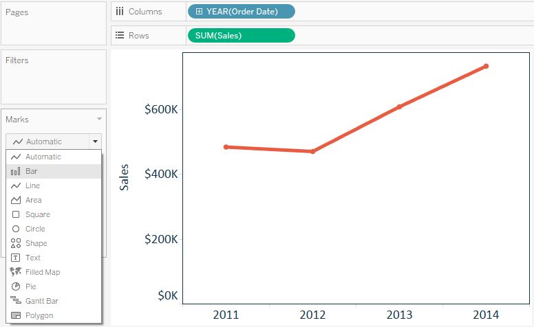
- You can change the mark type on an existing view to Bar. Let’s say you are looking at the Sales measure by Year of Order Date as a line graph. You can convert the line graph to a bar chart by changing the mark type on the Marks Shelf from Automatic (line) to Bar.

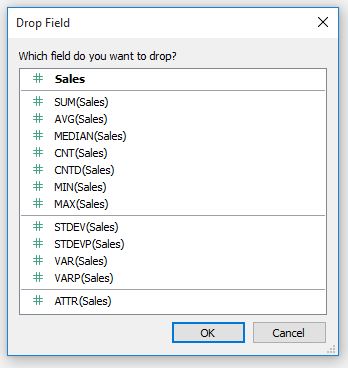
- Similar to approach 2 above, but if you right-click and drag the Sales measure from the Measures shelf to the Rows Shelf, you will be presented with the option to choose the data aggregation before the bar chart is created.

An Introduction to Aggregation in Tableau
Every measure on a view in Tableau is aggregated in some way.
It can be easy to not notice this when you’re getting started because the default aggregation is SUM, and that works for most situations. Look back at the views created through our five approaches above; the Sales measure is preceded by the word SUM to show you how the field is being aggregated.
There are several other aggregation options in Tableau, and the choice will influence your analysis.
Here is a list of some of the options and the results you can expect to see for each choice (using the Sales measure):
SUM: All of the sales added up together
AVG: All of your sales added up, divided by the number of records
MEDIAN: When sorted, the sales amount for the record in the exact middle of your data
CNT: A count of all records with sales
CNTD: A count of distinct sales amounts
MIN: The smallest sales value in your data
MAX: The largest sales value in your data
Knowing that there are always multiple approaches to the same solution in Tableau and having an understanding of aggregation will help tremendously as we start working with different visualizations and creating calculated fields in future posts.
