The Evolytics team was excited to see election-inspired visualizations using data to tell 2018 election stories.
It’s no secret that elections are gold mines of data and potential analysis. It’s important to our democracy that election results and voting practices are easy for the general population to understand. With this in mind, we chose some of our favorite political data visualizations.
Best Local Visualization
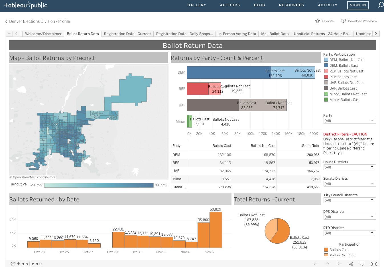
Denver Elections Division
This Denver Election Division Data Visualization Dashboard on Tableau Public uploaded data on voter registration, participation, and ballot tracking. We applaud this effort and hope to see more local municipalities making voter data transparent and easily accessible.
Best Analysis of Political Advertising Efforts
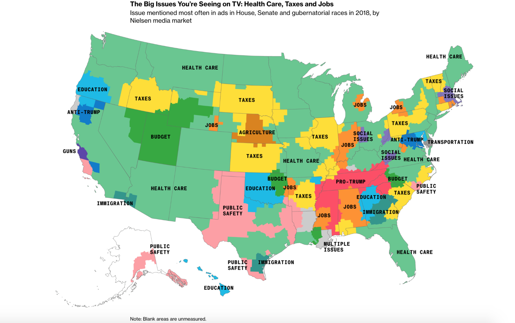
What the 2018 Campaign Looks Like in Your Hometown
More than three million 2018 election ads were analyzed by Bloomberg News across 210 local television markets to create these insightful maps of television political ad topics across the United States. Our team would love to see the market testing that went into these decisions.
Best Measurement of Get Out the Vote Campaigns
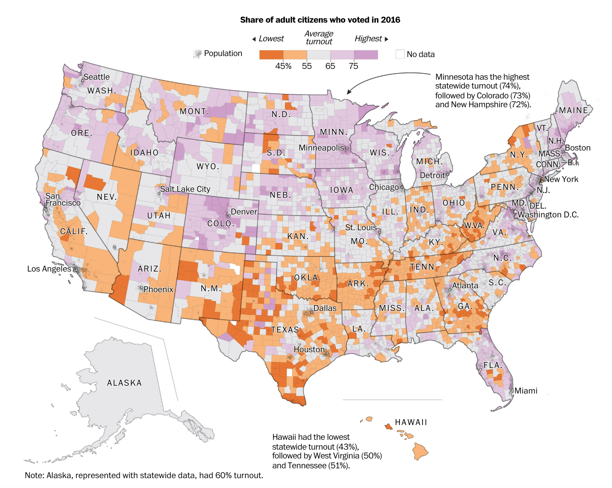
The Geography of Voting — and Not Voting
Record-setting voter turnout was projected for the 2018 midterms, but was that a high bar? Pew Research suggests United States voter turnout often trails other developed nations. This Washington Post visualization shows voter turnout county by county.
Best Visualization of Statistics, Forecasts & Impact
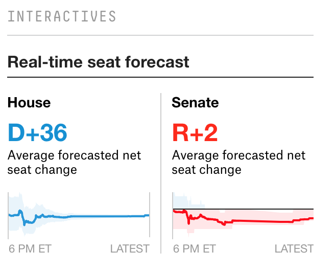
What Went Down In The 2018 Midterms
FiveThirtyEight is already a popular blog for political news junkies and statisticians alike. Their live coverage shows numerous, continually updating visualizations showing the potential impact of each projection on the House and Senate. If you could only view one website on election night, this would be it.
Best Record of Swing States
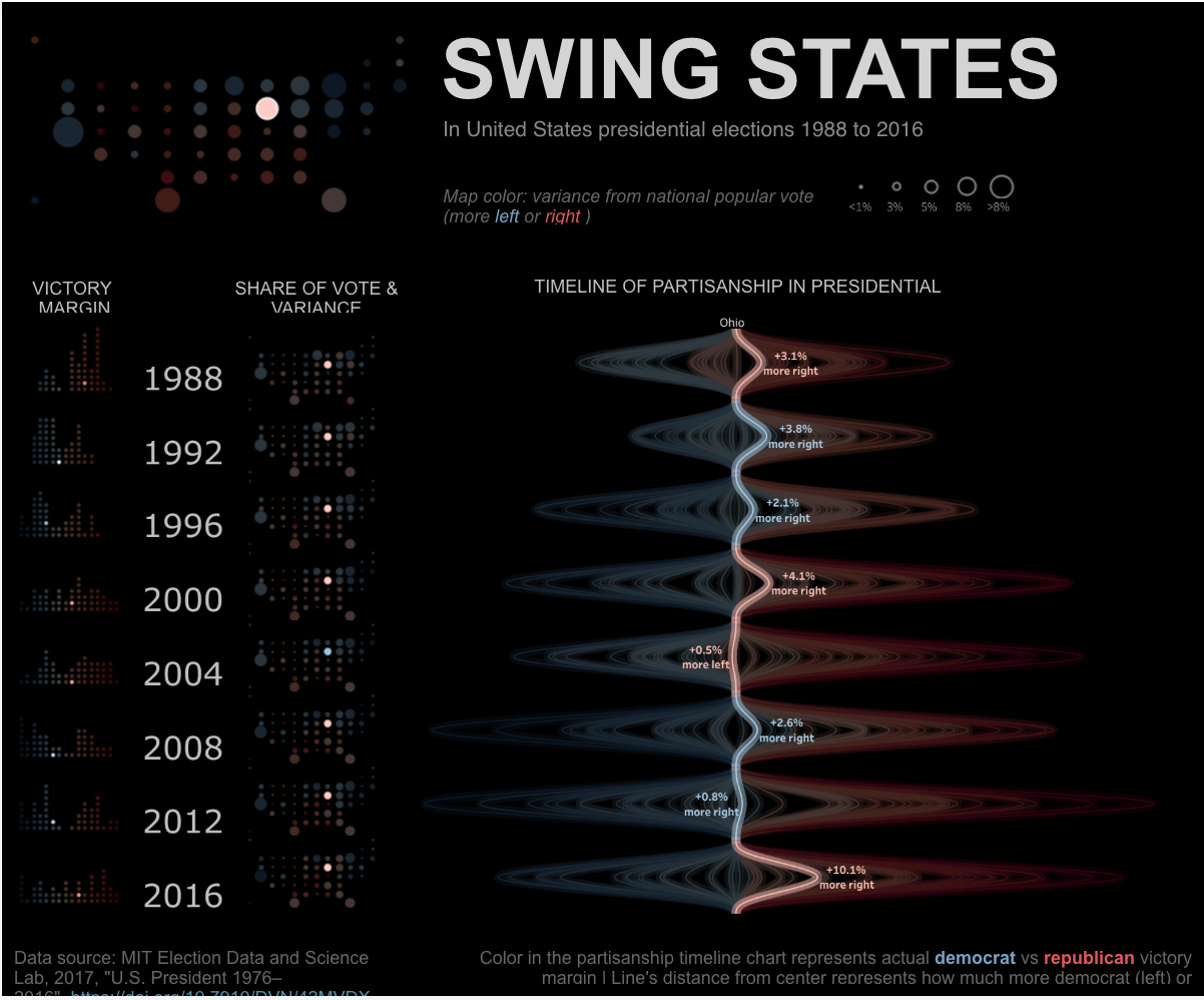
Swing States in United States Presidential Elections 1988 to 2016
If you ever find yourself wondering about the historical swing of those pivotal swing states, consider this Tableau Public visualization your go-to source.
Best Showcase of Gender Representation in Congress
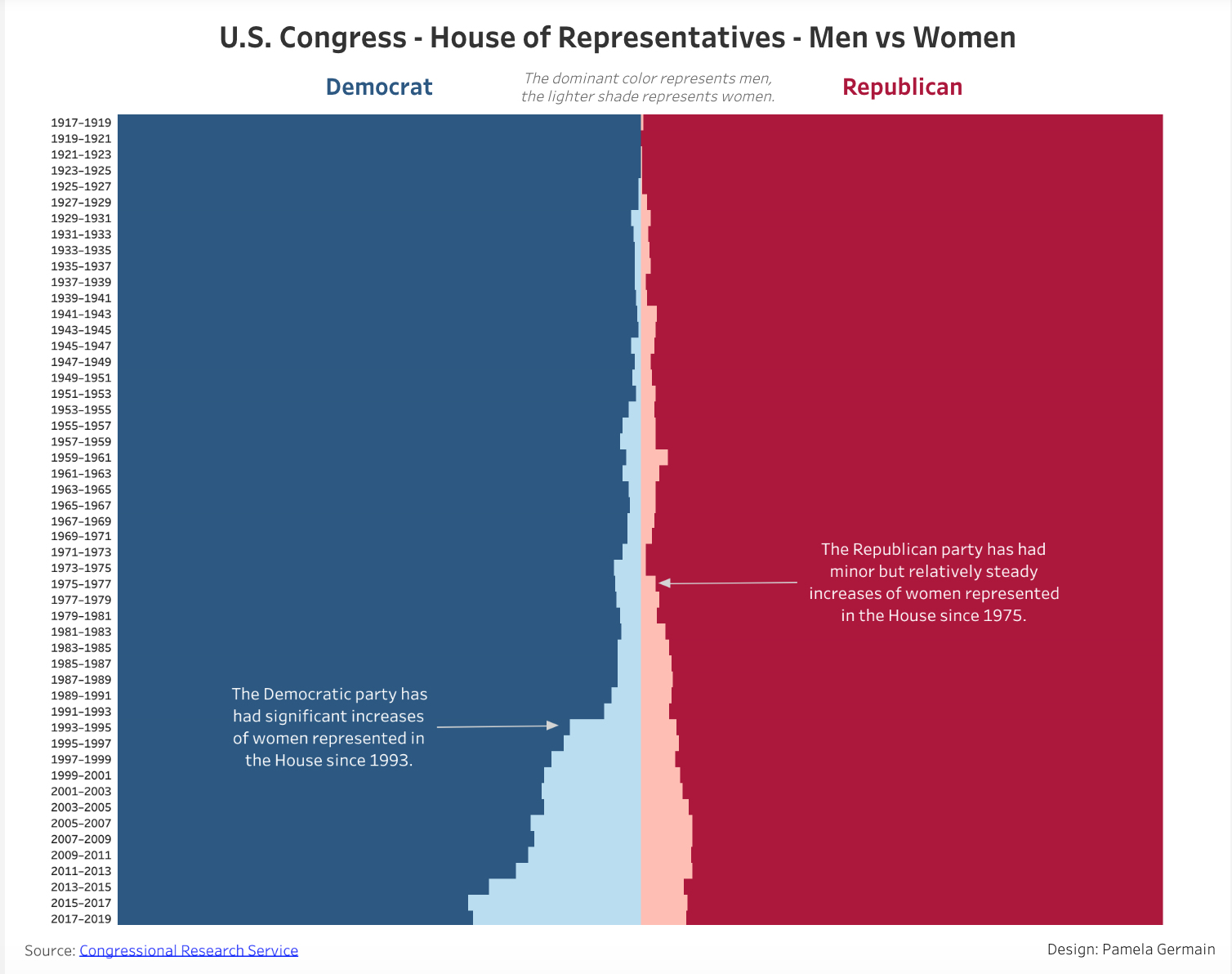
U.S. Congress – House of Representatives – Men vs Women
The 2018 midterm elections propelled a record number of women to serve in Congress come 2019. This Tableau Public visualization showcases the historic representation of men and women for both the Republican and Democratic parties.
Written By

Chase Porter
Chase Porter, Director of Data Operations, guides clients through the process of accessing, visualizing, and sharing data. His primary specialty is integrating, visualizing, and analyzing data from numerous systems to assess multi-channel program effectiveness and optimize conversion performance. He also provides analytical thinking and strategic guidance supporting performance analysis and program optimization for clients such as St.Jude/ALSAC, LogMeIn, and Intuit. Chase was nominated as a 2019 DAA Difference Maker Finalist.