Instructions on a Tableau dashboard are vital to ensuring your end users can get the most out of your work, whether or not you are there to explain it to them.
As with most things in Tableau, there are several different approaches to adding instructions to a dashboard, and there is not necessarily one best method.
Just to name a few you could:
- Add a text box to your dashboard and type out the full instructions.
- Include instructions on a second tab in your workbook.
- Not include written instructions, but display color, size, and mark legends for every dashboard object.
A go-to approach for adding instructions to the corporate dashboards is creating in Tableau to leverage a custom shapes palette and display a familiar icon to the end users.
When they see the icon, they know they can hover over it for more information, which is displayed to them as a tooltip.
Here is a look at the instructions icon I typically place in the top left corner of my dashboards:
For the reason why we choose to display my instructions icon in the top left corner, see tip five in our data visualization tips series: Use the Golden Ratio.
This is my favorite approach to including instructions because it ensures the end user has access to the instructions without requiring much real estate on my dashboards (we have cooler things to show, after all).
The end users have learned that the gear icon is their go-to place for instructions, but they will not necessarily need to be reminded how to use the dashboard after they’ve used it a few times.
In this Tableau 201 post, we will walk you through how to add a similar gears icon leveraging a custom shapes palette in Tableau.
We will also show you how to add instructions to this custom shape using a tooltip.
Step 1 : Create a Custom Shapes Palette with Your Instructions Icon
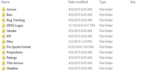
Every machine that has downloaded Tableau will have a “Shapes” folder on their computer at C:\Users\[User Name]\Documents\My Tableau Repository\Shapes.
Every folder listed in this location is associated with a shapes palette in Tableau.
Here is how our shapes folder looks on our computer:
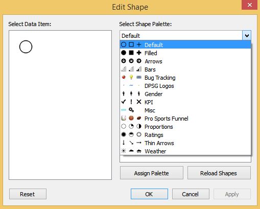
Here is how our shape palettes look in Tableau:
Notice every folder in our shapes directory has a corresponding palette in Tableau. By simply creating new subfolders in your shapes directory and adding images to that folder, you create custom shape palettes that can be used in Tableau.
Let’s try to do this by creating a new folder called “Instructions”, and placing an instructions icon in that folder. You can use whatever image you would like, but if you would like to use the icon I use, download this gears icon as a .png image:
By using .png images with transparent backgrounds, you will have the most flexibility possible when using your custom shapes in Tableau. For example, the transparency will allow you to color the image, while leaving the background white.
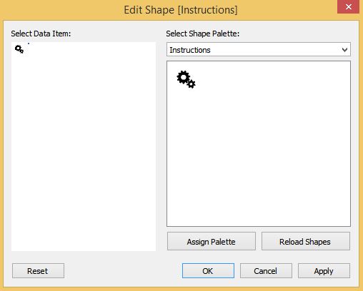
At this point, your custom shapes palette should look like this:
Step 2 : Create a ‘Dummy’ Dimension
Creating a ‘dummy’ dimension will provide a field that will act as your instructions.
To do this, create a calculated field that looks something like this:
Step 3 : Create a Sheet with Your Instructions Icon
On a new blank worksheet, change the marks type from “Automatic” to “Shape”. This will reveal a new marks card for “Shape”.
Drag your “Instructions” dimension to the Shape marks card.
You can now choose which shape you would like to assign to your instructions by clicking into the shapes palette.
If you do not see your new custom shapes palette as an option, choose “Reload Shapes” in the bottom right corner of the Edit Shape dialog box.
Map your custom instructions icon to the circle by first clicking on the circle shape, then clicking on your new icon. At this point, your instructions shape should look like this:
You can also change the color of your instructions icon by clicking into the Color marks card.
We like to drag my dummy dimension to the color marks card, which also allows us to choose from some custom colors that we have set up.
For more on color, see tip three in our data visualization tips series: Leverage Color.
Finally, you can customize what your instructions say by clicking into the Tooltip marks card and typing out your instructions.
This is what will show up when your end user hovers over the instructions icon. This acts as a full word processor, so you can build in different fonts, colors, and shapes to make your instructions as user-friendly as possible.
Get creative and tailor your instructions for your end users.
Step 4 : Add the Instructions to a Dashboard
The fourth and final step in adding instructions to your dashboard is to drag the sheet you created in step 3 above to a dashboard.
We typically make this dashboard object floating and set the dimensions to 50 high by 50 wide.
We also clear the borders and remove any sheet legends, such as the shapes legend that will appear when you place the sheet on your dashboard.
There you have it – an elegant way to add customized instructions to your dashboards without using much valuable real estate.


