Conformity is the jailer of freedom and the enemy of growth.
– John F. Kennedy
Using freeform dashboard design is an easy way to tie several of our data visualization tips together including Use the Golden Ratio and Balance Data and Design. Starting with Tableau version 8.0, data visualization developers have the option to not only select the overall height and width dimensions of their dashboards, but the ability to place charts, titles, filters, and graphics on the exact X and Y coordinates of their choosing – down to the pixel.
Creative Freedom
This feature is extremely powerful in that it removes all spatial restrictions and offers designers the freedom to use an entire dashboard canvas. Prior to Tableau 8, all dashboard elements had to literally fit inside of a box. The creative freedom that comes with freeform dashboard design provides additional means for engaging end users and making your data visualization worthy of sharing. The biggest benefit that we see from this update is that Tableau users can now create what are essentially interactive infographics. Here are just a few of the possibilities:
1. Design a background image for your data visualization that is the same height and width as your final dashboard. Place the image in the dashboard first, then float all of the elements over the image.
2. Experiment with the sizing and layout of icons and other graphics to create the best look and feel for your data visualization.
3. Place dashboard elements in better relation to associated content.
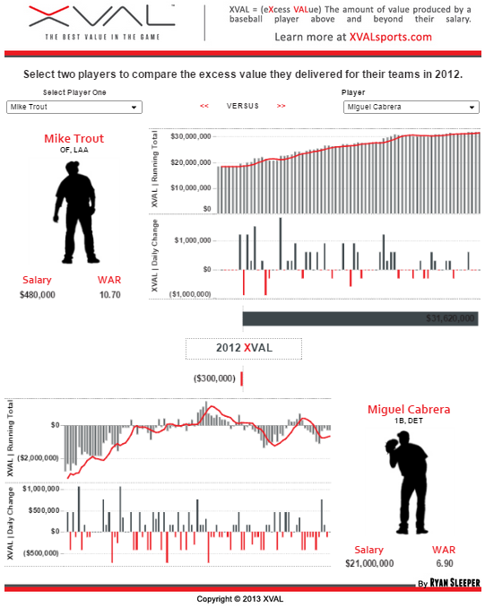
To help illustrate, take a look at a data visualization we originally created in Tableau 7, but gave a makeover in Tableau 8. In fact, this was a contest with the specific objective of showing off the new features in Tableau’s latest product release – including freeform dashboard design.
Original
Notice that every item is in its own container, with no overlap. We did not have much choice but to waste a great deal of real estate in the center of the dashboard where the main player comparison takes place.
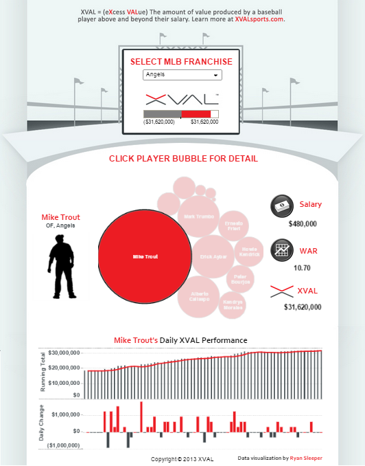
Freeform Dashboard Design
With freeform dashboard design, we were able to create an attractive background image and float everything on top of that image exactly where we wanted it, resulting in an interactive infographic. We were also able to place icons for Salary, WAR (an advanced baseball statistic), and XVAL (an advanced baseball statistic) in better relation to their titles and values. The original version garnered a respectable 3,181 views while my updated version is currently at 11,948 views – a difference of over 275%! This is the power of freeform dashboard design.


