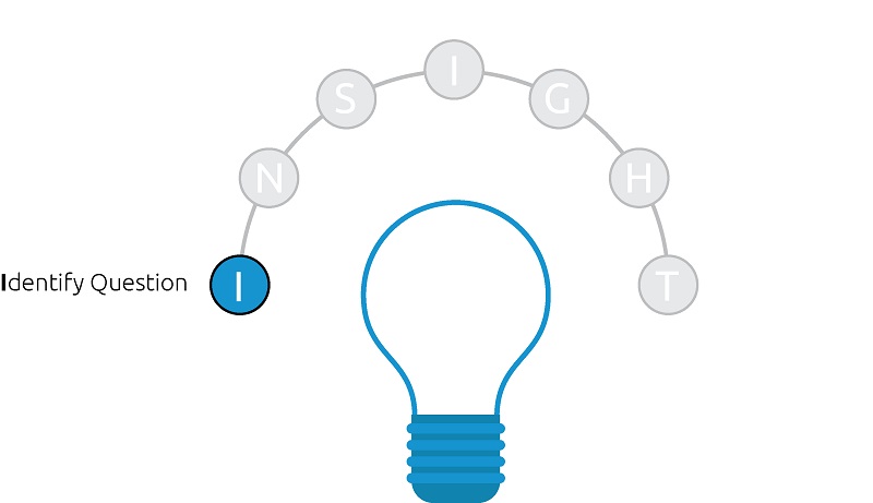
The first – and most critical step in the INSIGHT framework for data visualization – is to identify why you are making the data visualization to begin with! As a data visualization practitioner in a corporate environment, we call this step “Identify the business question”, but the concept can be applied to any question you are attempting to answer through visualizing data.
- What is contributing to our business growth?
- Where is the best place to get a cup of coffee in Seattle?
- What are the odds of becoming a professional athlete?
It’s incredible to see how often this fundamental step is overlooked in the real world. We theorize that this overlooking is due to easy access to data, making it tempting to look at too much at one time.
While it may sound convenient to put every number you care about on a single dashboard, this approach typically does more harm than good.
By having a single business question in mind when going into a data visualization design, you set yourself and your end users up for success by providing a clear purpose for the dashboard.
Further, most times it’s appropriate to literally state the question to open a dashboard. This not only provides a purpose, but gives you an opportunity to frame what an end user will be looking for in your dashboard even when you’re not there to explain it to them.
Notice that this step is called Identify the Business Question, and I can tell you that the singularity of the word ‘question’ is not coincidental. Some of the best data visualizations we’ve seen state a single question at the top. From there, the rest of the dashboard attempts to answer that single question.
Sure, additional insights, context, and ‘rabbit holes’ are likely to emerge, but by going into a data visualization design with one question in mind, you improve the chances of your work providing value.
This is because when you identify a single question, you’re almost guaranteed that your dashboard will serve at least one purpose: answering the question.
Throughout the posts about the INSIGHT framework for data visualization, we will use Ryan’s dashboard, “Do Old Movies Get Better with Age?” to illustrate how the framework can be applied in a real-life scenario. This was the winning entry in Tableau’s 2013 Iron Viz Championship, a popular data visualization contest held live at the Tableau Conference each year.
We are using this as our example to show we practice what we preach and that you can have success adopting this framework.
Here is a screenshot of the viz:
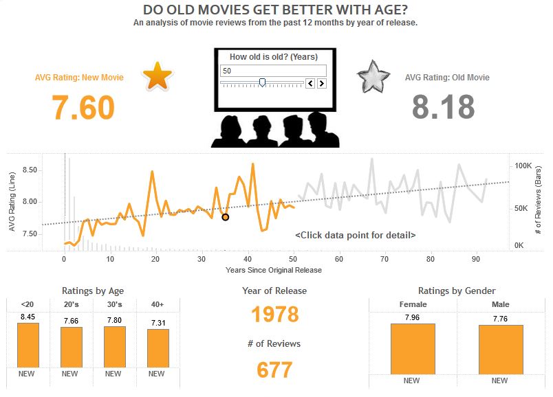
Notice that the dashboard asks a single question in the title, which makes it clear what the audience should be looking for throughout the rest of the dashboard. The next post will share how you help answer the business question.
Written By

Evolytics
This post is curated content from the Evolytics staff, bringing you the most interesting news in data and analysis from around the web. The Evolytics staff has proven experience and expertise in analytics strategy, tagging implementation, data engineering, and data visualization.