Clustering is a powerful feature in Tableau that allows you to easily group similar dimension members. This type of clustering helps you create statistically-based segments which provide insight into how different groups are similar as well as how they are performing compared to each other. We’ve always leaned on segmentation as a tactic for making my analyses with Tableau more powerful, and the post, How to Create a Scatter Plot in Tableau, shares how to make a simple quadrant-based segmentation. Clustering takes this a step further by statistically grouping the objects on a view using the variables on the view.
This post shows you how to use the cluster feature in Tableau and how to make the generated clusters more permanent for segmentation analyses.
Creating Segments
To demonstrate, we will first recreate the scatter plot mentioned above, which looks at sales and profit ratio by the Product Name dimension in the Sample – Superstore data set.
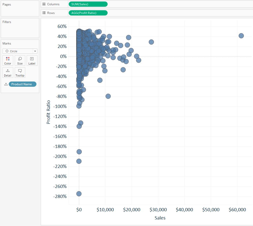
To create quadrant-based segments, at this point we would add a reference line for average on each axis. We can make this segmentation much more scientific by using the Cluster feature. Cluster lives on the Analytics Pane in Tableau, so to create a cluster analysis, simply navigate to the analytics pane (towards the top-left corner of the authoring interface) and drag “Cluster” onto the view.
What Just Happened
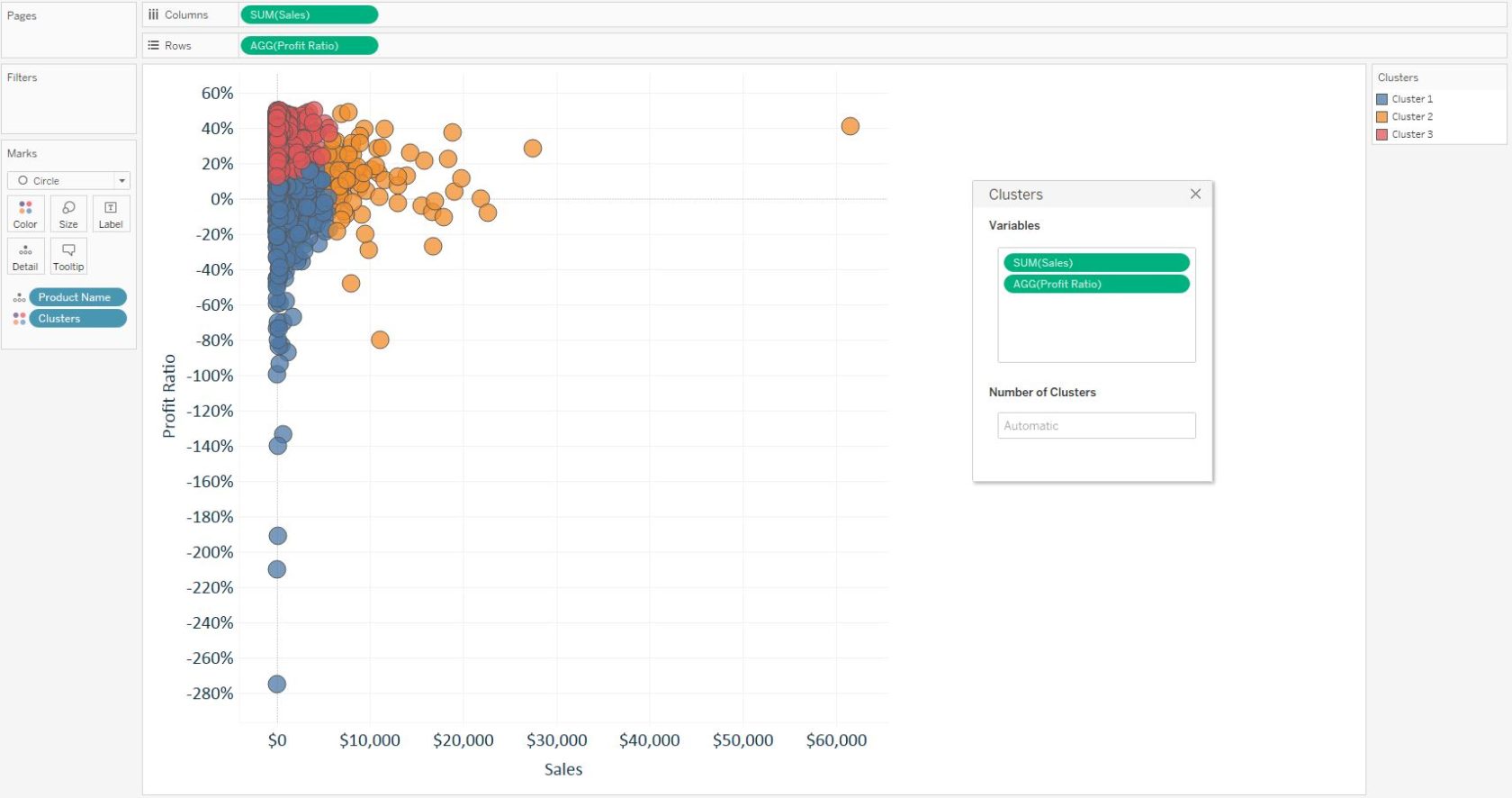
A few things to point out here:
- By default, Tableau created the clusters from the variables on the view (Sales and Profit Ratio). You can add or take away variables to customize the clusters.
- Clusters were added to the Color Marks Card, which colored each circle by its respective cluster segment. Remember that you can only color marks by one thing at a time in Tableau.
- Tableau automatically identified three similar groups of marks. This number may go up or down based on the variables in the cluster analysis. You can also manually set the number of clusters by entering a number in the box that says “Automatic”.
After you’re done creating the clusters, click the X in the top-right corner of the Clusters dialog box to remove it from the view. You can always edit the clusters again by right-clicking on the Clusters dimension on the Color Marks Card and choosing “Edit clusters…”.
But Wait, There’s More
Creating a cluster analysis is that easy in Tableau, but here are a few more ways this powerful feature can be used:
- If your resident data scientist is scoffing at your work because they don’t know how the segments were generated, you can right-click on the Clusters dimension on the Color Marks Card and choose “Describe clusters…”. This will provide all of the summary statistics and modeling you can handle!
- You can filter the view to look at only certain clusters at a given time. Dragging Cluster from the analytics pane onto the view does not create a permanent dimension on the Dimensions Shelf, but you can still filter on the field by right-clicking on it from the Color Marks Card and choosing “Show Filter”.
- If you would like to create a permanent segment from a cluster for future analyses, filter the view to the cluster of interest, use ‘Ctrl+A’ to select all of the marks (or left-click and draw a box around all of the marks), right-click on one of the highlighted marks and choose “Create Set…”.
For more on filters, see the post: An Introduction to Filters in Tableau
For more on sets, see the post: An Introduction to Sets in Tableau
Written By

Evolytics
This post is curated content from the Evolytics staff, bringing you the most interesting news in data and analysis from around the web. The Evolytics staff has proven experience and expertise in analytics strategy, tagging implementation, data engineering, and data visualization.