Blog


Sharing analytics tips, expert advice and industry insights.

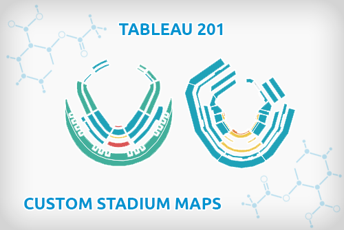
Tableau 201: How to Make Small Multiple Stadium Maps

This is part three in a three-part series on mapping in Tableau. Subscribe to our Tableau tips email list in the right sidebar or at the end of this article to be alerted as soon …

How to Map Anything in Tableau

This is part two in a three part series on mapping in Tableau. Subscribe to our Tableau tips email list in the right sidebar or at the end of this article to be alerted as …

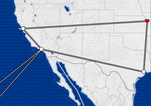
Tableau 201: How to Map a Sequential Path

This is part one in a three-part series on mapping in Tableau. Subscribe to our Tableau tips email list in the right sidebar or at the end of this article to be alerted as soon …

Evolytics to Present Keynote at Big Data Summit KC 2015

Evolytics’ Director of Data Visualization, Ryan Sleeper, will be presenting a keynote at Big Data Summit KC with Tableau on Wednesday, September 16th. Big Data Summit KC is an annual event that brings data enthusiasts …

Tableau Pie Chart: A Better Approach

Despite being one of the least effective means of communicating data, we often see Tableau pie charts in corporate dashboards and Tableau Public visualizations. New users likely see pie charts as an easy way to …

Leveraging Tooltips to Communicate Analysis in Tableau

Tableau does a great job of providing features that allow for an incredible amount of usability in a report by a wide-ranging audience. One such feature is called the “Tooltip.” (Tooltip definition at Tableau’s Knowledge …

Tableau 201: How to Add Instructions Using Custom Shape Palettes

Instructions on a Tableau dashboard are vital to ensuring your end users can get the most out of your work, whether or not you are there to explain it to them. As with most things …

10 Tableau Data Viz Tips We Learned from Google Analytics

Five years ago, we were fortunate to be introduced to Tableau, a tool for data visualization that has led to personal opportunities and contributions to our clients’ businesses that we didn’t imagine would be possible …

Tableau 201: 3 Ways to Add Alerts to Your Dashboards

One of the biggest advantages to using a tool like Tableau is that the software can do much of the ‘heavy lifting’ for you. For example, you can build in logic to improve the usability …

Tableau 201: How to Compare and Create Segments

Scenario: The data set that you’re working with in Tableau has several dimensions that represent different customer segments such as Married vs. Single, New vs. Returning, RFM Score, or whatever segments are important to your …