This is part three in a three-part series on mapping in Tableau. Subscribe to our Tableau tips email list in the right sidebar or at the end of this article to be alerted as soon as new tips are published.
In our last two Tableau 201 tutorials about mapping, we have discussed pathing maps in How to Map a Sequential Path and custom symbol maps in How to Map Anything in Tableau.
There is a third type of map in Tableau called a polygon map that allows you to map custom shapes. If you’re not familiar with these types of maps, the best example to think of is a “filled map”.
Imagine a map of sales by U.S. state where each state is colored by their respective sales volumes. With these filled maps, Tableau is essentially looking up the latitude and longitude coordinates all the way around the border of each state, and plotting a custom polygon for each territory.
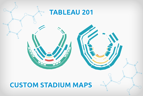
This tutorial will use one our most asked about visualizations, The Cost of Attending the 2015 World Series, to illustrate how you can create custom polygon maps with any shapes – including stadiums!
First, let’s take a look at the screenshot of the original viz:

Polygon maps in Tableau are created by looking up the coordinates of the shape you want to draw, and then connecting the dots by drawing a path between them.
We encourage you to read the first two posts in this series mentioned in the opening paragraph if you are not familiar with these concepts.
The main difference between a polygon map and a path map is that you “close the loop” around the dots by choosing a polygon mark type instead of a line mark type.
Here are the steps:
How to Make Small Multiple Stadium Polygon Maps in Tableau
1. Find an image of the stadium that you want to map.
StubHub is a good source for these images because they already have the sections broken out, but you can use any image, including an aerial photo of the stadium.
Being a visualization about the 2015 World Series, we used Kauffman Stadium in Kansas City and Citi Field in New York.
2. Follow the steps in How to Map Anything in Tableau to set up your map in Tableau and record the coordinates for your shapes.
3. Similar to mapping a sequential path, each combination of coordinates should be given a “point order”.
This is a field in your underlying data that tells Tableau what order the “dots” are connected.
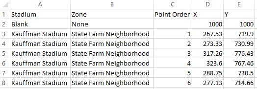
At this point, our underlying data for one section of Kauffman Stadium looks like this:
4. Once you have the X and Y coordinates for each point of each shape you want to plot, we are ready to build the stadium map in Tableau.
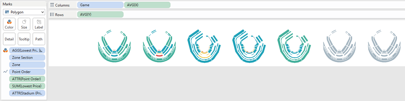
To start, put your X measure on the columns shelf and Y measure on the rows shelf; both with an aggregation of AVG.
5. Change the mark type from Automatic to Polygon, and place your Point Order dimension on the Path Marks Card.
6. Place the section dimension (and/or the dimension with the most granular level of stadium detail) to the Detail Marks Card.
Note that our maps are actually plotted by zone and zone section (which was required when the same zone name existed in two places in the stadium) so we had to add both of these to the Detail Marks Card.
If you are just building one stadium at the section level, you would place section on the Detail Marks Card.
At this point, our map looks like this:

7. This can now be made into a small multiple view by “slicing” the map coordinate measures by a dimension.
In our case, we are looking at the maps for each game of the World Series, so we put Game on the columns shelf to create a column for each game with a stadium in each cell.
From here, you can hide the axes and encode each section by putting a measure on the Color Marks Card.
Here’s what my final product looks like under the hood:
We admit that the map creation process requires painstaking attention to detail, but this step only has to be done once.
The map coordinates can then be used over and over in future analyses and the results are great!
Written By

Evolytics
This post is curated content from the Evolytics staff, bringing you the most interesting news in data and analysis from around the web. The Evolytics staff has proven experience and expertise in analytics strategy, tagging implementation, data engineering, and data visualization.