Blog


Sharing analytics tips, expert advice and industry insights.

Tableau 201: How to Highlight a Dimension Member Throughout a Workbook

When it comes to having a successful business there are so many things that the business will need to think about – what product will they sell, how will they sell it, what can they …

Tableau Fundamentals: Marks Cards, Encoding, and Level of Detail

The Marks Cards in Tableau provide some of the most powerful functionality in the program because they allow you to modify a view’s design, visualization type, user experience, and granularity of analysis all in one …

Tableau Hack: How to Conditionally Format Individual Rows or Columns

Almost every Tableau user has also been, or still is, a heavy Excel user. Being that we almost all learned Excel first, it is natural to approach a tool like Tableau for the first time …

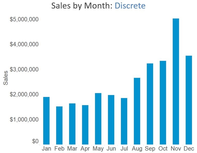
Tableau Fundamentals: 5 Ways to Make a Bar Chart / An Intro to Aggregation

Now that we’ve gone through some fundamental topics such as dimension vs. measure, discrete vs. continuous, and you have an overview of the authoring interface, you’re ready to start creating visualizations in Tableau. This post …

Tableau Fundamentals: Getting a Lay of the Land

If you are a first time Tableau user, the authoring interface can feel like an intimidating place. Without at least a quick tutorial, it can be very challenging to know how to even get started. We …

INSIGHT Framework: Tell the Story

Once you have honed your dashboard and possibly iterated a couple of times to land on a final product, you are ready to distribute your data visualization. We call this step, “Tell the Story”, because …

INSIGHT Framework: Hone Dashboard

After gathering feedback from your stakeholders, you are ready to finalize your data visualization. We call this step “hone the dashboard” because you are refining your initial concept based on the audience input provided in …

Tableau Fundamentals: Discrete vs. Continuous

The fourth thing we wish we knew the first day we used Tableau is the difference between discrete and continuous fields. This classification has an impact on what types of visualizations you can create as …

INSIGHT Framework: Gather Feedback

 As mentioned in the Initial Concept post, there is no one best way to create a data visualization and there are almost infinite factors that can influence a dashboard concept. Data visualization is a form …

Adobe Analytics: Creating a Unique Row Count Metric

Adobe Analytics’ Calculated Metric Builder offers the ability to create unlimited, on-demand metrics. With the ability to add segments to a custom metric, analysts have the ability to create virtually any metric they can dream …