Blog


Sharing analytics tips, expert advice and industry insights.

Tableau Fundamentals: Shaping Data for Use with Tableau

The second thing we wish we knew, the first day we used Tableau, is that there is an optimal way to shape data for use with the software. The first thing every one of us …

INSIGHT Framework: Name KPIs

The second step in the INSIGHT framework for data visualization is to name the key performance indicators, or ‘KPIs’, that will help answer the business question identified as the focus for the dashboard. More specifically, …

Tableau 201: How to Make a Dual-Axis Map

In the last two posts, you’ve read how to make a symbol map with Mapbox maps and how to make a filled map in Tableau. This post provides a step-by-step tutorial on how to combine …

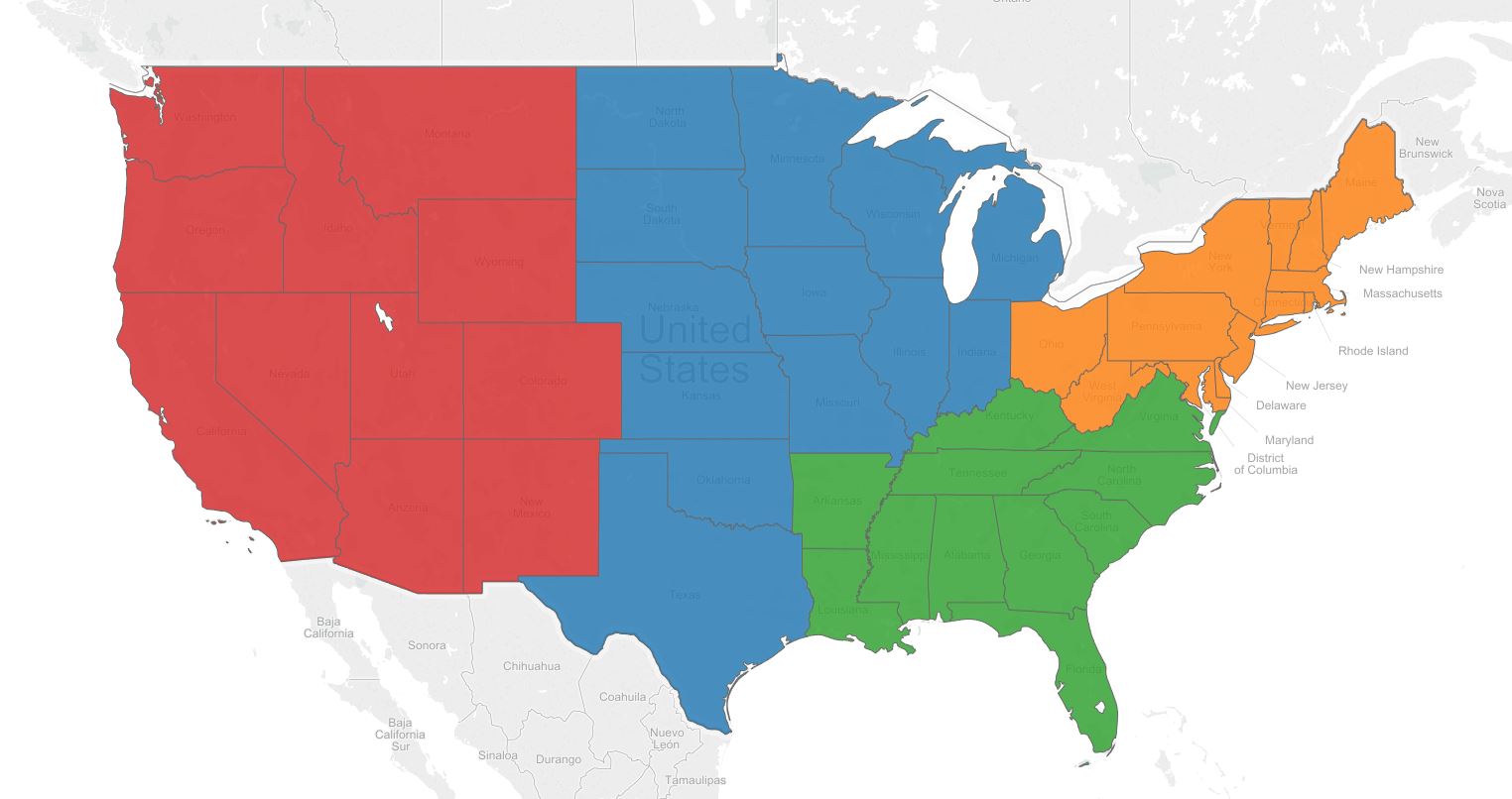
Tableau 201: How to Make a Filled Map

In the last post, we shared how to create symbol maps in Tableau with custom Mapbox maps, and how mapping in Tableau leverages schemas that you are familiar with to help you rapidly decode latitude …

INSIGHT Framework: Identify Business Question

The first – and most critical step in the INSIGHT framework for data visualization – is to identify why you are making the data visualization to begin with! As a data visualization practitioner in a …

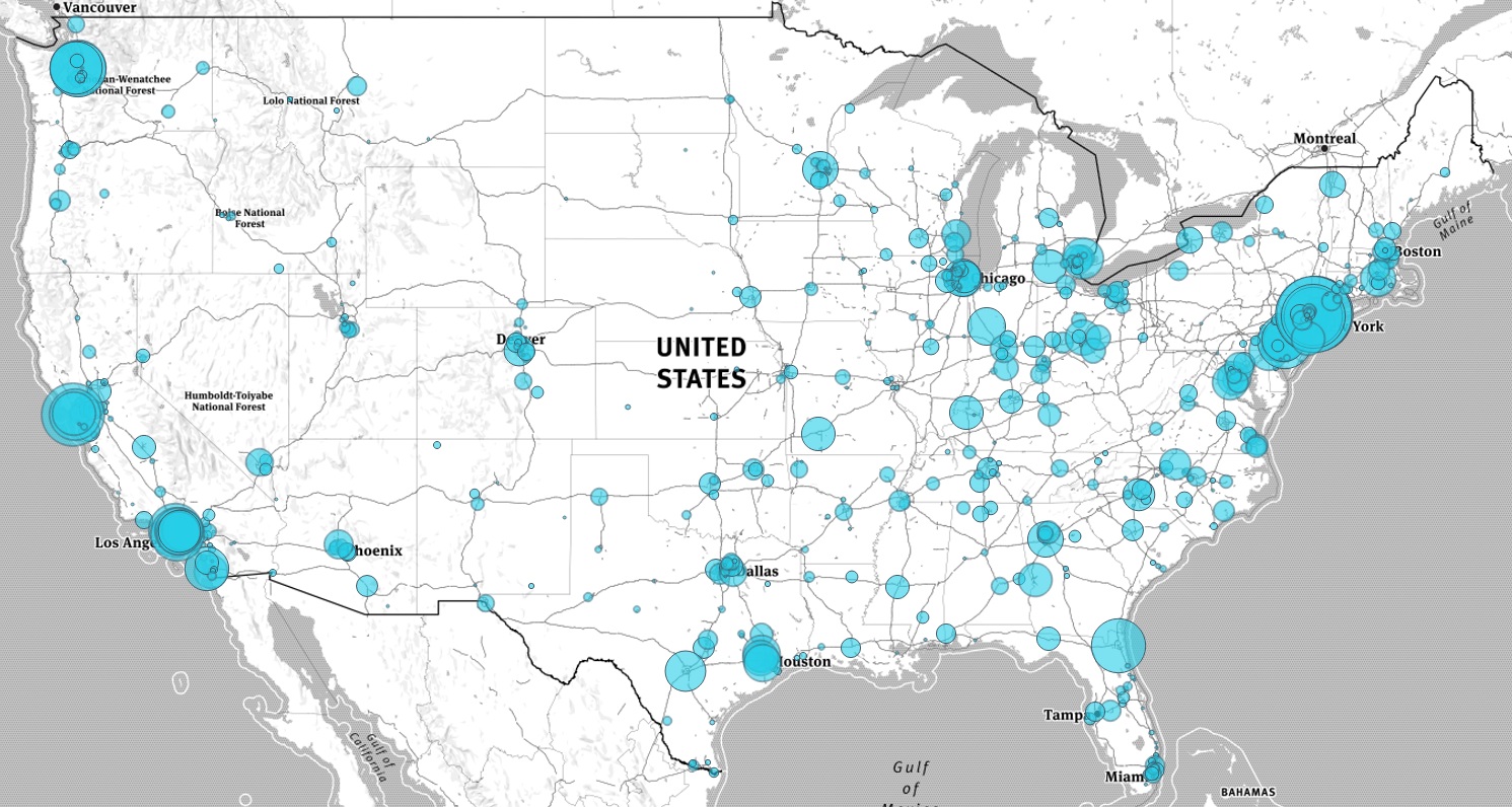
Tableau 201: How to Make a Symbol Map with Mapbox Integration

Maps, which were introduced with Tableau 4.0 in August 2008, are one of the most powerful visualization types available. The power of maps comes from their inherent ability to leverage schemas that you have been …

Five Things I Wish I Knew the First Day I Used Tableau

Presented by Evolytics at the Kansas City Tableau User Group. For more presentations, see Evolytics speaking engagements. Slideshow outlineMy Learning Curve Tableau Licensesa. Tableau Publicb. Tableau Desktop: Personalc. Tableau Desktop: Professionald. Tableau Server (Interactor)Shaping DataDimension …

Data Visualization: INSIGHT Framework

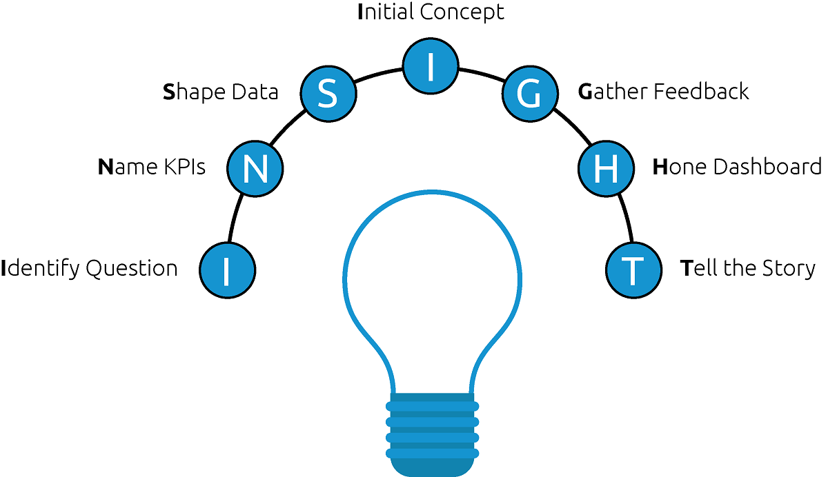
As consultants and content marketers, we have designed and constructed hundreds of data visualizations. Whether that has been a pictograph or a Venn diagram, having visuals to showcase findings could make it easier for many …

Tableau 201: How to Make Dual-Axis Slope Graphs

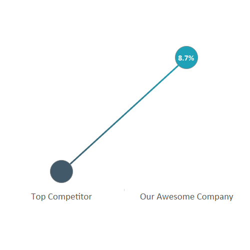
Slope graphs, or essentially line graphs between two points, are one of our favorite Tableau charts when our analysis requires a comparison between two data points. They work so well, in fact, that they are …

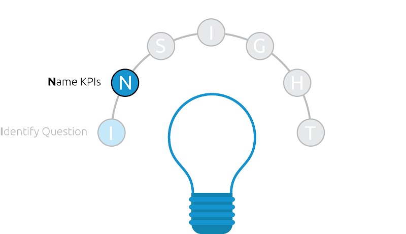
Tableau 201: Using Level of Detail Expressions to Create Benchmarks

One of the most powerful features of Tableau is the “Level of Detail” (LOD) functionality, which provides a syntax for explicitly assigning a different level of detail, or granularity, to a measure. This unlocks many …