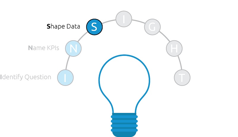
The first two steps in the INSIGHT framework for data visualization, (1) Identify Business Question and (2) Name KPIs, will inform what should be included in the third step: Shape Data.
In the Tableau fundamentals series, we discussed the ideal way to shape data for use with Tableau. This step is also about accessing the required data, doing any preparation such as joins or aggregations, and making sure the data set is laid out for your data visualization requirements.
Mastering this step is truly half the battle when it comes to data visualization, and this post will touch on different tactics for ensuring your analyses are set up for success.
Shaping Data for Use with Tableau
As mentioned in the introduction to this post, we have already covered the ideal way to shape data for use with Tableau and similar data visualization tools, but it’s worth repeating some of this critical concept. In general, it is easier to work with ‘vertical’ tables versus ‘horizontal’ tables. In most cases, each column should represent one field with the field name in the column header, and each subsequent row should be an entry under that column header.
One common example that usually requires reshaping is survey data, where by default each answer to a single survey question may have its own column. A data set like this would be much easier to work with if it was transposed so that each survey question had its own column, and the answers were the individual rows in the respective column.
Joining and Aggregating Data
As your analyses become more sophisticated, it is not uncommon to require access to data across multiple sources, and when possible, to consolidate the data into one centralized data connection.
Further, as the size of your data grows, you will need to start thinking strategically about how to aggregate your data so it continues to be manageable to work with.
One of the most common questions we receive is if it’s better do this type of data preparation in Tableau or before you connect to the data with Tableau. Tableau comes with some useful data preparation functionality including the ability to do joins, blending, interpretation, reshaping, and aggregation. Our general recommendation is to prepare the data as much as possible before it gets to Tableau, but these capabilities are extremely handy for trying new things on the fly before making them more permanent in the underlying data.
One big exception to pre-Tableau preparation is with calculated measures. One of the most powerful features of Tableau is its ability to do quantitative calculations on the fly across any dimension you throw on a view.
If you are aggregating your data set before it gets to Tableau to the point where every number is predetermined, you are basically working with an OLAP, or cube, data source. This takes away a lot of the exploratory value of Tableau. One suggestion is having the raw calculated measure inputs in the data set before connecting with Tableau, but creating calculated measures themselves within Tableau.
Laying Out Data for Specific Analyses
Certain chart types, such as Sankey Diagrams and Funnel Charts, are much easier to create if there is some thought put into how the underlying data set is laid out. Situations like this are a case by case basis, but we did want to point out again that the data set itself can actually help you create data visualizations more efficiently.
If you come across a situation like this where a certain chart type requires a unique data format, we advise keeping a master data connection for the rest of your workbook, but creating a second data connection for the unique requirements. The second data set may have the exact same data, but it can be laid out in a way that makes it easier to accomplish the special use case.
Shaping Data for the Iron Viz Example
Sticking with the “Do Old Movies Get Better With Age?” dashboard example, let’s take a look at how the ‘Shape the Data’ step was applied.
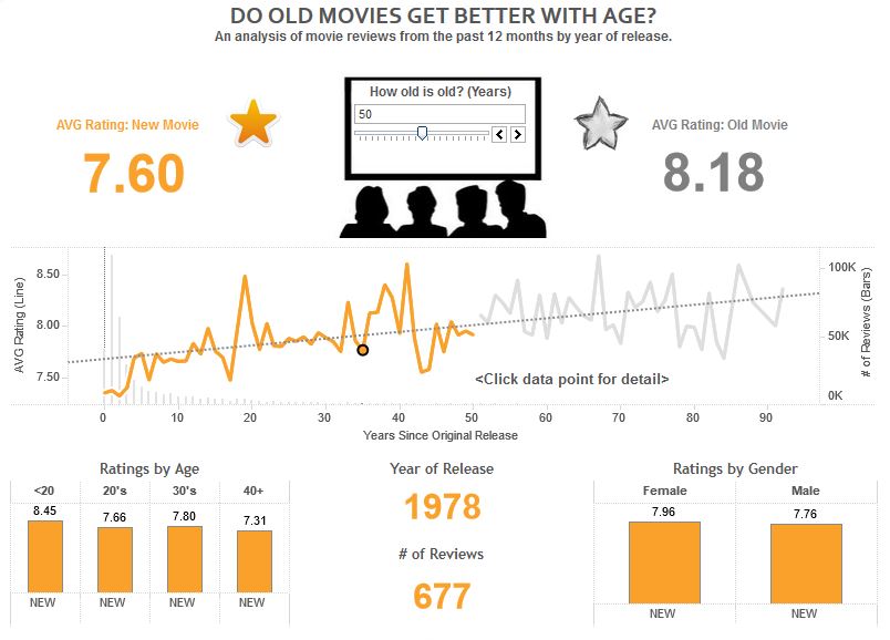
In the case of the Iron Viz competition, all three contestants were provided with a clean and easy to work with data set. After all, this contest is meant to be a data visualization contest, and not a data preparation contest.
Admittedly, this data set was a lot easier to work with immediately compared to many of the data sets that you may come across in your day job. That being said, there was one notable hole in the underlying data: Age.
As mentioned in the last post in this series, Age was the number one KPI for the analysis and, without this field, it would not have been the visualization we envisioned..
Rather than move on to a different concept, we evaluated the existing fields that we had to work with. Fortunately, we found that the titles of each movie included the year it was released in the text. If we could strip out the year of release from each title, we would have a numeric field. From there, we could subtract the year of release from the current year, creating my field for Age.
So we created a calculated field to isolate year of release that looked like this:
Year of Release = int(mid([Main Movie Title],find([Main Movie Title],”(“)+1,4))
Then another calculated field for Age:
Age = Current Year – Year of Release
We were then able to use these fields as part of my analysis. This is a perfect example of creating something on the fly in Tableau by getting creative with the existing data. If this was a real situation, upon proving the value of this field, try making Year of Release and Age permanent dimensions in the underlying data set before it gets to Tableau.
In the next post, we will finally start to visualize data!
Written By

Evolytics
This post is curated content from the Evolytics staff, bringing you the most interesting news in data and analysis from around the web. The Evolytics staff has proven experience and expertise in analytics strategy, tagging implementation, data engineering, and data visualization.