I found I could say things with color and shapes that I couldn’t say any other way – things I had no words for.
– Georgia O’Keeffe
During his keynote presentation at the 2014 Tableau Conference, Tableau CEO and Co-Founder, Christian Chabot, talked about data analysis being a creative process. As an analyst, you may not think of yourself as an artist, but by its nature, data visualization is an art form. Visual analysts use data to express insights and provoke action. As Christian Chabot put it, “Analysts and artists are both on a mission to reveal something new — to discover truth, to find meaning.” So if you are doing visual analytics, congratulations – you’re an artist! If that label makes you feel slightly uneasy, don’t worry, this post covers several tips on utilizing one of the most powerful forms of artistic expression: Color.
The tips in the Data-Driven Storytelling series attempt to follow a natural progression on the ease of implementation spectrum. While leveraging color is just the third of fifteen tips, meaning it is relatively easy to put into practice, it is also one of the most effective tools for discovering and sharing insights.
Just a few benefits of leveraging color in your data visualization
1. Color makes the stories in your data pop. The primary use of color is a practical one: it helps the insights in your data emerge, both for you and your audience. Color helps accomplish a shorter time to insight by providing (a) a means to identify discrete dimensions so you can quickly recognize strong and poor performers (i.e. West is colored orange; East is colored blue) and (b) a scale to illustrate relative performance (i.e. The higher the sales, the darker the green, as shown in Smooth the Excel Transition).
2. Color helps engage your audience. Careful color selections, or even the use of color at all, is an easy way to subliminally capture and keep the attention of your visualization users. One concept that we always have in mind when designing data visualizations is Seth Godin’s idea of being ‘remark’-able. Being remark-able means that your work is so unique, interesting, insightful, or awesome enough in some way, that your audience will want to make a remark about it. In today’s world, that may mean sharing it on social media, or passing your report up the corporate ladder. We have found that the use of color is often a key ingredient in achieving remark-ability in data visualization.
3. Color can help align your dashboards with your brand identity. Your company’s website, business cards, PowerPoint decks, letterhead, and more, are all in your brand’s look and feel – so why aren’t your corporate dashboards? A lot of thought went into the creation of your company’s brand colors, and usually these colors work well as the primary colors incorporate dashboards. Part of the reason a client’s brand colors usually work for me is that they force me to work within a limited color palette, which is one of my top tips for using color.
Customizing your use of color is easy with Tableau
Below is one colorful example from my Tableau Public portfolio. Remember, if you ever see something you like in a Tableau Public viz, you can download it to find out how it was created. The same is true with colors – if you see a color you like, you can download the workbook to find the values that generated the color. More on color values below.
This visualization uses the out-of-the-box “Temperature Diverging” color palette in Tableau. Even though it is typically not best practice to use red and green due to a common color-blindness that impacts around one out of ten men, we couldn’t resist using these colors for a viz specifically about traffic. The only downside was that using the color palette in Tableau was not as flexible as we would like; this certain color palette is only available for use when coloring continuous measures (i.e. lower values colored red; higher values colored green). Fortunately, Tableau allows you to customize colors and how you can use them if you know the values used to generate them.
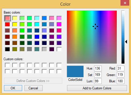
There are three types of color values that you can use to customize colors in Tableau. The quickest way to customize colors in Tableau is to know either the (1) Hue-Saturation-Luminance or (2) Red-Green-Blue values. Both HSL and RGB use a combination of three, three-digit numerical codes. You only need to know one of the combinations because when you use one, the other will automatically be generated. For example, if you type in the RGB values of a color, the corresponding HSL values will be generated. Any color can be added and used in Tableau by double-clicking a color in Tableau color legends until you see a color dialog box and enter the HSL or RGB values. The custom color dialog box looks like this:
Here are the RGB values for Tableau’s temperature diverging color palette if you would like to use them in your own data visualization. The first value is the level of red, the second is green, and third is blue:
Green: 82.153.133
Yellow: 219.207.71
Red: 194.107.81
Orange: 239.180.78
The third type of color value that can be used with Tableau is called hex, which is a six-digit numerical code. Note that all colors have all three types of values (among others): HSL, RGB, and hex. Hex values can be used to create a variety of custom color palettes in Tableau. You can use a tool like ColorSchemer to find the color values you need.
Tips for getting the most from color in your data visualization
1. Use limited color palettes. Ideally, two-color schemes are the most effective. These types of visualizations make the story in your data very clear and don’t require the use of a color legend. Sometimes, the volume of dimensions dictates how many colors you need to use, but we generally try to keep the colors on any dashboard to five or less. Just keep in mind that the more colors you add, the more your dashboard user has to work to look back and forth to the color legend to understand what they are looking at.
2. Use muted colors. Muted colors are less intense due to a lower hue saturation. Muted colors as shown in the example above are more pleasing on the eye and make it easier for your audience to consume your visualizations. Try to avoid harsh/sharp/bright colors which distract from your data, rather than add to it.
There are several color-related topics that we have not touched on here including how the color wheel works, selecting color schemes, and the psychology of color. For more on color, see our guest Tableau blog post: Leveraging Color to Improve Your Data Visualization.


